Case Study — AVRIE
Website Design for Pilates & Fitness Studio Brands
Strength, held softly.
A pilates studio sells discipline and calm — the website should feel the same. This case study covers designing a movement studio brand where the schedule, memberships, and first-class offer are all reachable in a tap.
Client
AVRIE Studio, Silver Lake, LA
Deliverables
Visual Identity, Website
Industry
Wellness
Year
2026
Concept mockup — a design study, not a live website.
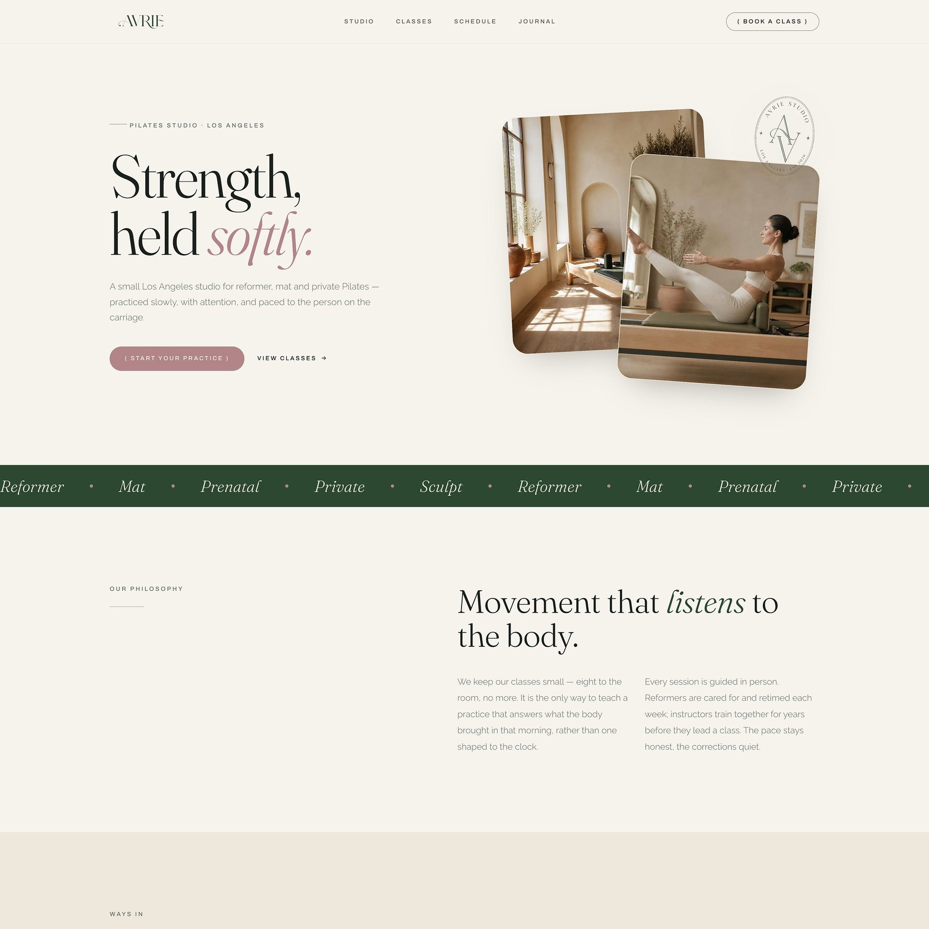
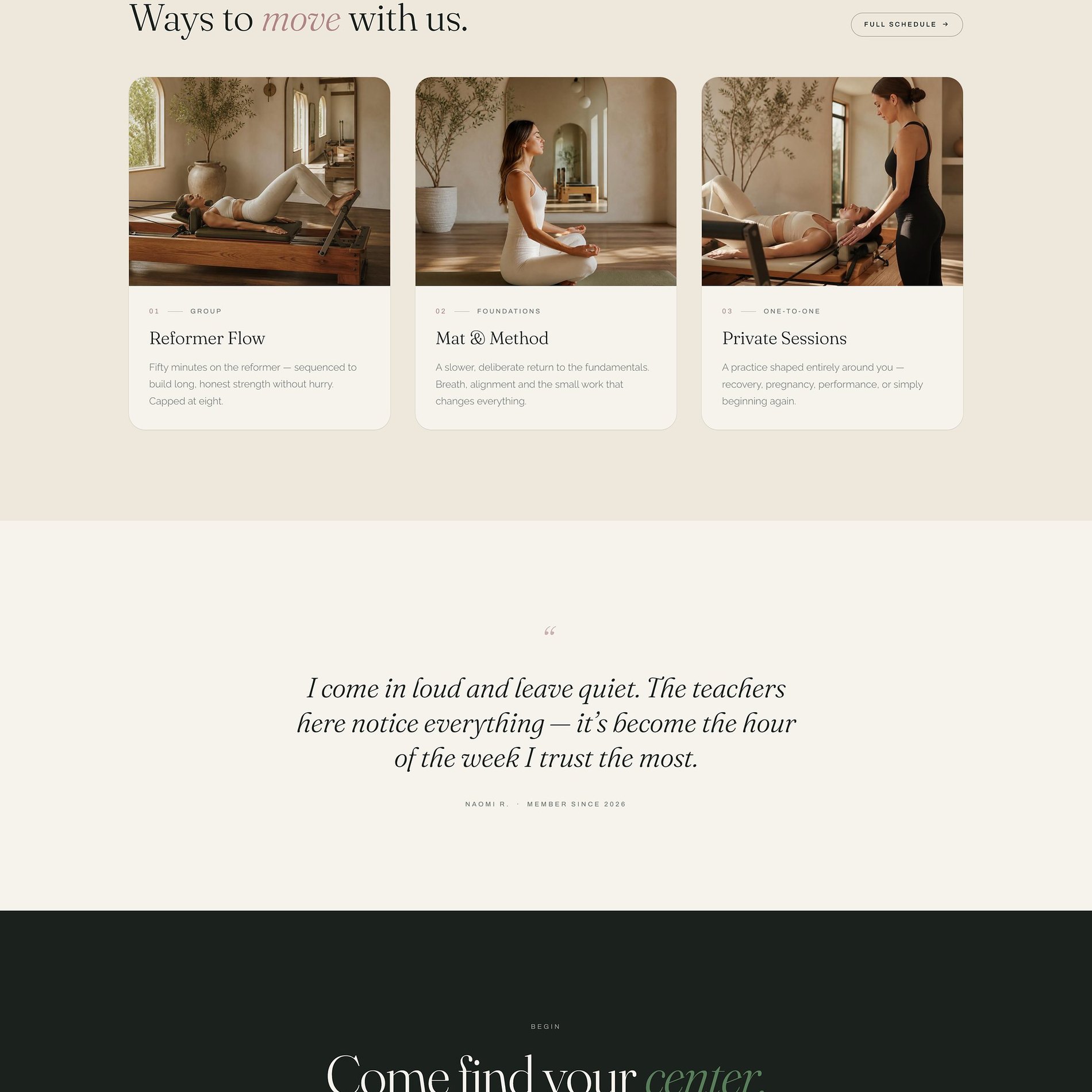
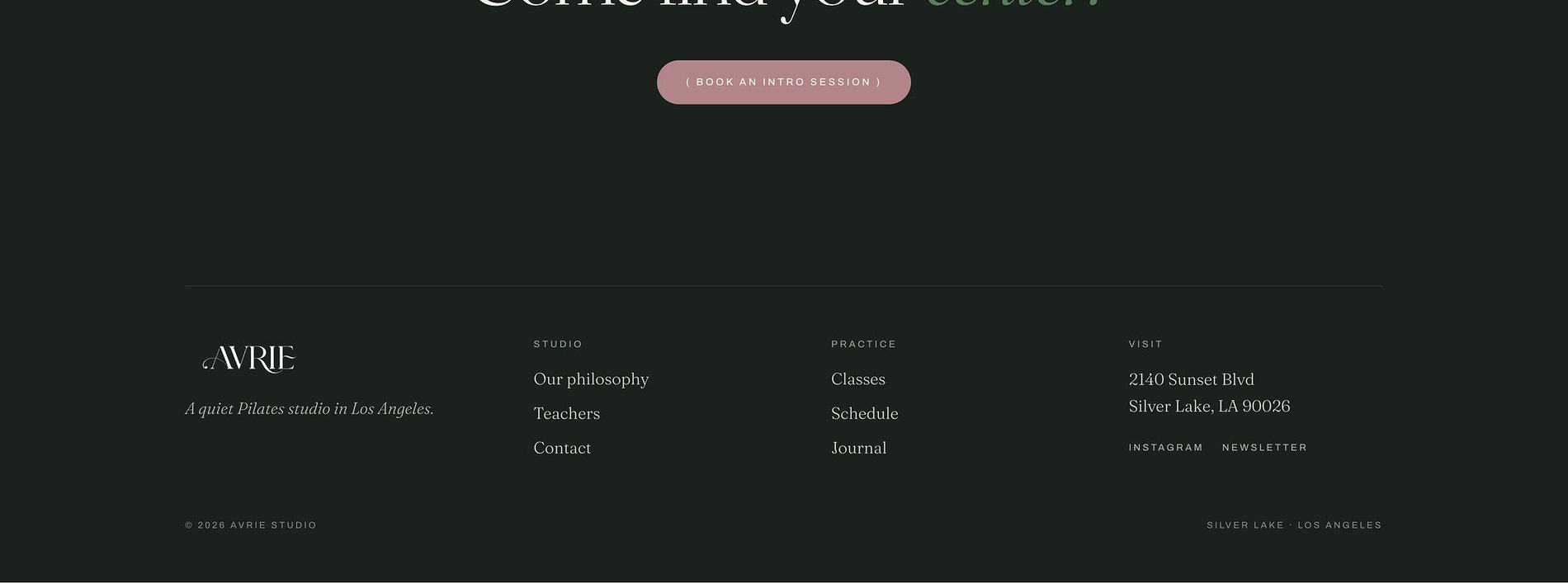
↓ Scroll inside the frame to explore · switch pages above
The Vision
What the brand needed to become.
AVRIE is a small Pilates studio in Silver Lake built on reformer, mat, and private work — classes kept deliberately small so the practice can answer what the body brought in that morning, rather than one shaped to the clock. The brand needed to feel as unhurried and attentive as the room itself.
Boutique fitness usually shouts — neon, hustle, 'no pain, no gain.' AVRIE is the exact opposite: quiet, grounded, and warm. The identity had to signal strength without aggression, and calm without going soft — the feeling of leaving a session more yourself than when you walked in.
I come in loud and leave quiet — it's become the hour of the week I trust the most.
The Work
What we made.
A grounded, editorial identity and a full website paced to match the studio — calm, natural, and quietly confident, built to turn a first curious visitor into a standing weekly ritual.
Visual Identity
The AVRIE wordmark and seal, an editorial serif system, and an earthy, natural colour language that reads calm at a glance.
Five-Page Website
Home, Studio, Classes, Schedule, and Journal — fully responsive, spaced to feel like room to breathe.
Class System
Reformer, Mat & Method, and Private Sessions — three clear ways in, each framed around attention rather than intensity.
Schedule & Journal
An easy weekly schedule plus a journal that carries the studio's voice and keeps the practice present between sessions.
The Palette
Color, with a reason.
Where boutique fitness reaches for neon and high-contrast energy, AVRIE goes the other way entirely. A soft cream and deep pine hold a calm, editorial frame; forest and sage bring the grounding of nature; and a dusty clay-rose adds the warmth and softness the whole brand is named for — strength, held softly.
Cream
#F3EFE7
The calm, natural-light base — soft, warm, unhurried.
Pine
#1B211D
A green-black for the grounding dark sections — depth without harshness.
Forest
#2C4731
Nature and rootedness — the studio's connection to something slower.
Sage
#527653
The softer green — carries accent words like 'find your center.'
Clay Rose
#C08A79
The warmth and softness — the 'softly' in strength held softly.
Warm Taupe
#AC9F92
Drawn from the studio's wood and light — natural, tactile, calm.
Type
The voice, set in metal.
Pilates Studio · Silver Lake
Strength, held softly.
- High-contrast serif — calm and editorial.
- The swash italic — softness on the key word.
- Mono — quiet, precise class tags.
Selected Screens
A few pages.
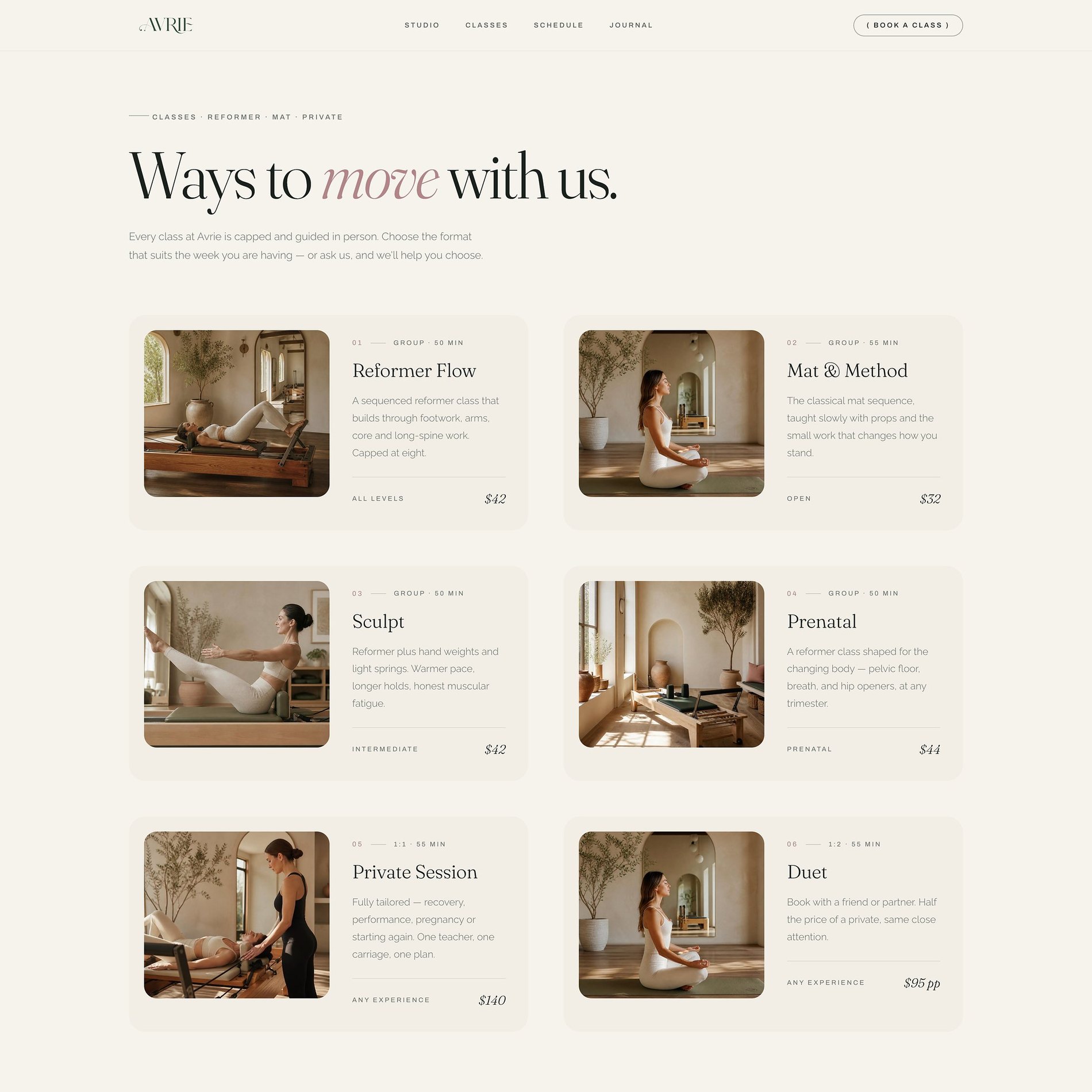
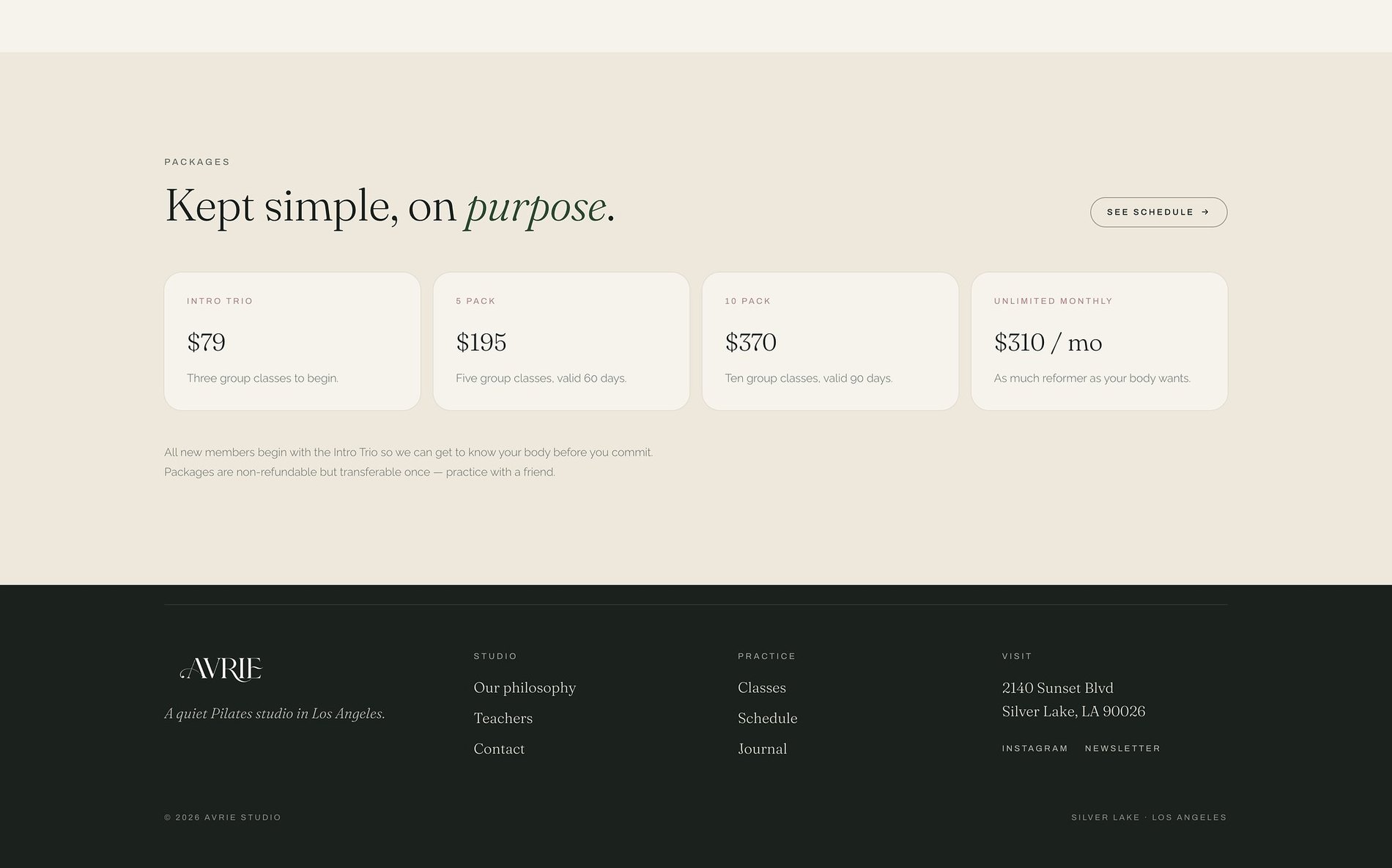
Three ways in, all unhurried
'Ways to move with us' — Reformer, Mat & Method, and Private Sessions, framed around attention.
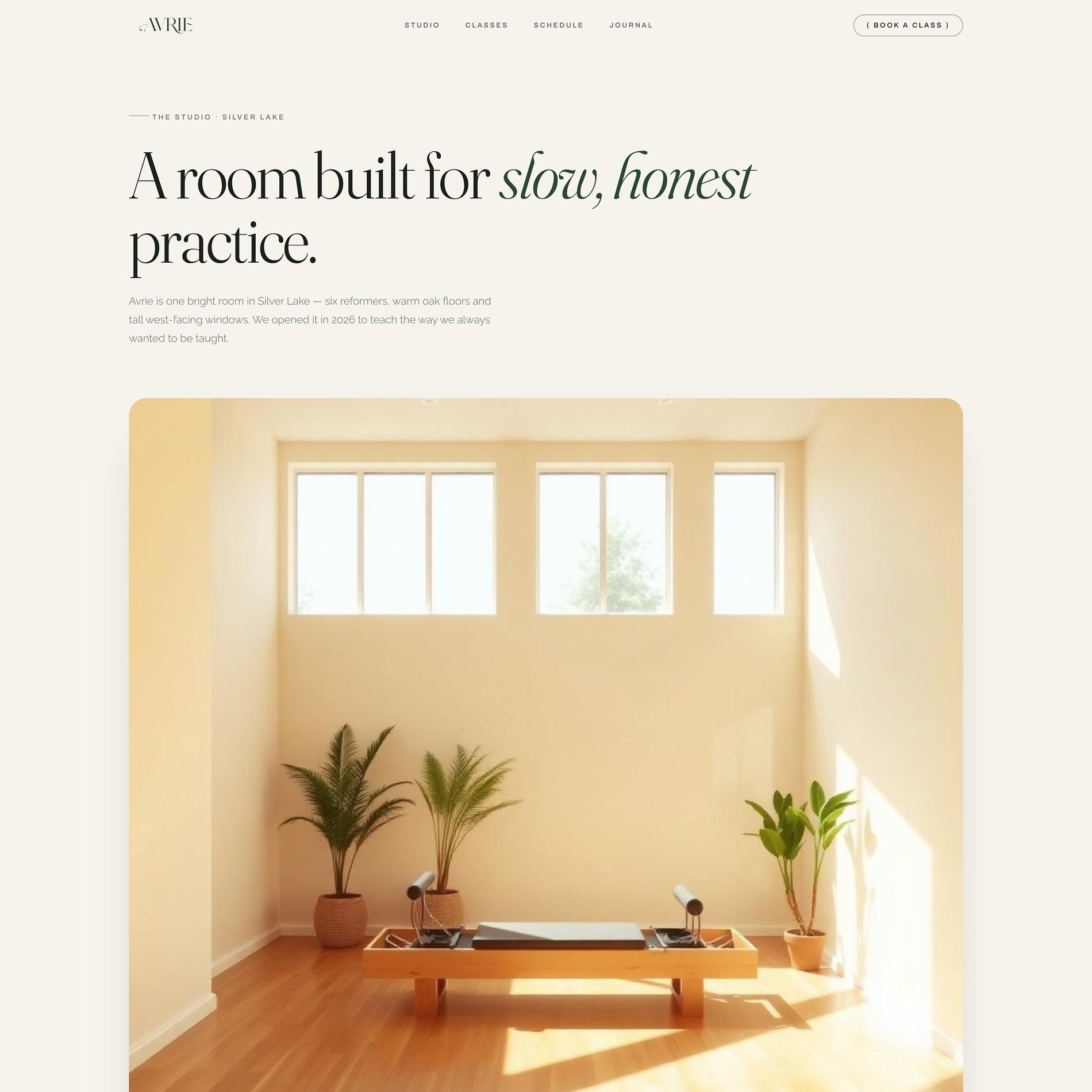
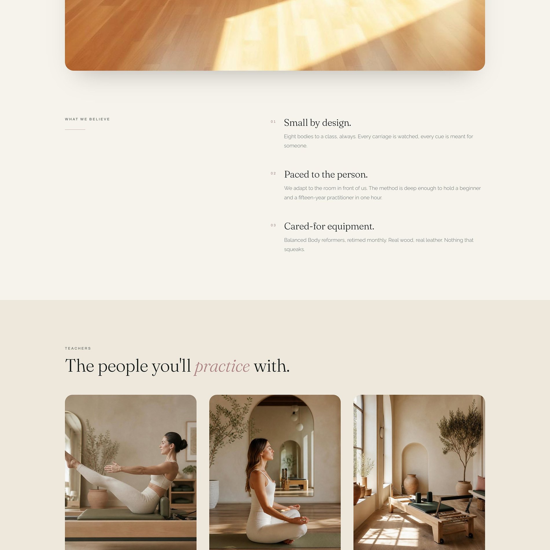
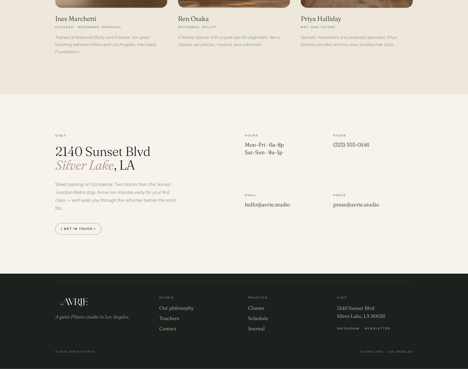
A room built for attention
The studio page lets the space do the talking — natural light, warm wood, small classes.
The week, made simple
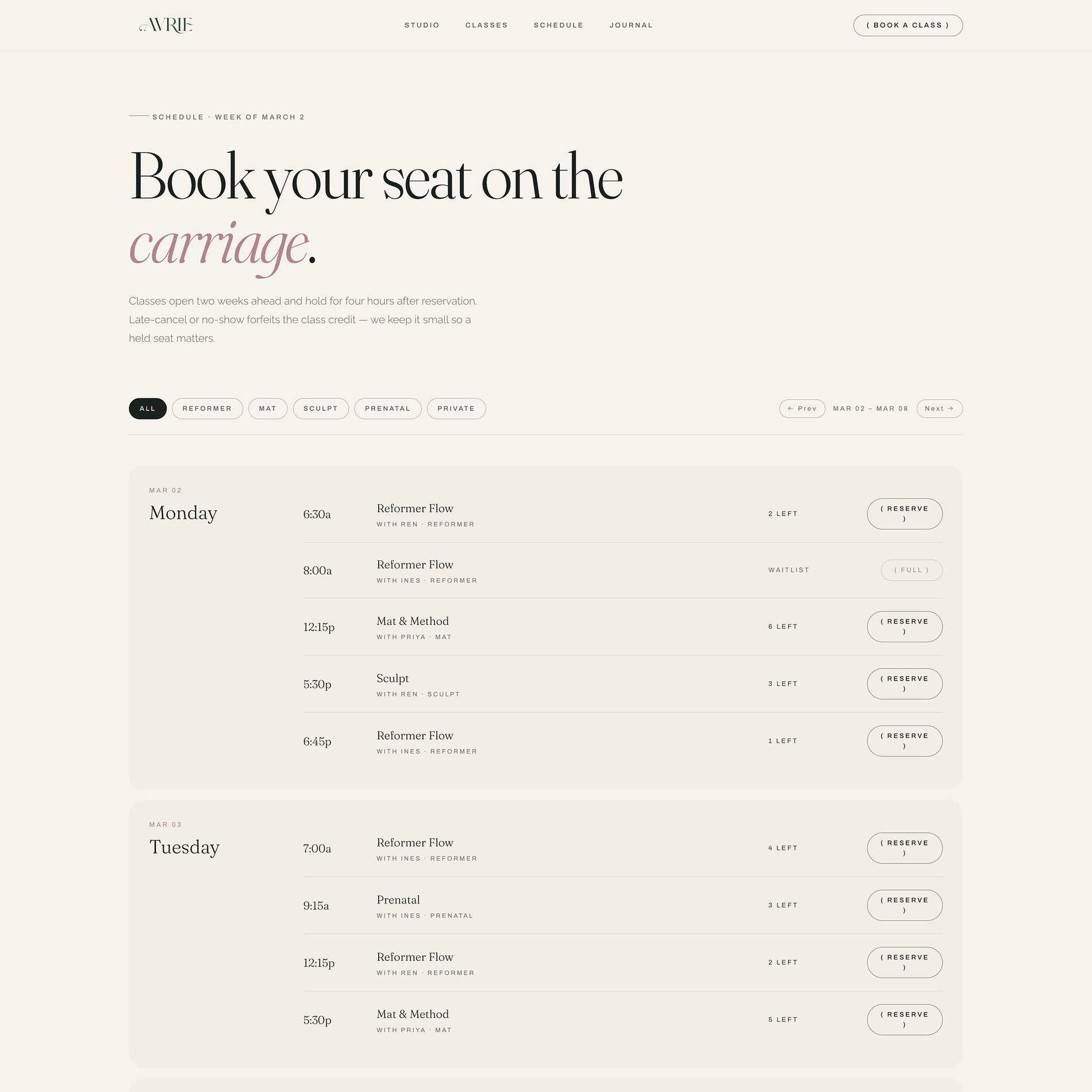
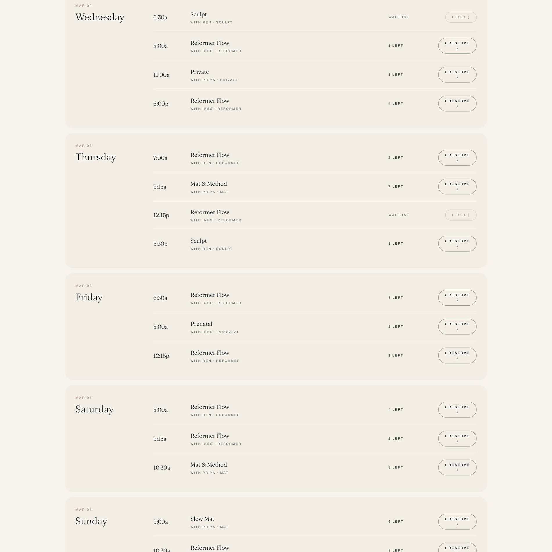
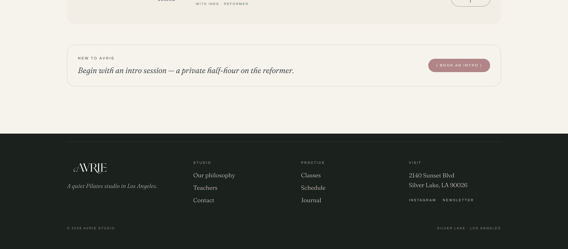
A clean, calm schedule — easy to scan and easy to book.
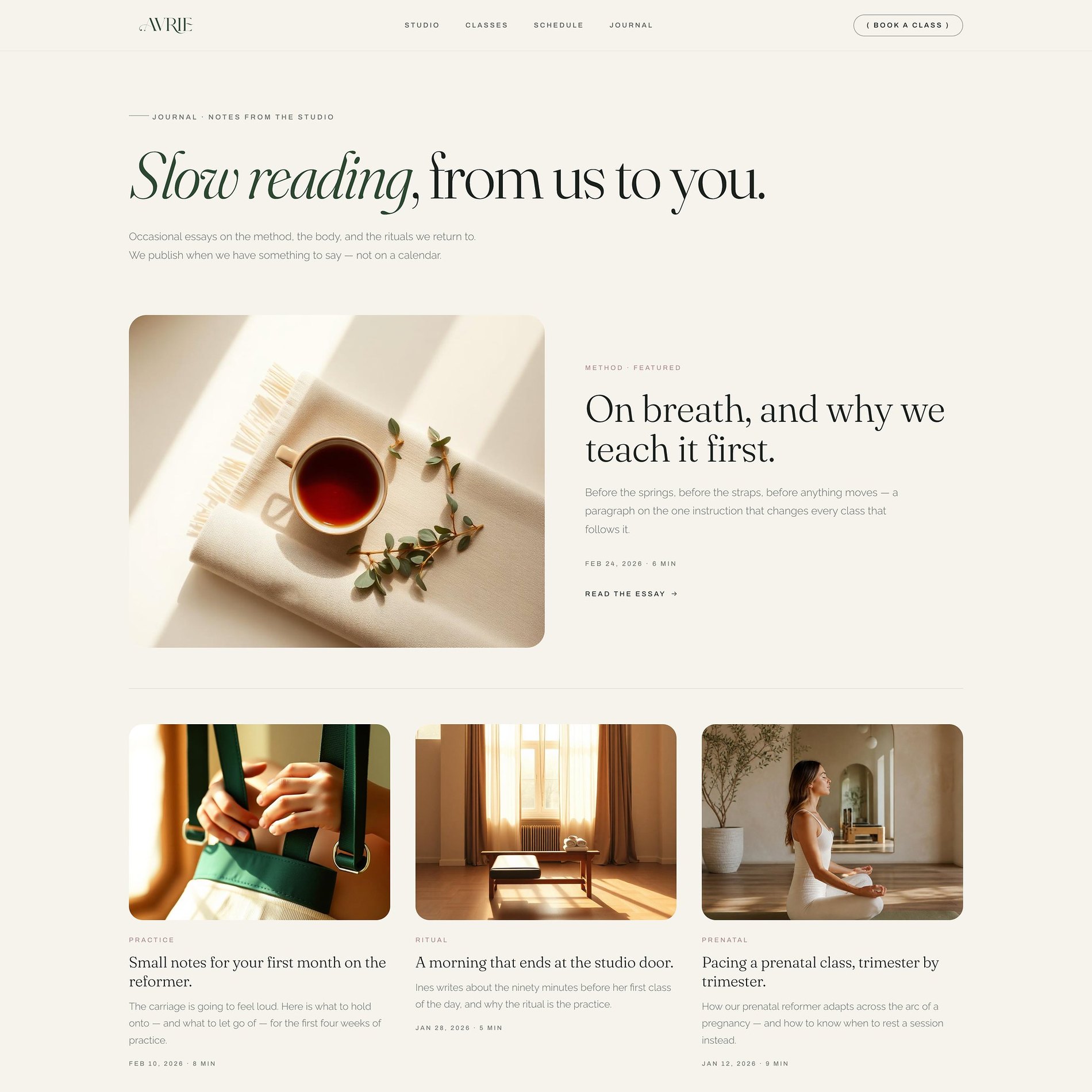
The studio's voice
A journal that keeps the practice present between sessions.
Before & After
What changed.
Before
- — Loud fitness-industry visual language that didn't fit the studio
- — Schedule and pricing living in a third-party tool only
- — No clear path for a first-time visitor
- — Brand tone inconsistent across touchpoints
After
- — A quiet, disciplined identity built on restraint and space
- — Schedule, memberships, and pricing given real page structure
- — An obvious first-class path for new visitors
- — One tone across web, studio, and social
The Process
How this site was made.
Strategy & positioning
We start with the audience a pilates studio is actually trying to reach — what they're afraid of, what they're comparing, and what would make them book.
Identity direction
Colour, type, and tone are chosen against the category, not from a moodboard. Every decision has a reason you can repeat out loud.
Page-by-page design
Each page is designed for one job — reassure, explain, or convert — then built responsive from the smallest screen up.
Build, launch & handover
Copy, imagery, and SEO basics ship together, with a walkthrough so the team can keep the site current after launch.
Project Outcomes
What was delivered.
Identity + Website
Scope
Class bookings
Primary goal
Quiet, disciplined
Tone
Mobile-first
Responsive
Services
Studio Website
Schedule-driven sites for pilates, yoga, and movement studios.
View services & pricing →Start a project
Want something like this for your pilates & fitness studio brand?
Tell me where the brand is now and what it needs to become. I reply to every inquiry personally.
Start an inquiry →