Case Study — Flutter & Co.
Website Design for Lash & Beauty Studio Brands
Wake up already done.
A lash studio lives or dies on bookings. This case study covers designing a lash lounge brand that feels soft and indulgent while keeping the booking button impossible to lose — the practical side of website design for beauty studios.
Client
Dani Reyes, Silver Lake, LA
Deliverables
Visual Identity, Website & Membership
Industry
Beauty
Year
2026
Concept mockup — a design study, not a live website.
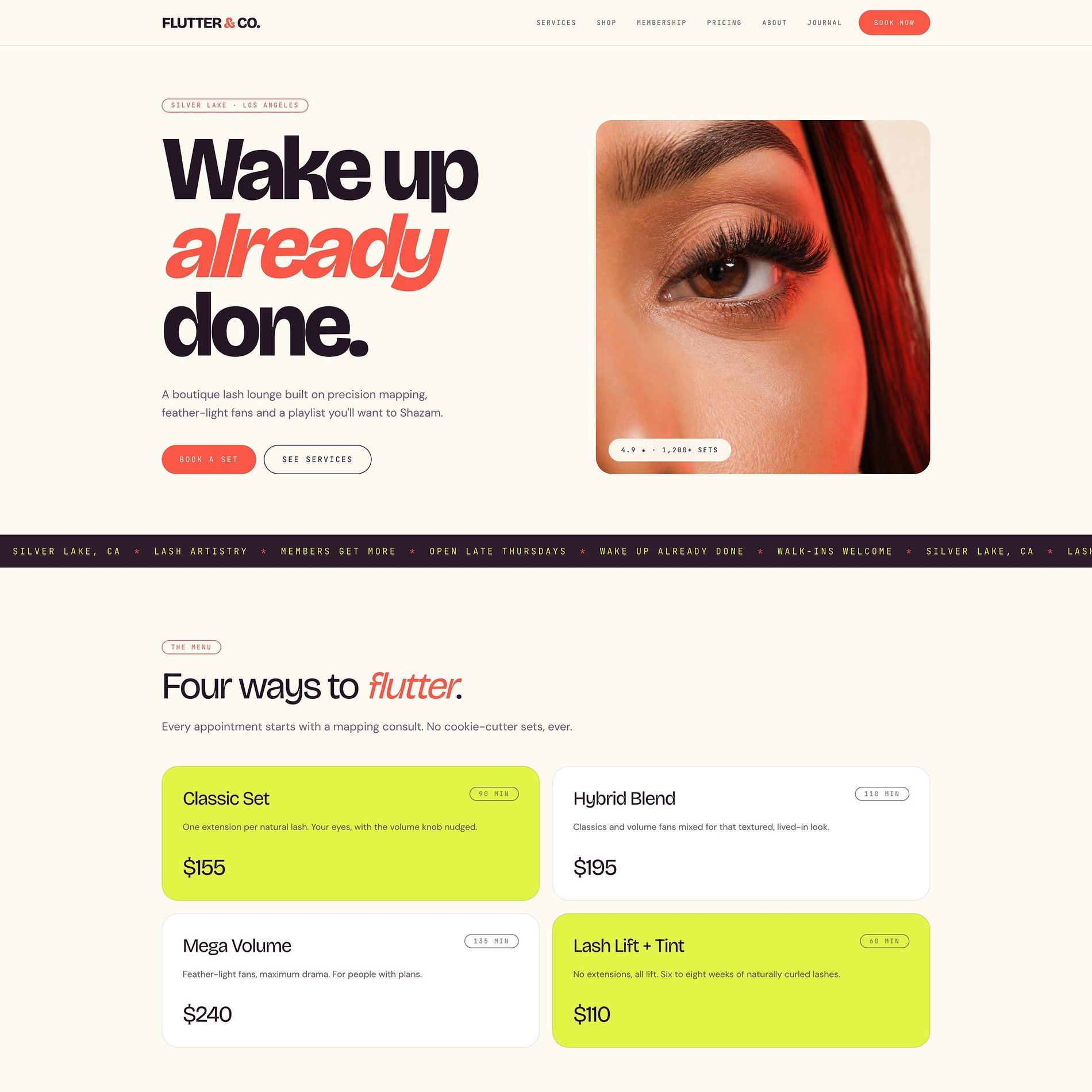
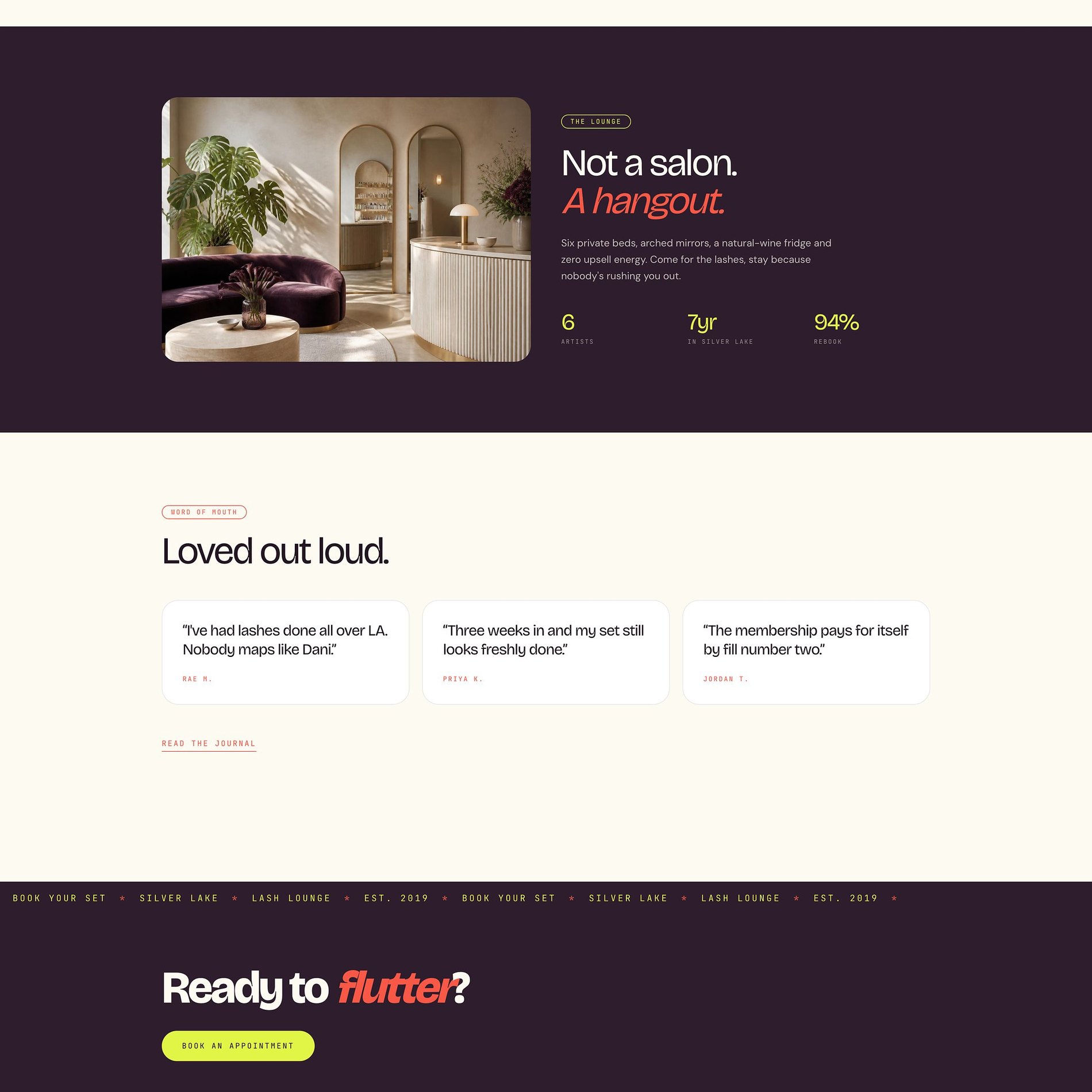
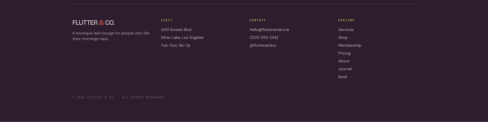
↓ Scroll inside the frame to explore · switch pages above
The Vision
What the brand needed to become.
Flutter & Co. is a boutique lash lounge in Silver Lake — six artists, private beds, a natural-wine fridge, and zero upsell energy. It started as one bed in the back of a nail studio; seven years later it is a storefront with a following. The brand had to feel like the coolest room in the neighborhood, not another beauty bar.
Lash branding almost always defaults to blush pink and swirly script. Flutter goes the other way entirely: bold, loud, and a little irreverent — while still reading as genuinely expert, with precision mapping and a lash-health-first philosophy underneath the attitude.
Come for the lashes — stay because nobody's rushing you out.
The Work
What we made.
A loud, confident identity and a seven-page site engineered to do the two things that actually grow a lash business — book new sets and convert them into recurring members.
Visual Identity
The FLUTTER & CO. wordmark, a running marquee system, and an electric colour language that refuses to look like every other lash bar.
Seven-Page Website
Home, Services, Membership, Pricing, About, Journal, and Book — fully responsive, with the brand voice carried edge to edge.
Membership Engine
'The Flutter Club' — three tiers that turn a fill habit into predictable monthly revenue and priority booking.
Voice & Journal
Aftercare and technique notes — 'Notes from the bed' — that build authority and keep clients coming back between fills.
The Palette
Color, with a reason.
The whole point was to break the pink-and-nude default of the category. An electric lime does the attention-grabbing that most lash brands don't dare, a warm coral carries the playful italic voice, and a moody aubergine makes the space feel like a night out rather than a clinic — all grounded on a soft cream so it stays inviting instead of aggressive.
Cream
#FBF9F1
The soft base that keeps all that boldness feeling warm and welcoming.
Ink
#1A1315
Near-black for the heavy display headlines — confident, high-impact.
Aubergine
#2D1C2B
The moody dark that makes the lounge feel like a night out, not a clinic.
Electric Lime
#DEF347
The signature jolt — the exact colour no other lash bar would dare use.
Coral
#FA4A38
Warmth and play — it carries every italic 'flutter' and every CTA.
Type
The voice, set in metal.
Silver Lake · Est. 2019
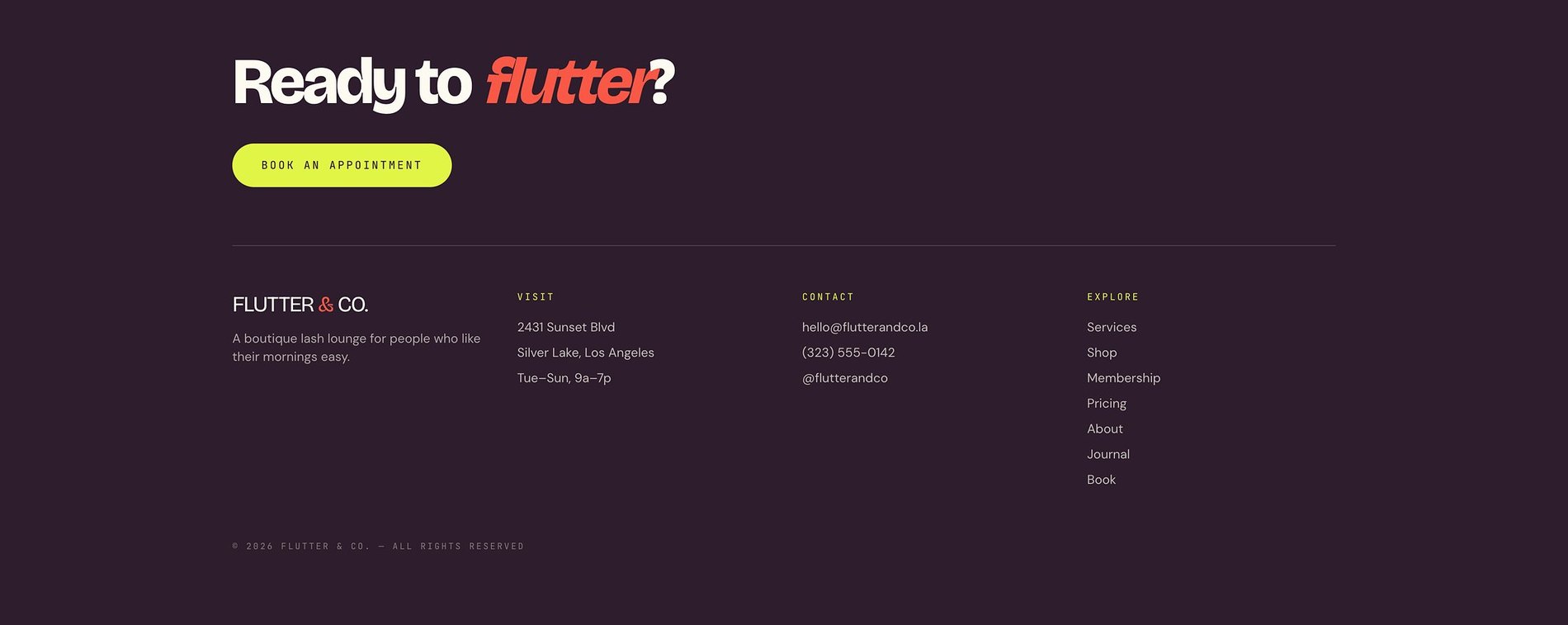
Ready to flutter?
- Heavy condensed serif — loud and confident.
- The coral italic — where the personality lives.
- Mono — for marquees and tags.
Selected Screens
A few pages.
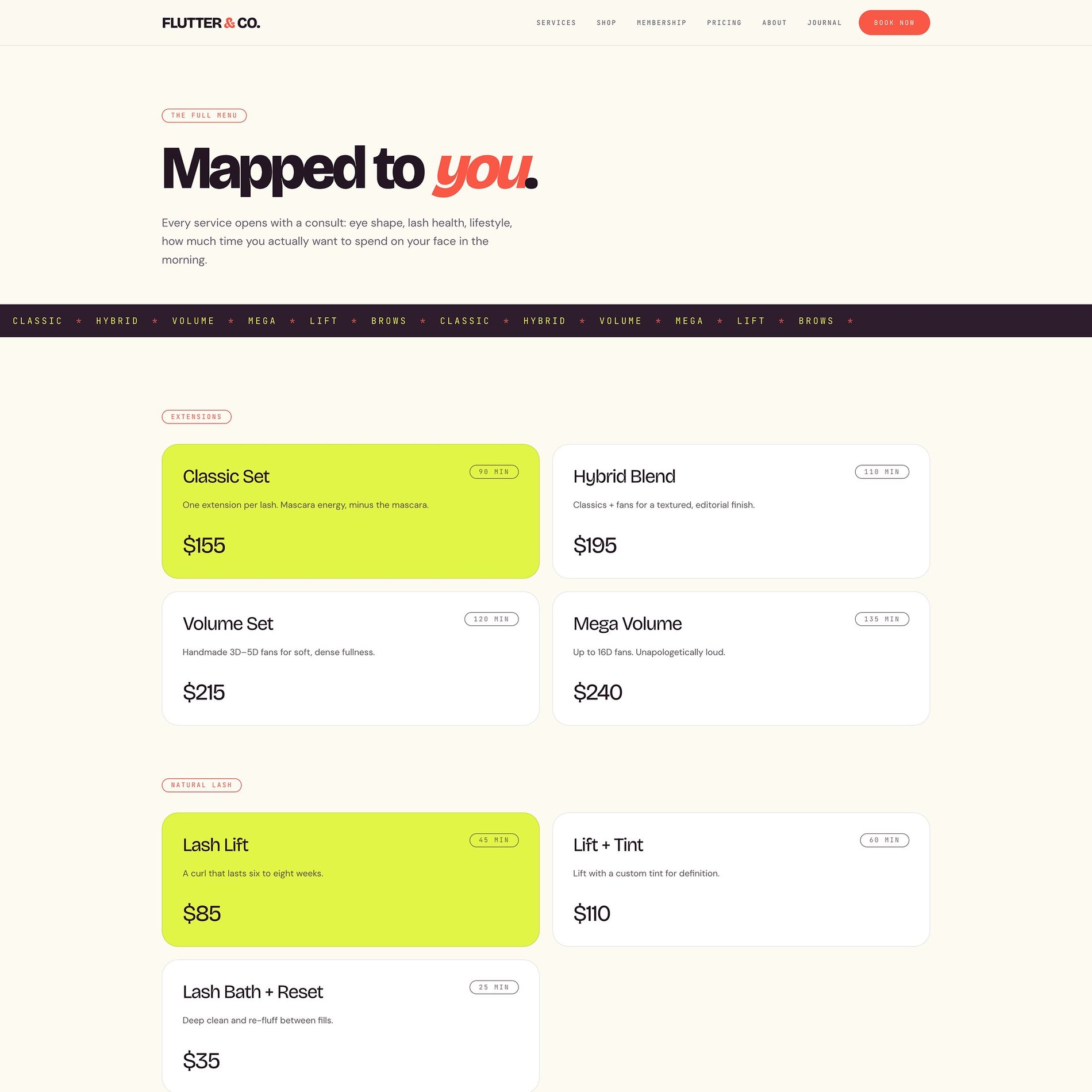
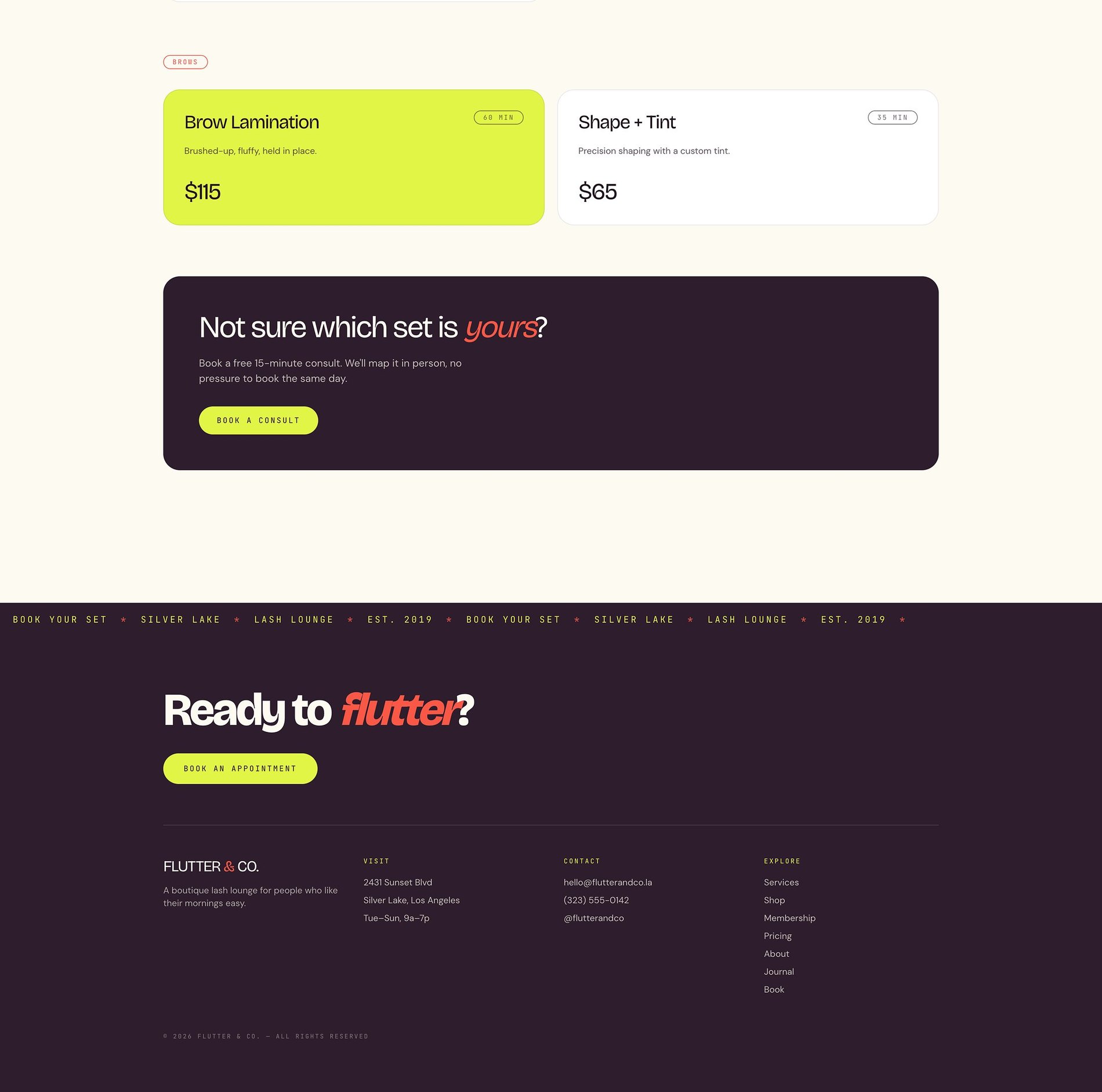
A menu you actually want to read
'Mapped to you' — colour-blocked service cards that make choosing a set feel effortless.
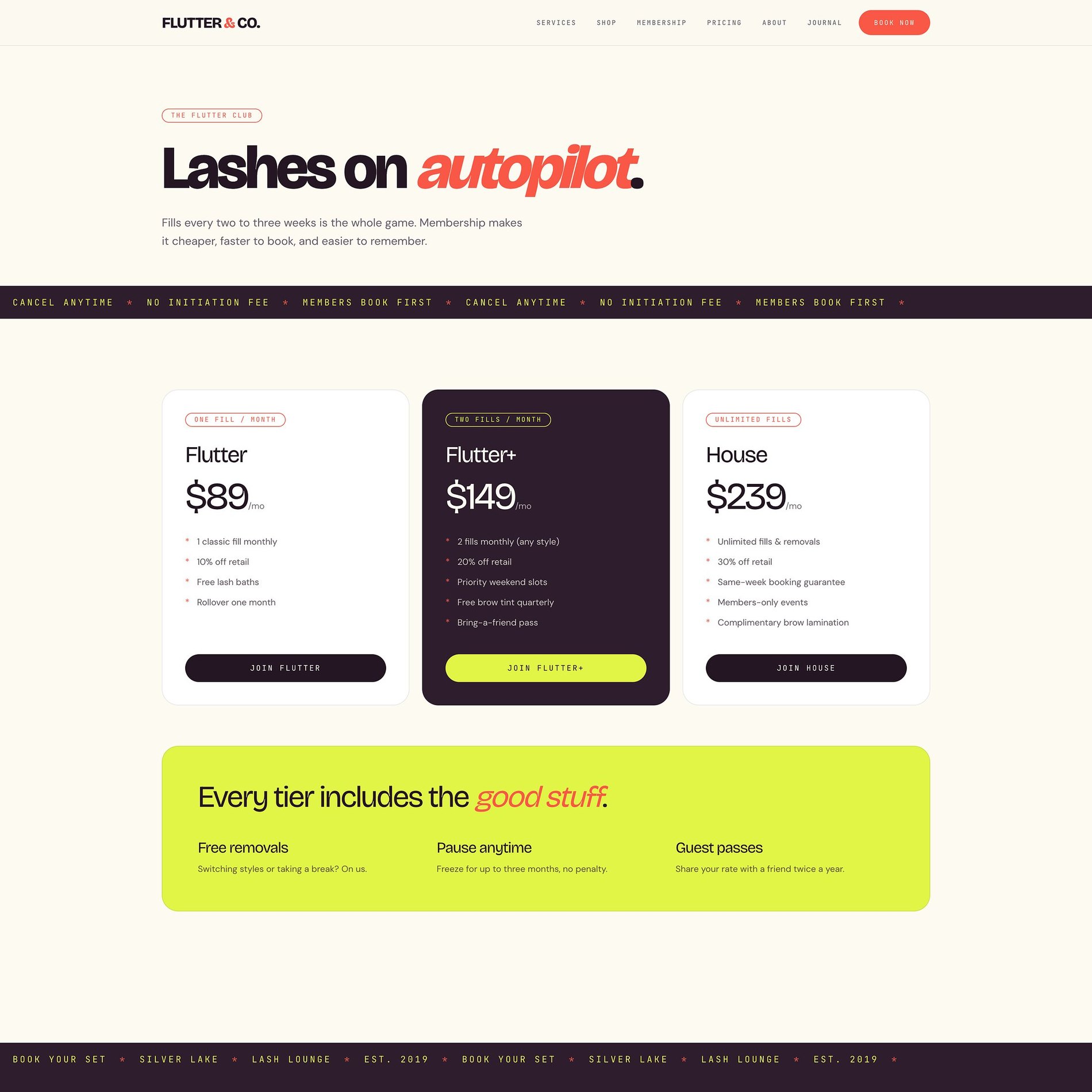
Recurring revenue, built in
'Lashes on autopilot' — three membership tiers that turn a fill habit into predictable monthly income.
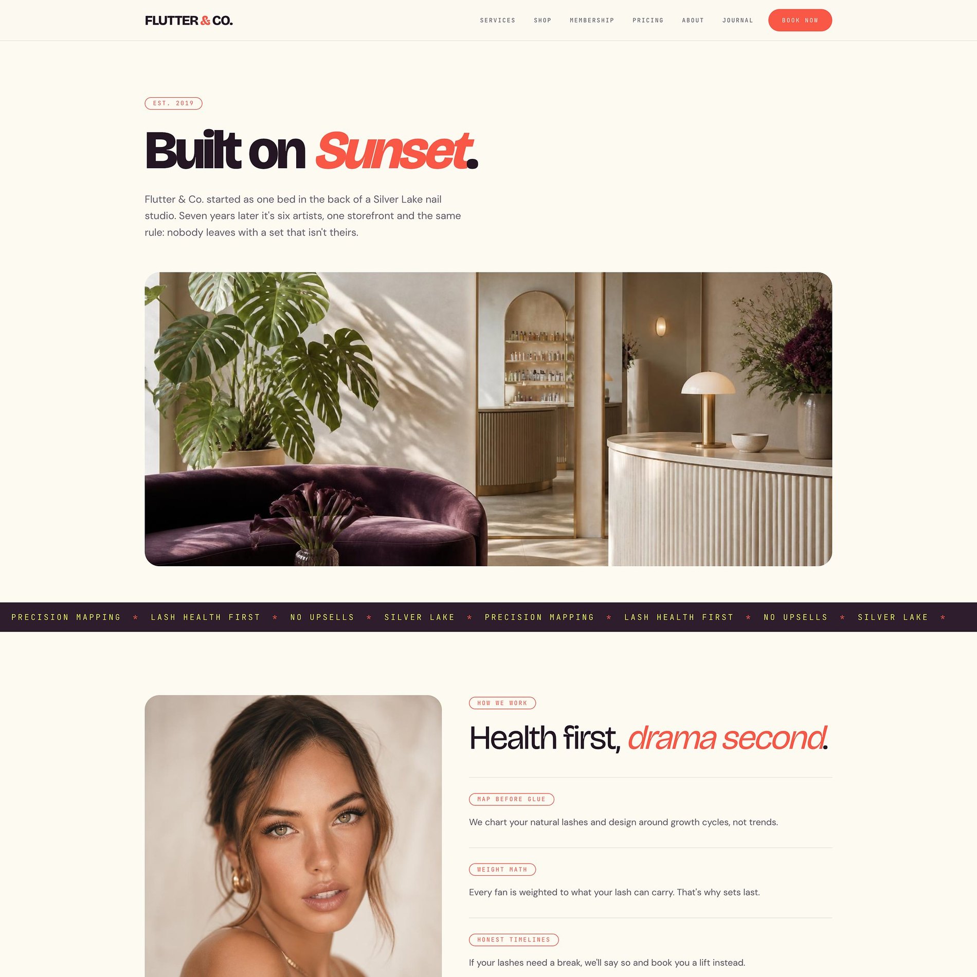
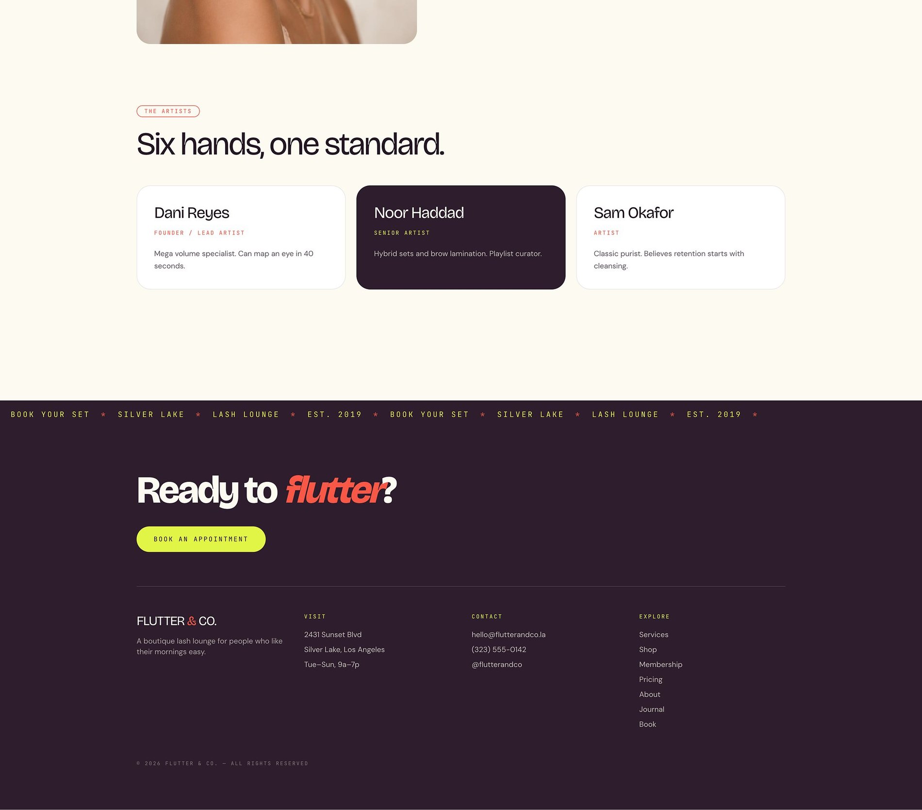
Personality & proof
'Health first, drama second,' the artist lineup, and the hangout story.
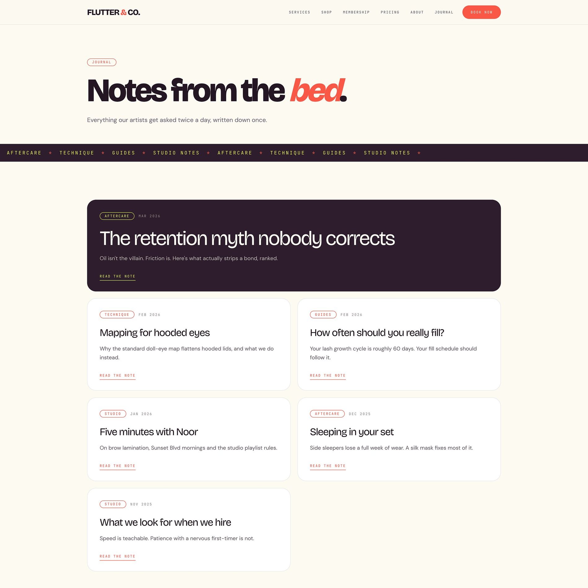
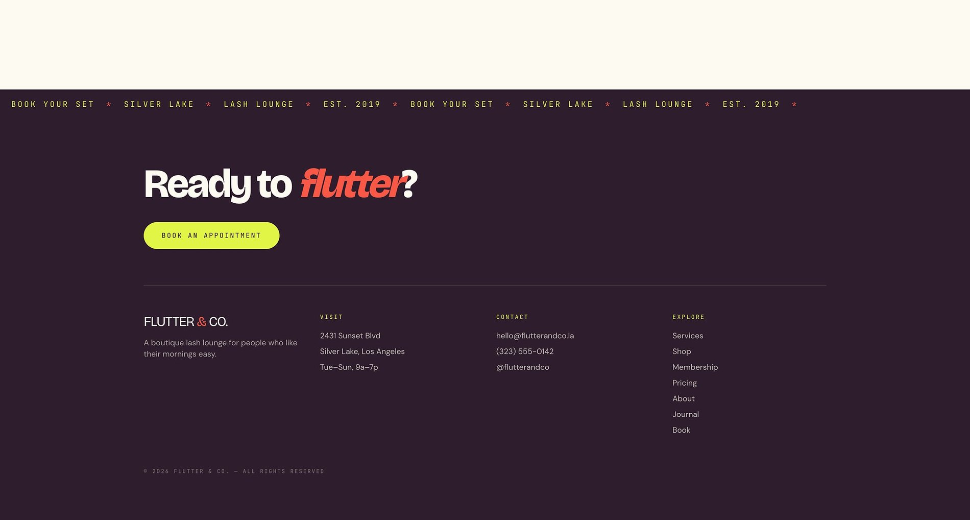
The expert voice
'Notes from the bed' — aftercare and technique posts that build authority.
Before & After
What changed.
Before
- — Instagram-only presence with no bookable home base
- — Service menu and pricing scattered or unclear
- — Booking buried below the fold
- — No consistent look between social and web
After
- — A soft, feminine identity that carries across web and social
- — A clear service menu with pricing and duration
- — Booking anchored in the nav and repeated at every section end
- — One coherent brand from first tap to appointment
The Process
How this site was made.
Strategy & positioning
We start with the audience a lash studio is actually trying to reach — what they're afraid of, what they're comparing, and what would make them book.
Identity direction
Colour, type, and tone are chosen against the category, not from a moodboard. Every decision has a reason you can repeat out loud.
Page-by-page design
Each page is designed for one job — reassure, explain, or convert — then built responsive from the smallest screen up.
Build, launch & handover
Copy, imagery, and SEO basics ship together, with a walkthrough so the team can keep the site current after launch.
Project Outcomes
What was delivered.
Identity + Website
Scope
Bookings
Primary goal
Nav + per section
Booking entry points
Mobile-first
Responsive
Services
Studio Website
Booking-first sites for lash, brow, and beauty studios.
View services & pricing →Start a project
Want something like this for your lash & beauty studio brand?
Tell me where the brand is now and what it needs to become. I reply to every inquiry personally.
Start an inquiry →