Case Study — Golden Hour
Website Design for Skincare & Beauty Brands
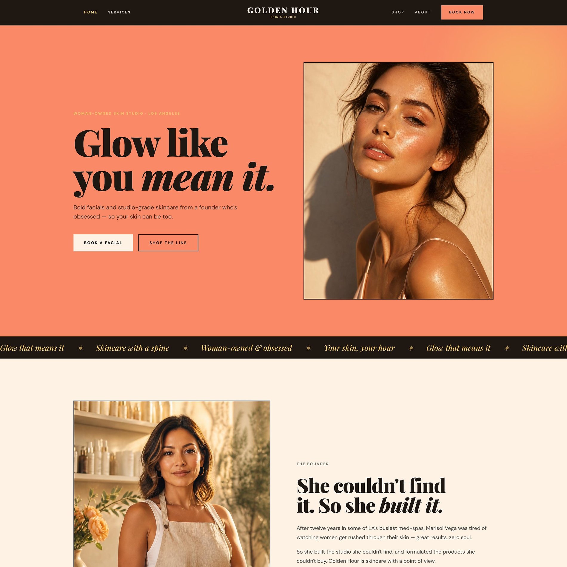
Glow like you mean it.
Skincare shoppers buy the feeling before the formula. This case study walks through designing a beauty brand where warmth, restraint, and editorial pacing do the persuading — the kind of website design skincare labels need to sit beside the brands they're compared to.
Client
Marisol Vega, Silver Lake, LA
Deliverables
Visual Identity, Website & Shop
Industry
Beauty
Year
2026
Concept mockup — a design study, not a live website.
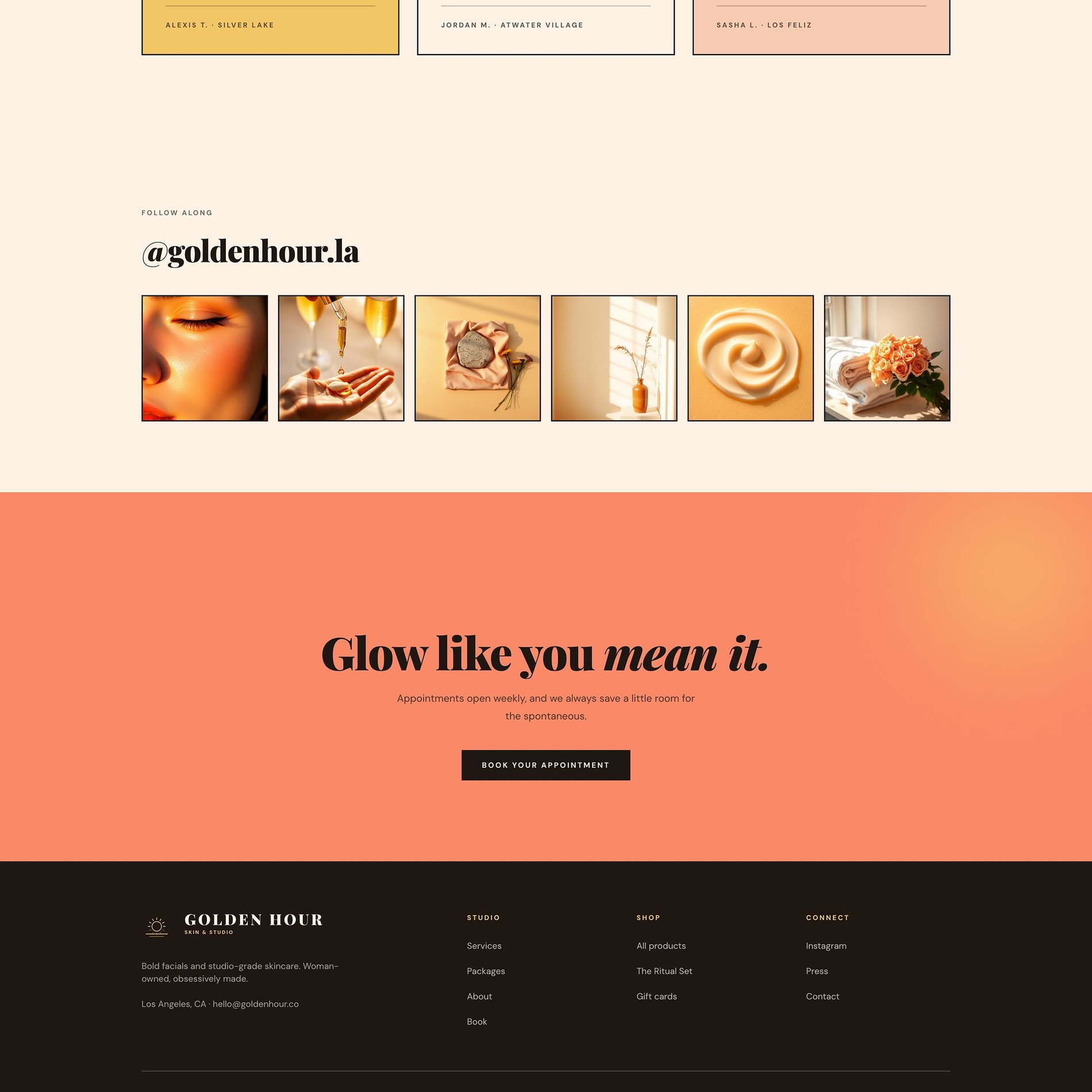

↓ Scroll inside the frame to explore · switch pages above
The Vision
What the brand needed to become.
Marisol spent twelve years in LA's busiest med-spas, watching women get rushed through their skin — great results, zero soul. Golden Hour is the studio she couldn't find: bold facials and a studio-grade product line, woman-owned and obsessively made. The brand had to carry that point of view before a word was read.
Beauty branding usually splits two ways — cold and clinical, or soft and precious. Golden Hour is neither. The vision was a brand lit from within: warm, sun-drenched, and confident, with the clinical credibility of a real practice and the attitude of someone who genuinely knows better.
I don't want you chasing perfect. I want you walking out fierce, dewy, and completely yourself.
The Work
What we made.
A full visual identity plus a multi-page site that does two jobs at once — books the treatment room and sells the product line — while making a one-room studio feel like an established brand.
Visual Identity
The Golden Hour wordmark and sun mark, an editorial type system, and a sunlit colour language across every touchpoint.
Website & Shop
Home, Services, Shop, Membership, About, and Book — a full storefront with product pages, cart, and booking.
Product & Menu System
A treatment menu with attitude and an eight-piece skincare line, each styled to feel like the same brand on a shelf.
Membership Engine
'Commit to the glow' — packages and a monthly membership designed to turn one-time facials into loyal regulars.
The Palette
Color, with a reason.
Golden hour is that last warm hour of sun, and the whole palette lives there. A sun-warmed cream and a deep espresso hold the editorial frame; a signature coral carries the glow itself; and an unexpected lavender keeps the brand playful rather than precious. There is no clinical white anywhere — every colour reads as lit from within.
Sunlit Cream
#FCF0E3
The base — warm, editorial, and nothing like a clinic's cold white.
Espresso
#1F1712
Grounded contrast. Carries the bold headlines and the dark, moody sections.
Coral Glow
#F78C67
The signature — the golden hour itself. Every 'book' and every CTA.
Lavender
#C28CDA
The unexpected note — keeps a beauty brand playful, never precious.
Butter Gold
#EFC24A
Warmth and optimism — the sunlight across the menu and membership.
Type
The voice, set in metal.
Bold Facials · Silver Lake
Glow like you mean it.
- High-contrast serif — editorial and bold.
- A clean sans keeps menus and product copy effortless.
- Mono labels keep it credible rather than cutesy.
Selected Screens
A few pages.
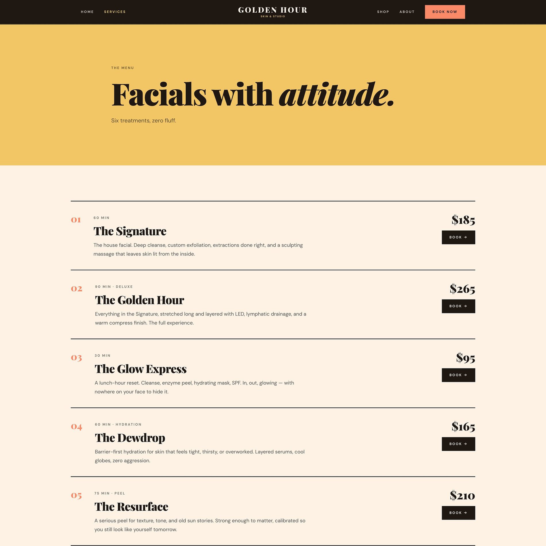
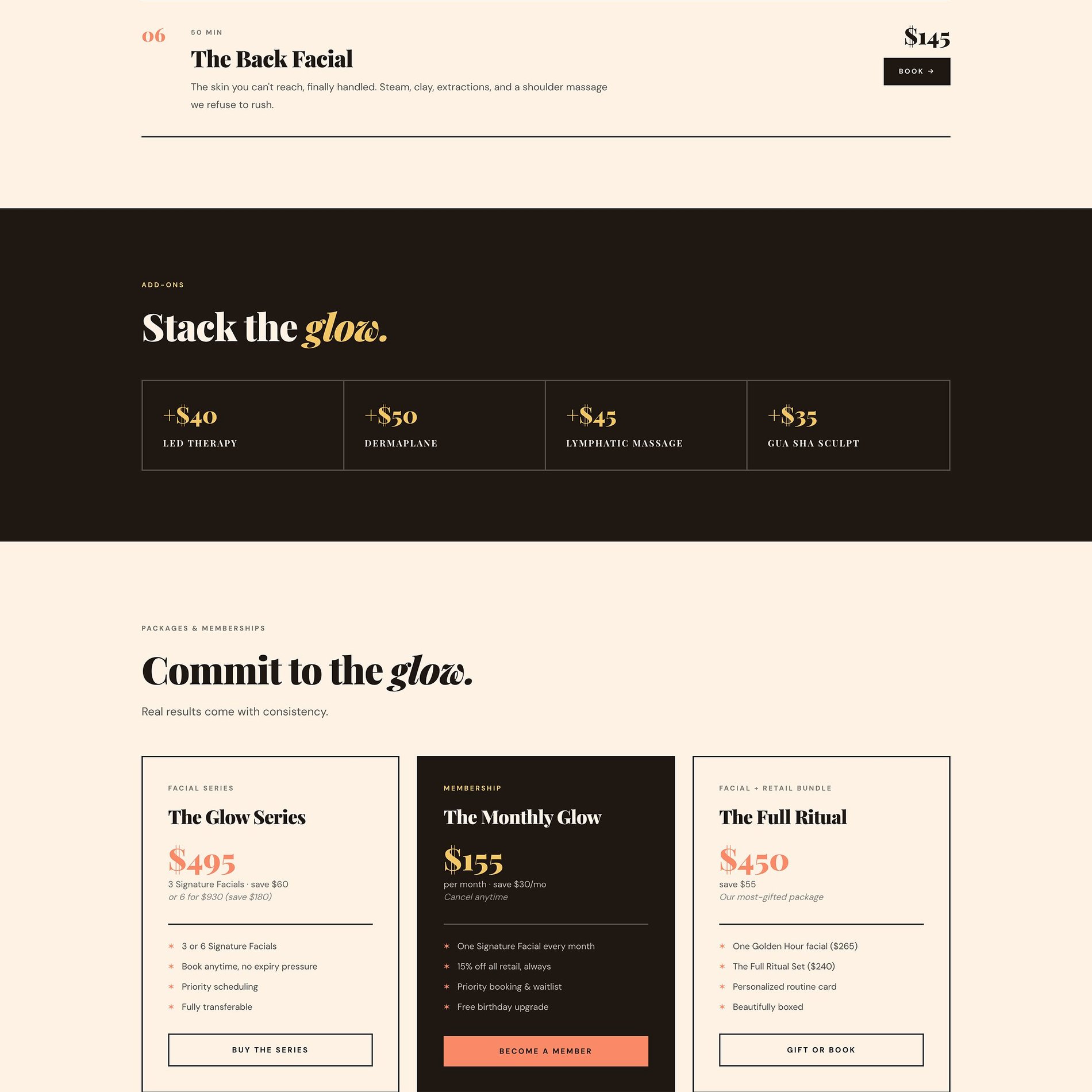
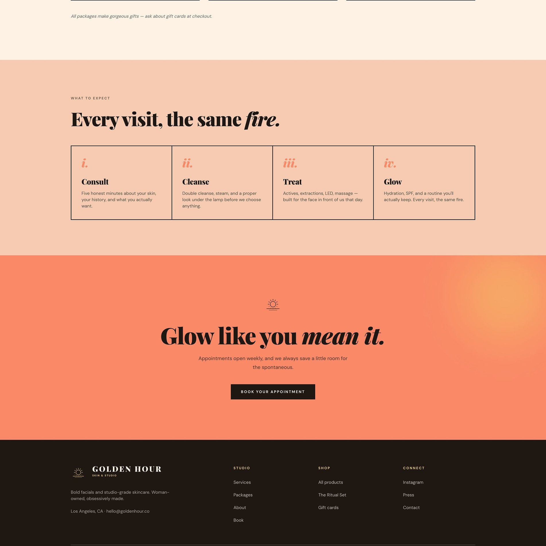

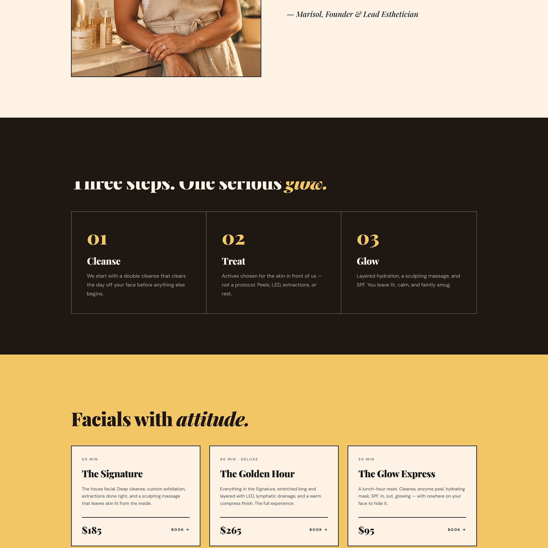
A menu with a point of view
'Facials with attitude' — six treatments, priced and described with the same confident voice.
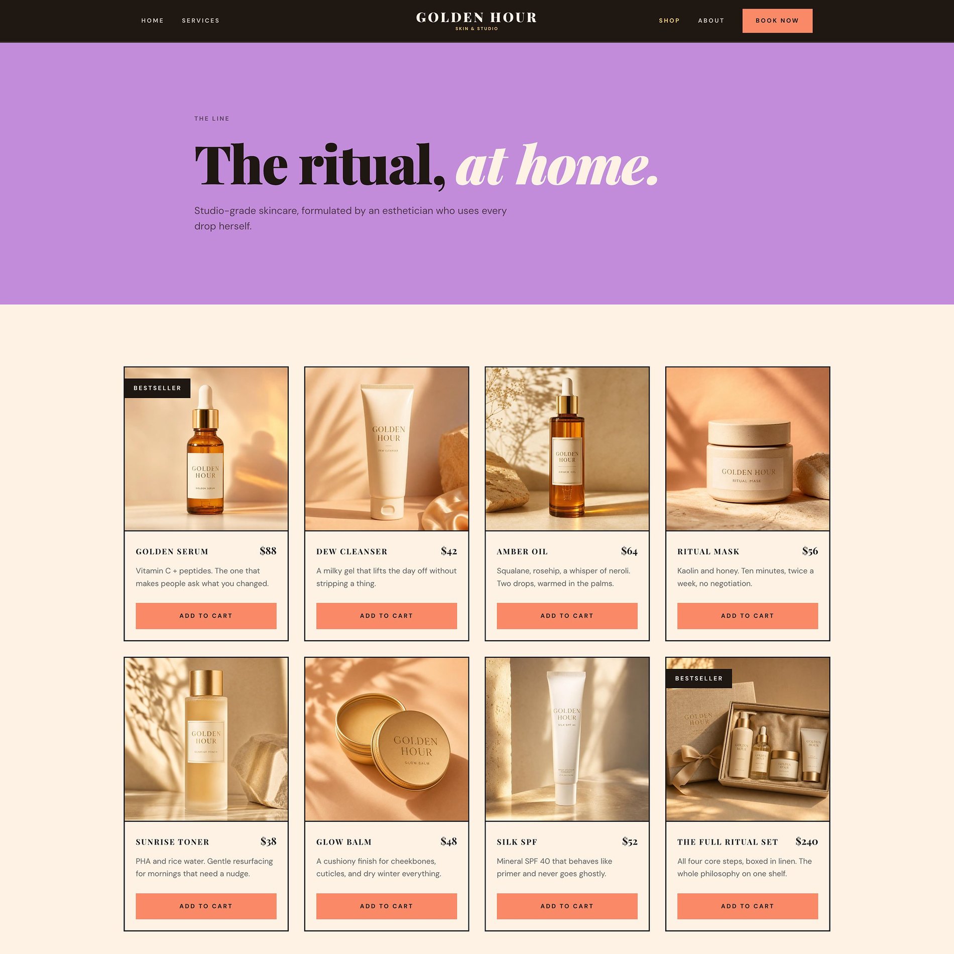
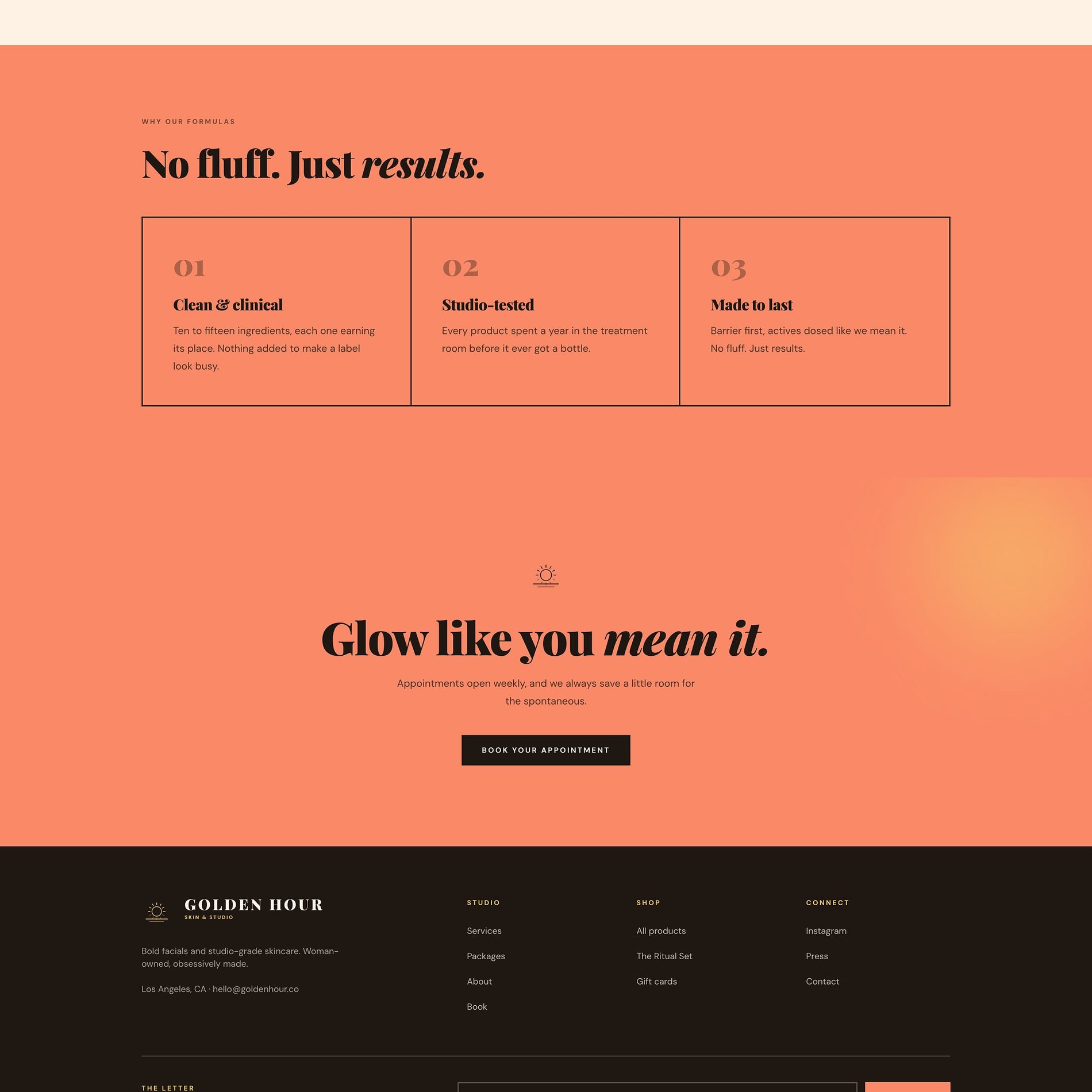

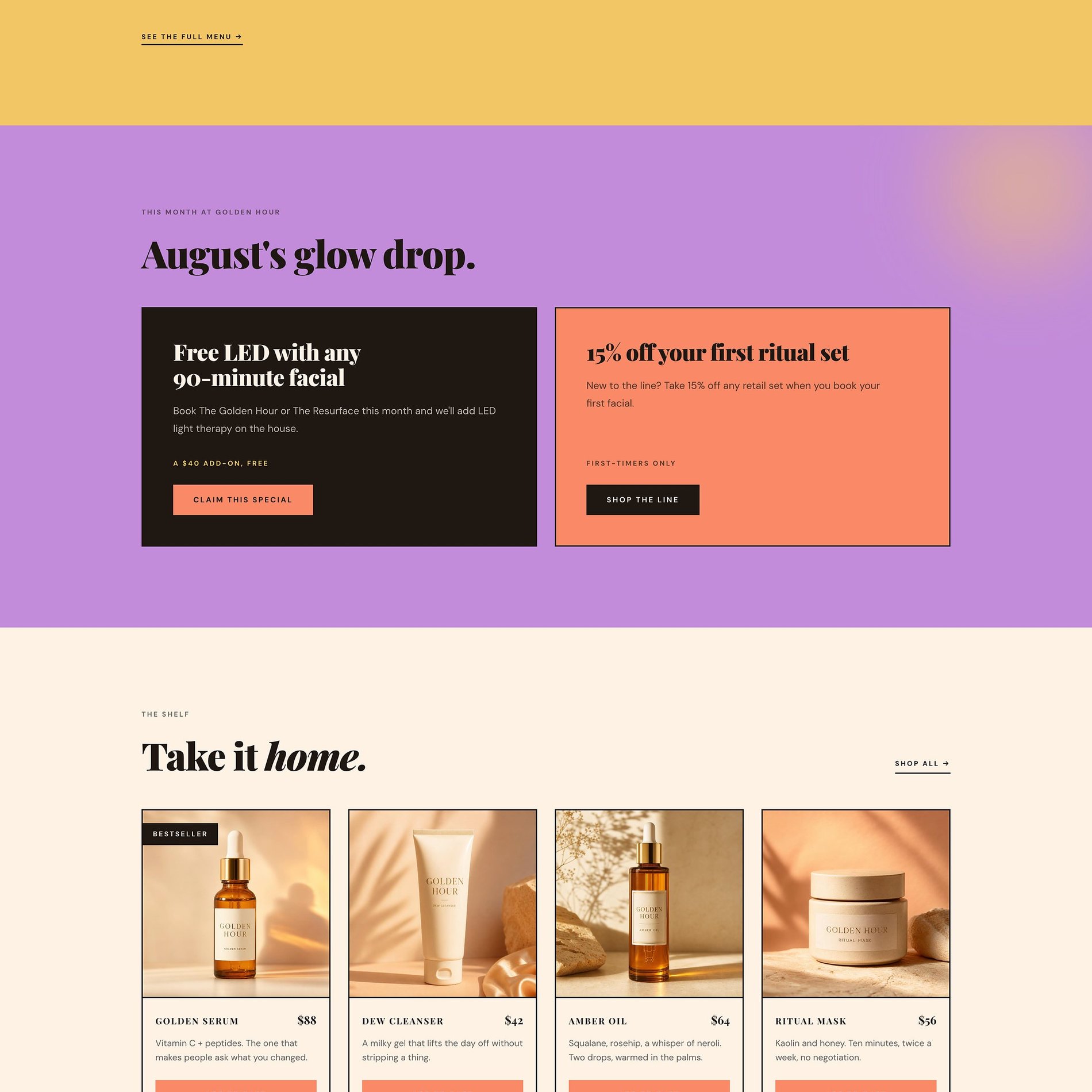
A shop that feels like the studio
The eight-piece line, shot in golden-hour light and laid out so the products read as one considered brand.
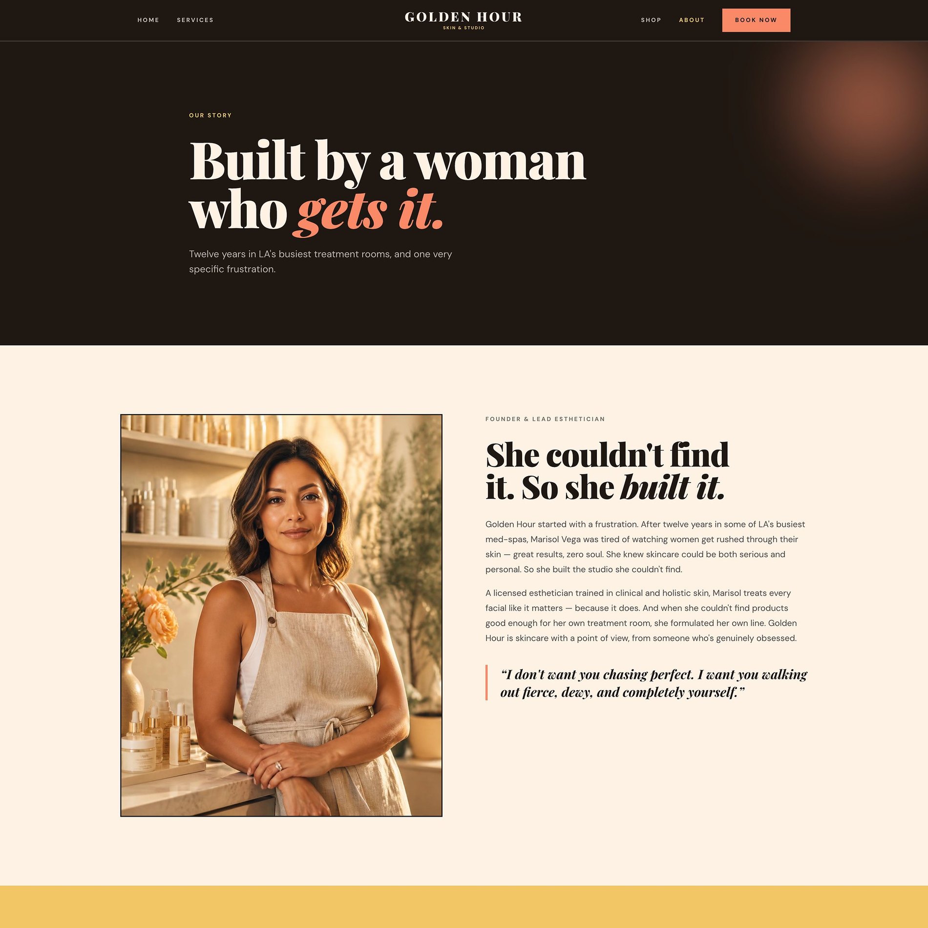
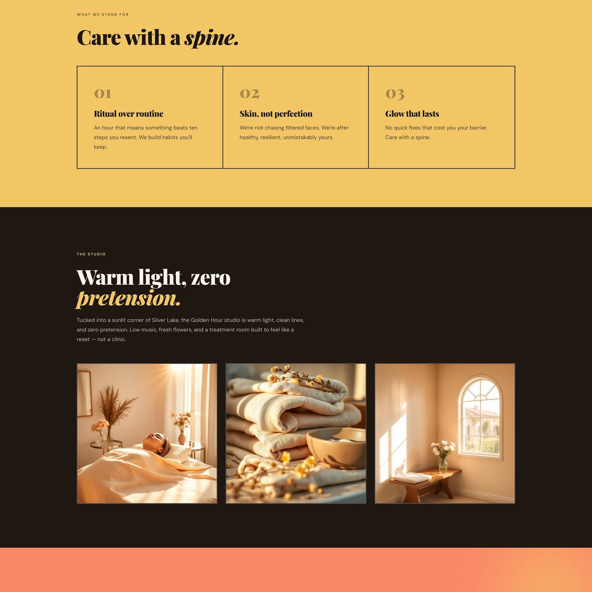
Built by a woman who gets it
The founder story leads with a frustration, not a résumé — the emotional core that makes clients trust the room.
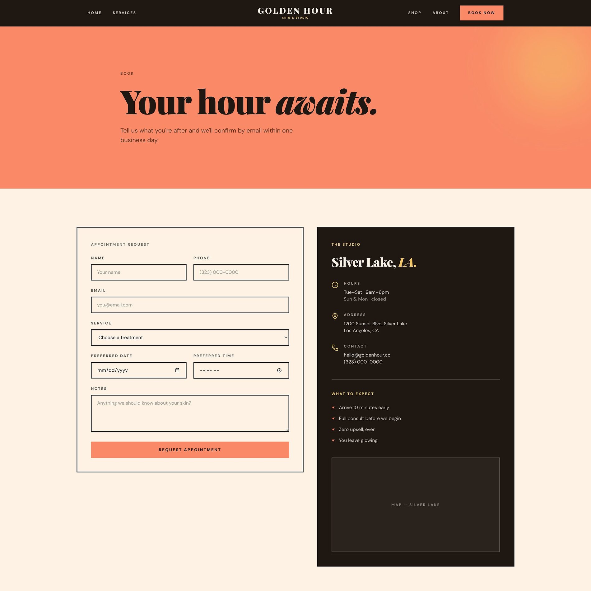
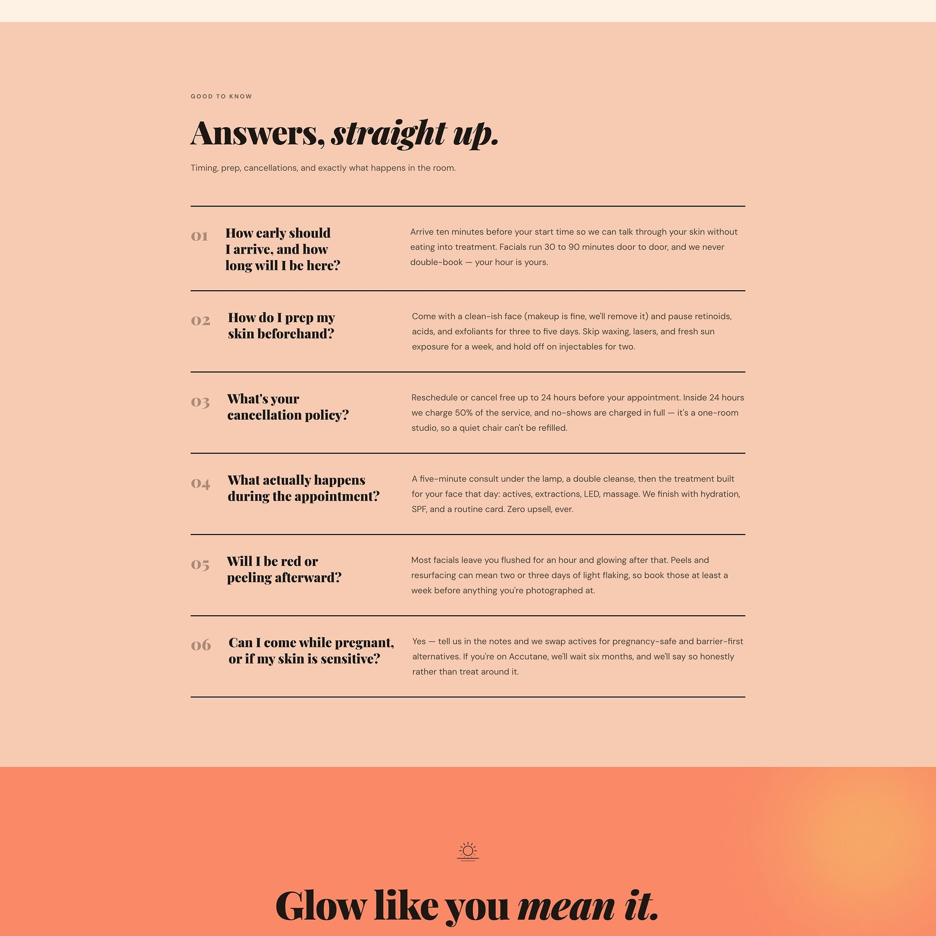
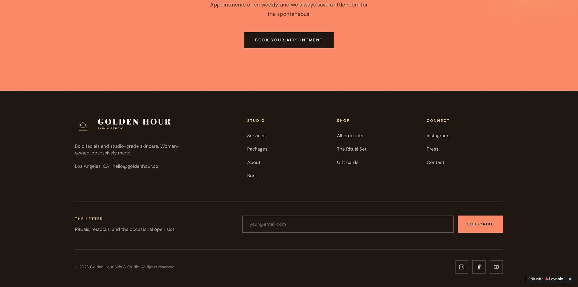
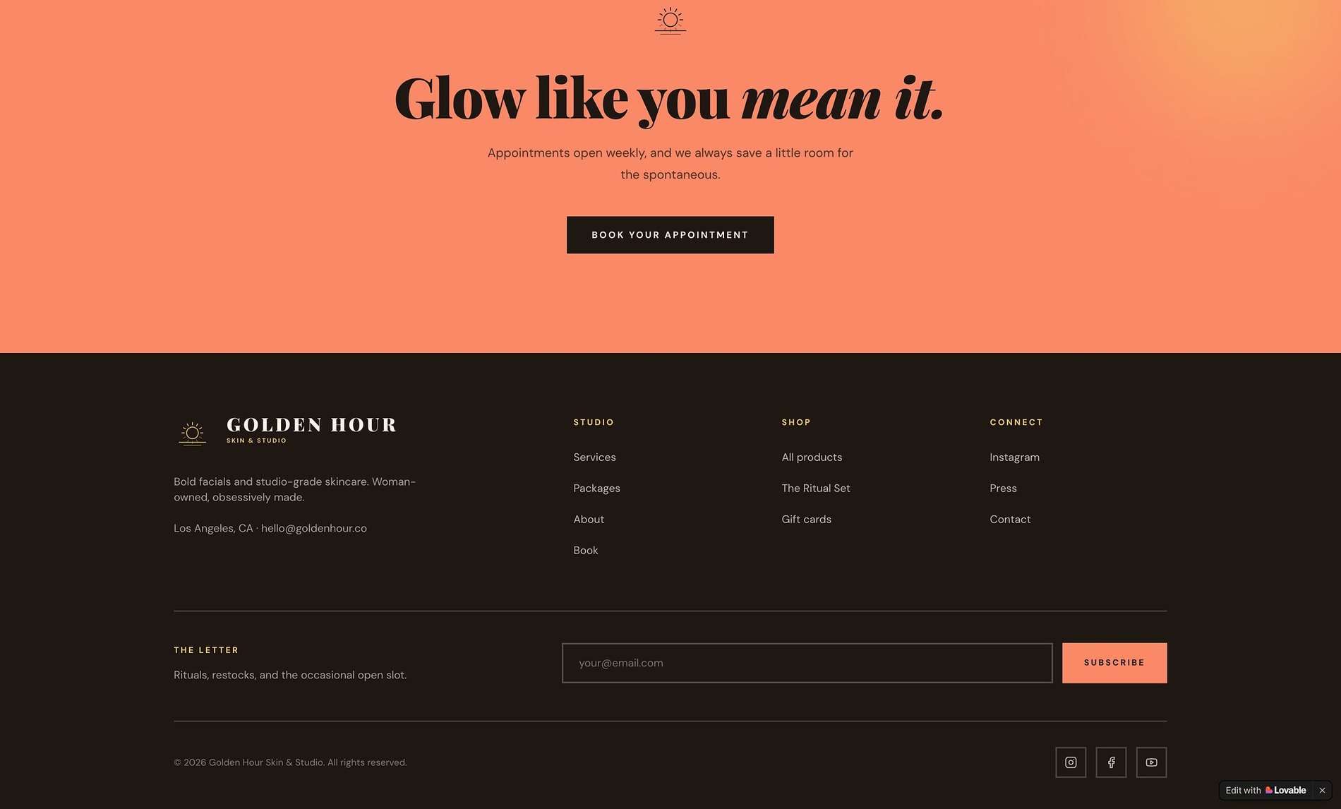
One warm next step
Booking kept simple and unintimidating — request a time, tell them about your skin, done. Zero upsell.
Before & After
What changed.
Before
- — Product-first layouts with no story or point of view
- — Palette and type that read generic in a crowded beauty aisle
- — No consistent system across pages or product sections
- — Nothing that justified a premium price on sight
After
- — A warm, golden editorial identity with a clear brand idea
- — Type and colour chosen against the category, not a trend
- — A reusable page system for products, story, and ritual
- — Design that signals price point before a word is read
The Process
How this site was made.
Strategy & positioning
We start with the audience a skincare brand is actually trying to reach — what they're afraid of, what they're comparing, and what would make them book.
Identity direction
Colour, type, and tone are chosen against the category, not from a moodboard. Every decision has a reason you can repeat out loud.
Page-by-page design
Each page is designed for one job — reassure, explain, or convert — then built responsive from the smallest screen up.
Build, launch & handover
Copy, imagery, and SEO basics ship together, with a walkthrough so the team can keep the site current after launch.
Project Outcomes
What was delivered.
Identity + Website
Scope
Custom, rationale-led
Palette
Editorial pairing
Type system
Mobile-first
Responsive
Services
Signature Website
Editorial, product-led sites for beauty and skincare brands.
View services & pricing →Start a project
Want something like this for your skincare & beauty brand?
Tell me where the brand is now and what it needs to become. I reply to every inquiry personally.
Start an inquiry →