Case Study — Mindful Movements
Website Design for Wellness & Mobility Brands
Move stronger. Move pain-free.
Wellness and mobility practitioners are trusted for how they make people feel. This case study shows how a calm, human brand system and clearly structured programs turn a practice's website into its most reliable referral.
Client
Alina Ebkarian, St. Charles, IL
Deliverables
Visual Identity, 7-Page Website
Industry
Wellness
Year
2026
Concept mockup — a design study, not a live website.
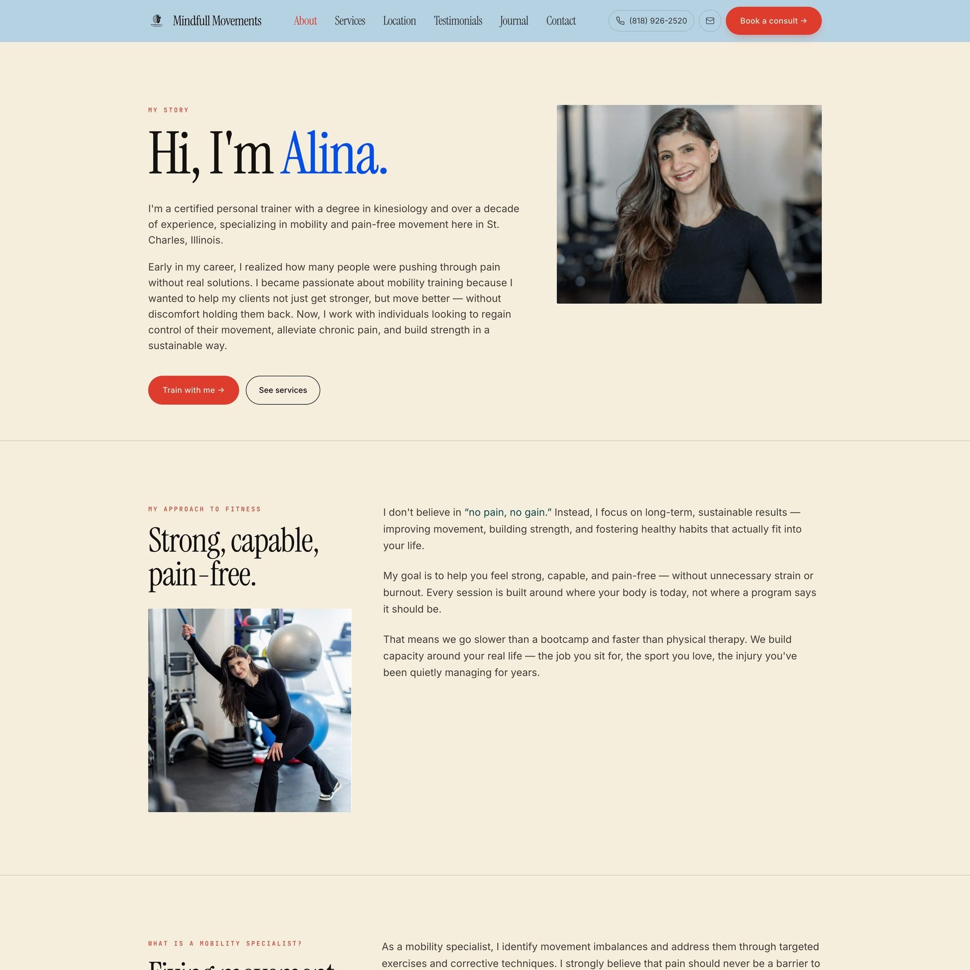
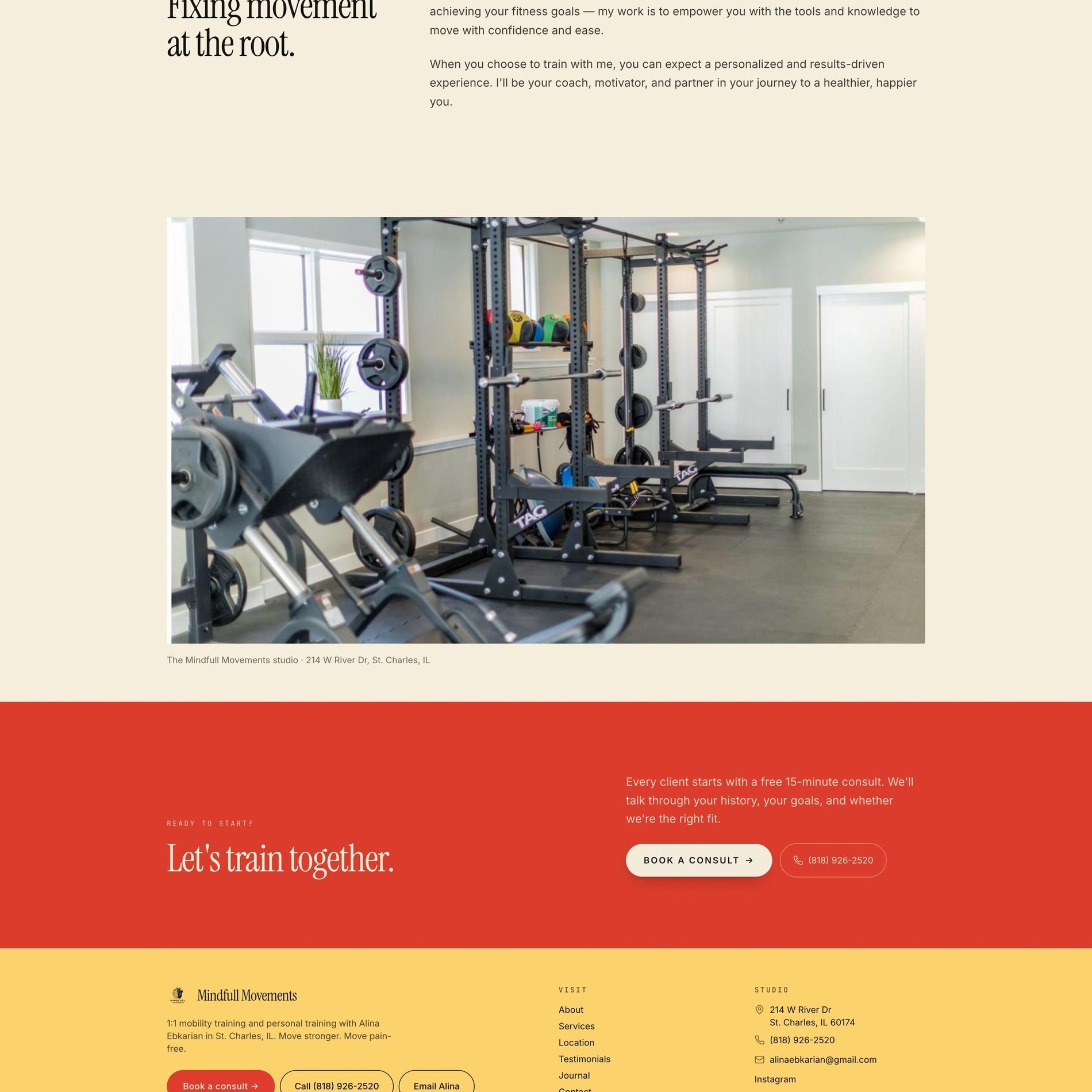

↓ Scroll inside the frame to explore · switch pages above
The Vision
What the brand needed to become.
Alina is a certified trainer with a kinesiology degree and a decade of hands-on experience — but her old presence read like every other gym in town. The work she does is quiet, precise, and deeply personal: one client at a time, rebuilding movement without pushing through pain. The brand needed to say that before a single word was read.
Mobility training lives in an awkward gap — too clinical to feel like a gym, too active to feel like physical therapy. The vision was to own that middle: a space that feels human and warm, yet unmistakably credible and expert. Editorial, not corporate. Calm, not sterile.
Not the loudest trainer in the room — the one you trust with the injury you've been quietly managing for years.
The Work
What we made.
A complete visual identity and a seven-page website — built to convert a curious visitor into a booked consult, while making a solo practitioner look like an established studio.
Visual Identity
Logo system, editorial type pairing, and a warm-but-credible color language applied across every touchpoint.
Seven-Page Website
Home, About, Services, Location, Testimonials, Journal, and a frictionless Booking flow — fully responsive.
Proof & Trust System
Real 5-star reviews woven in as social proof, plus a Journal that positions Alina as the expert voice.
Conversion Flow
Every page routes to one clear next step — a low-pressure 15-minute consult, not a hard sell.
The Palette
Color, with a reason.
People arrive already knowing two aesthetics — the sterile clinic and the loud gym — and Mindful Movements is neither. So the palette pairs a soft, sun-warmed cream with a grounded ink for editorial credibility, then uses colour with intent: a signal red that owns every 'book' moment, and calm supporting tones borrowed from recovery and daylight.
Warm Cream
#F3ECDC
The base. Approachable and human — the opposite of a clinic's cold white.
Ink
#1F2225
Editorial grounding. Carries the serif headlines and lends quiet authority.
Signal Red
#DE3D2D
Reserved for action — every 'book a consult' moment, and nothing else.
Butter
#FAD16A
Energy and optimism. The warmth of movement, without shouting.
Powder Blue
#B4CFDF
Calm and recovery. Signals care and safety for clients managing pain.
Electric Blue
#004FE9
The pain-free promise — a jolt of confidence on the words that matter.
Type
The voice, set in metal.
Mobility · Personal Training
Move pain-free.
- Fraunces — a high-contrast serif.
- Space Mono — clinical precision on the labels.
- A clean humanist sans keeps long-form readable.
Selected Screens
A few pages.
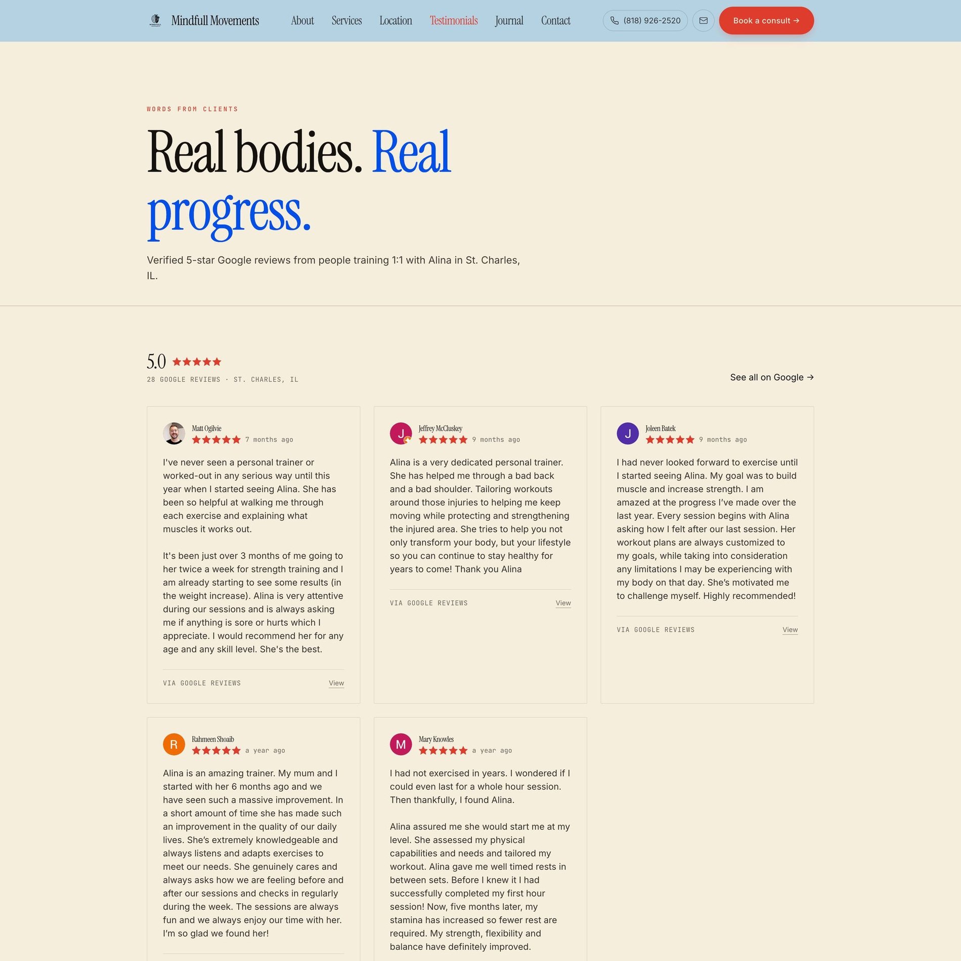
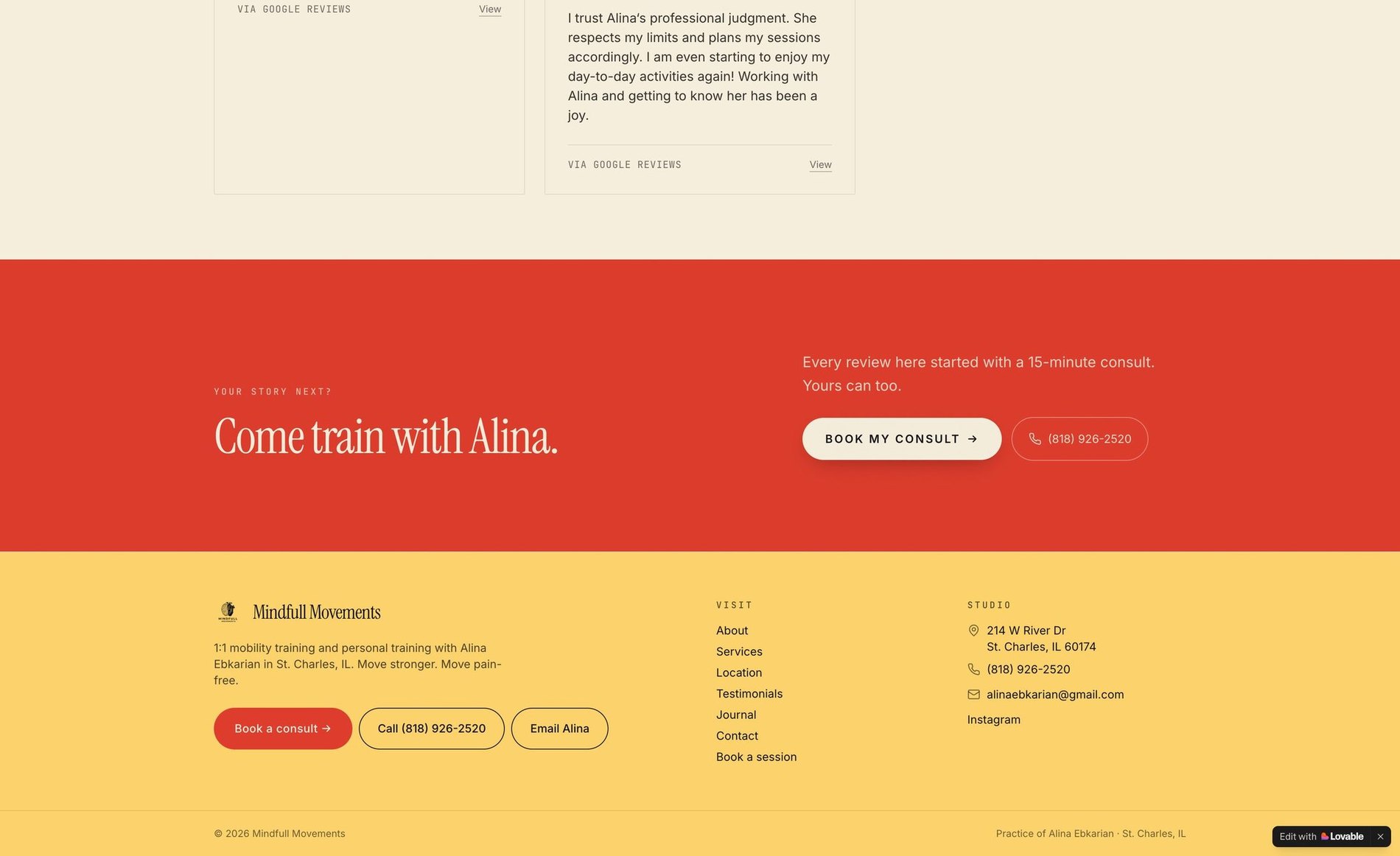
Proof, up front
Real five-star reviews pulled in as social proof — credibility that reads as effortless.
The expert voice
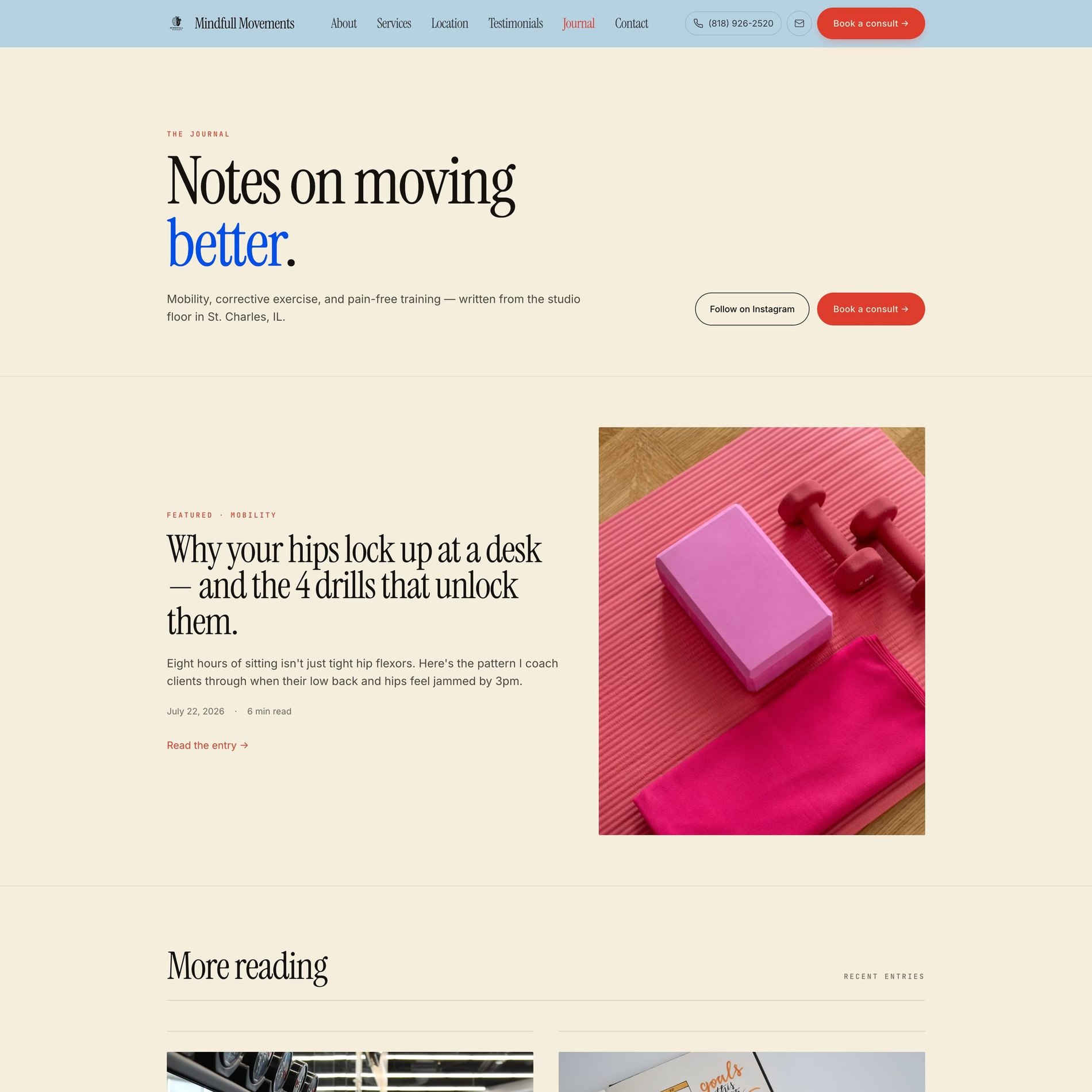
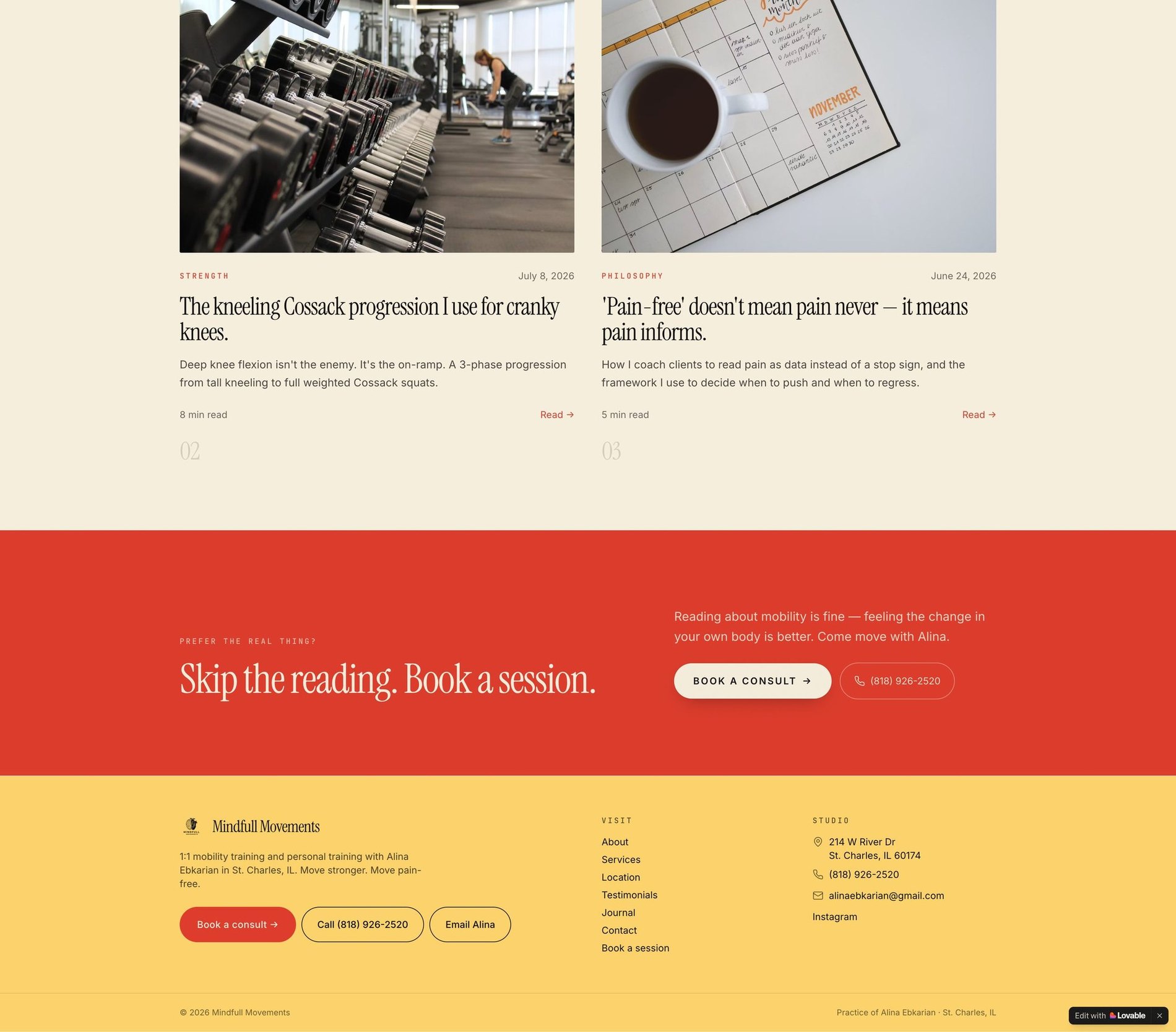
A Journal that turns a trainer into an authority — editorial layout, real teaching.
A real place
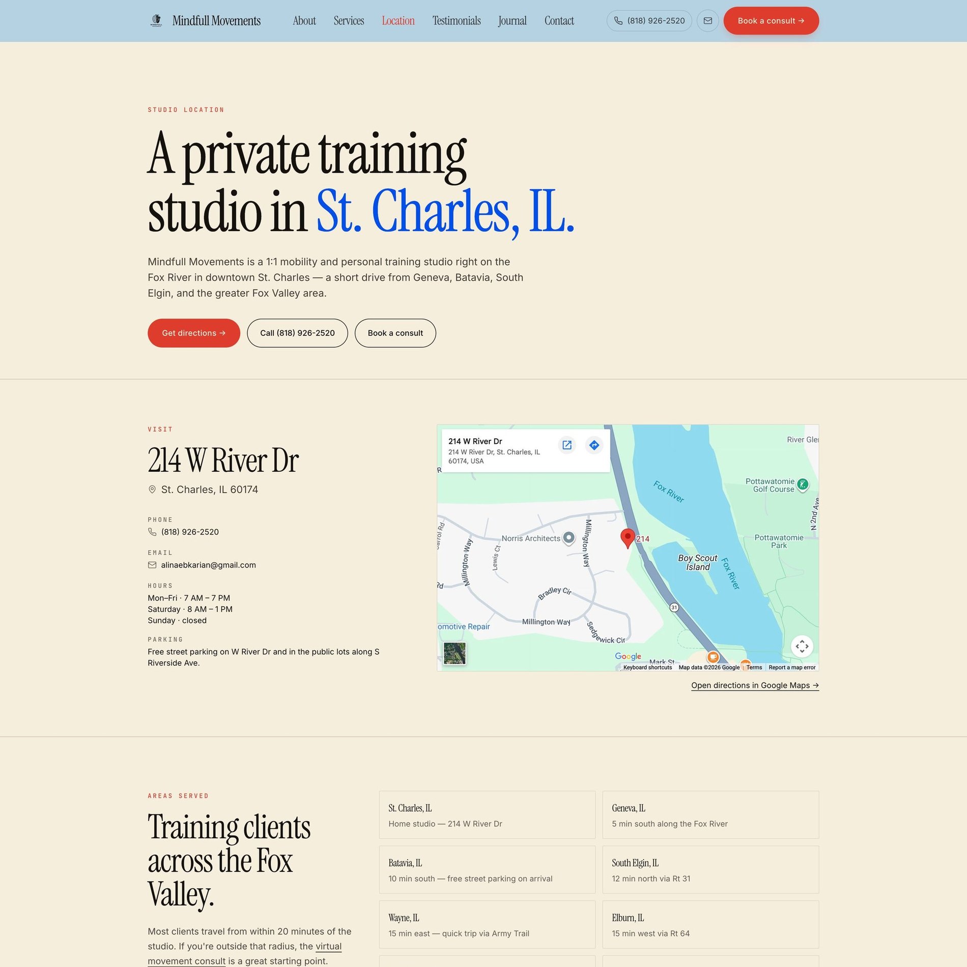
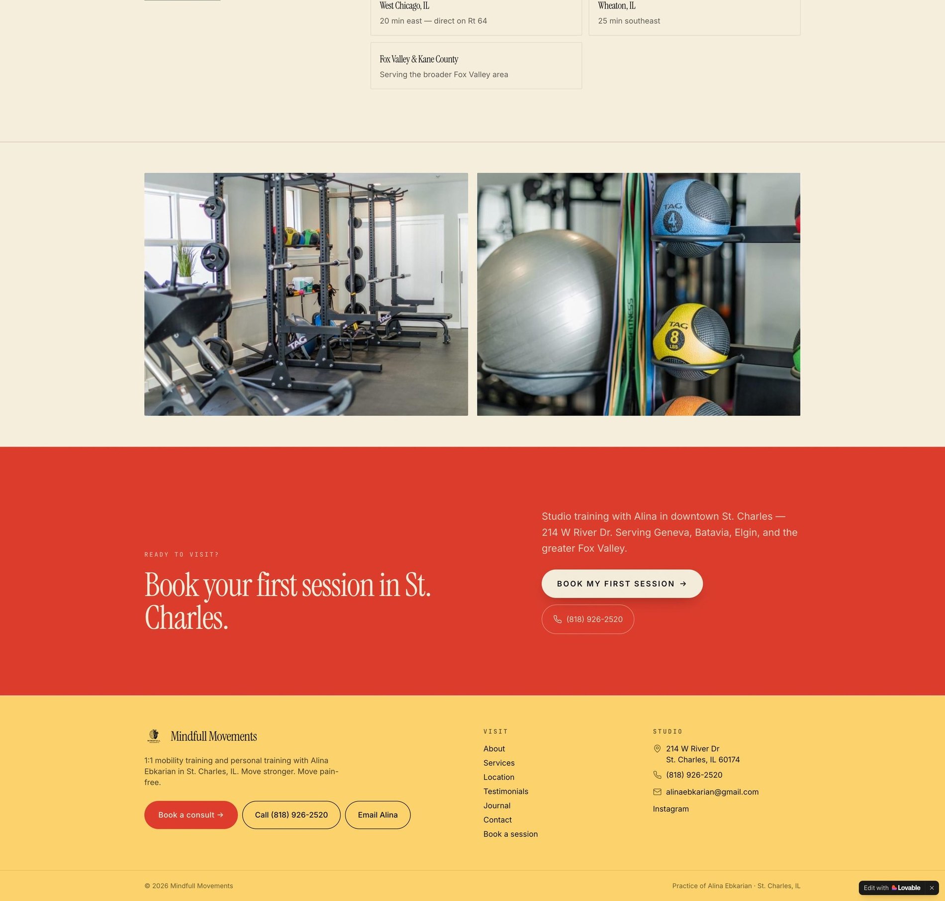
Studio, map, and service area — grounding the practice in St. Charles.
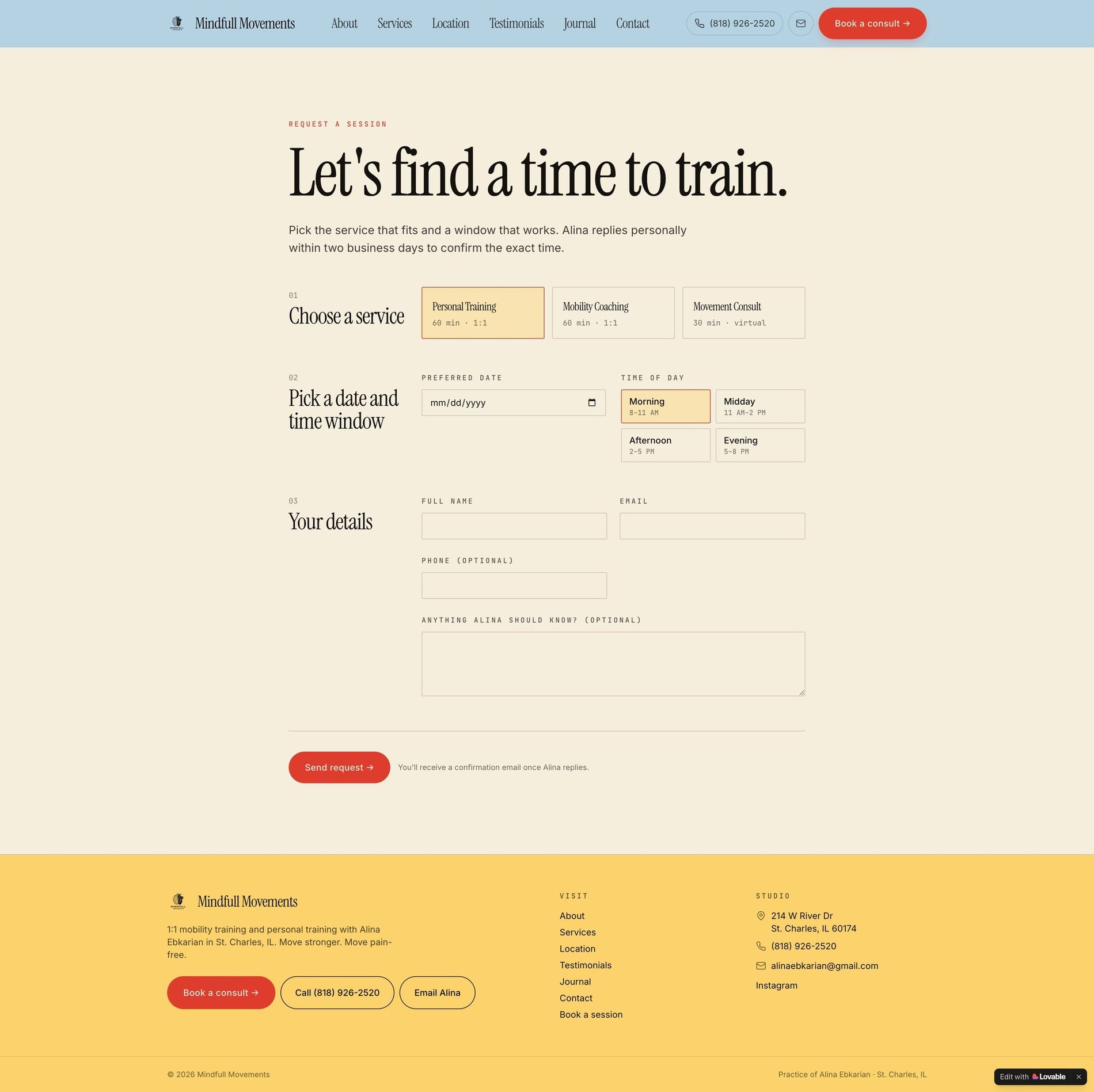
One clear next step
A calm, guided booking flow — choose a service, pick a window, done.
Before & After
What changed.
Before
- — Generic wellness stock imagery and soft, forgettable design
- — Programs and sessions described in vague language
- — No structure for someone deciding where to start
- — Nothing to distinguish the practitioner from the category
After
- — A calm, human identity specific to this practitioner
- — Programs and sessions written in plain, concrete terms
- — A clear starting point for each type of visitor
- — A brand that carries the practitioner's actual voice
The Process
How this site was made.
Strategy & positioning
We start with the audience a wellness practice is actually trying to reach — what they're afraid of, what they're comparing, and what would make them book.
Identity direction
Colour, type, and tone are chosen against the category, not from a moodboard. Every decision has a reason you can repeat out loud.
Page-by-page design
Each page is designed for one job — reassure, explain, or convert — then built responsive from the smallest screen up.
Build, launch & handover
Copy, imagery, and SEO basics ship together, with a walkthrough so the team can keep the site current after launch.
Project Outcomes
What was delivered.
Identity + Website
Scope
Programs & sessions
Focus
Calm, human
Tone
Mobile-first
Responsive
Services
Studio Website
Program-led sites for wellness practitioners and coaches.
View services & pricing →Start a project
Want something like this for your wellness & mobility brand?
Tell me where the brand is now and what it needs to become. I reply to every inquiry personally.
Start an inquiry →