Case Study — Reign Recovery
Website Design for Recovery Center Brands
From broken paths to crowned lives.
Recovery centers are judged in seconds by families in crisis. This case study shows how a rehabilitation brand can look clinically credible and genuinely hopeful at the same time — identity, nine pages, and an admissions flow designed for the hardest phone call of someone's life.
Client
Reign Recovery, Los Angeles, CA
Deliverables
Visual Identity, 9-Page Website
Year
2026
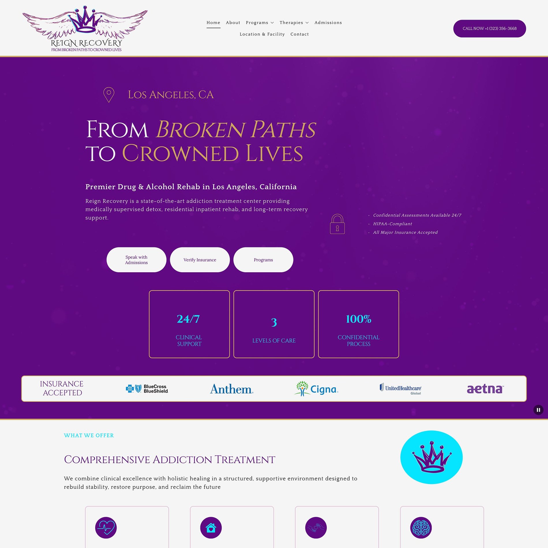
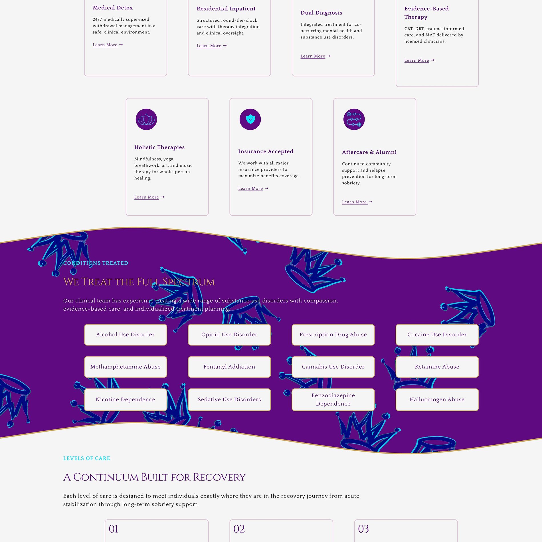
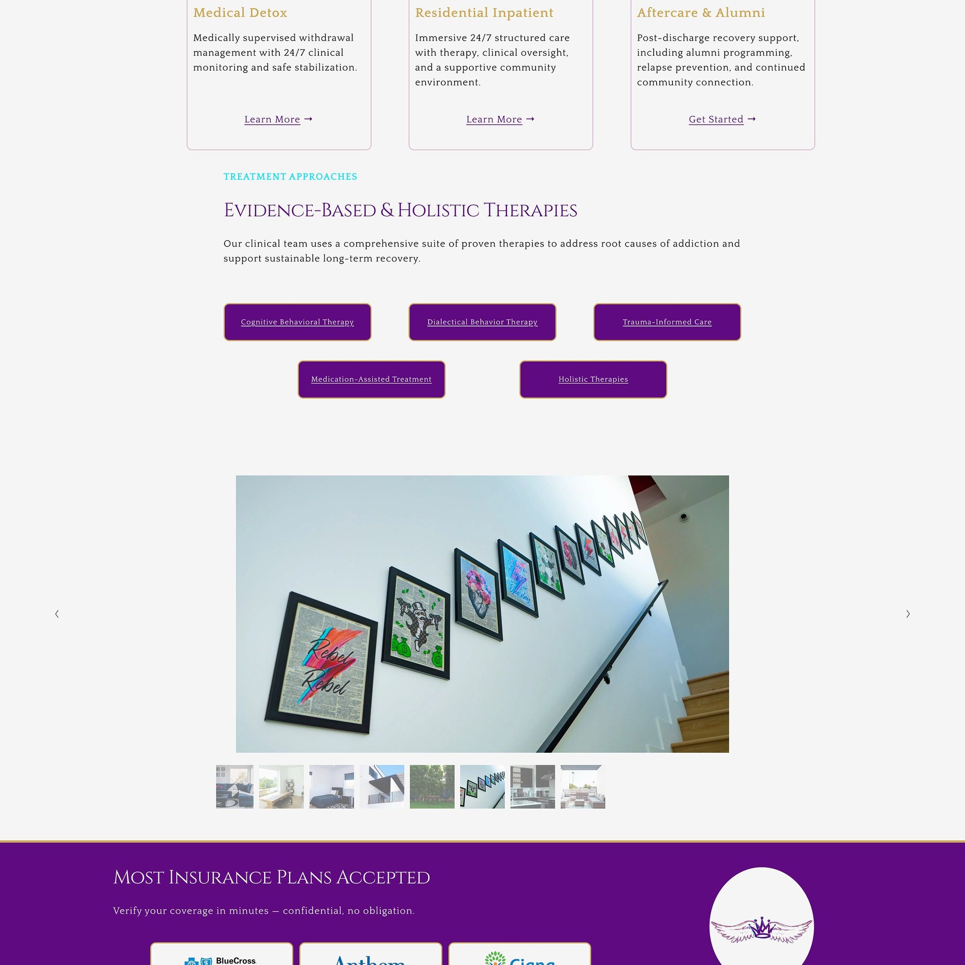
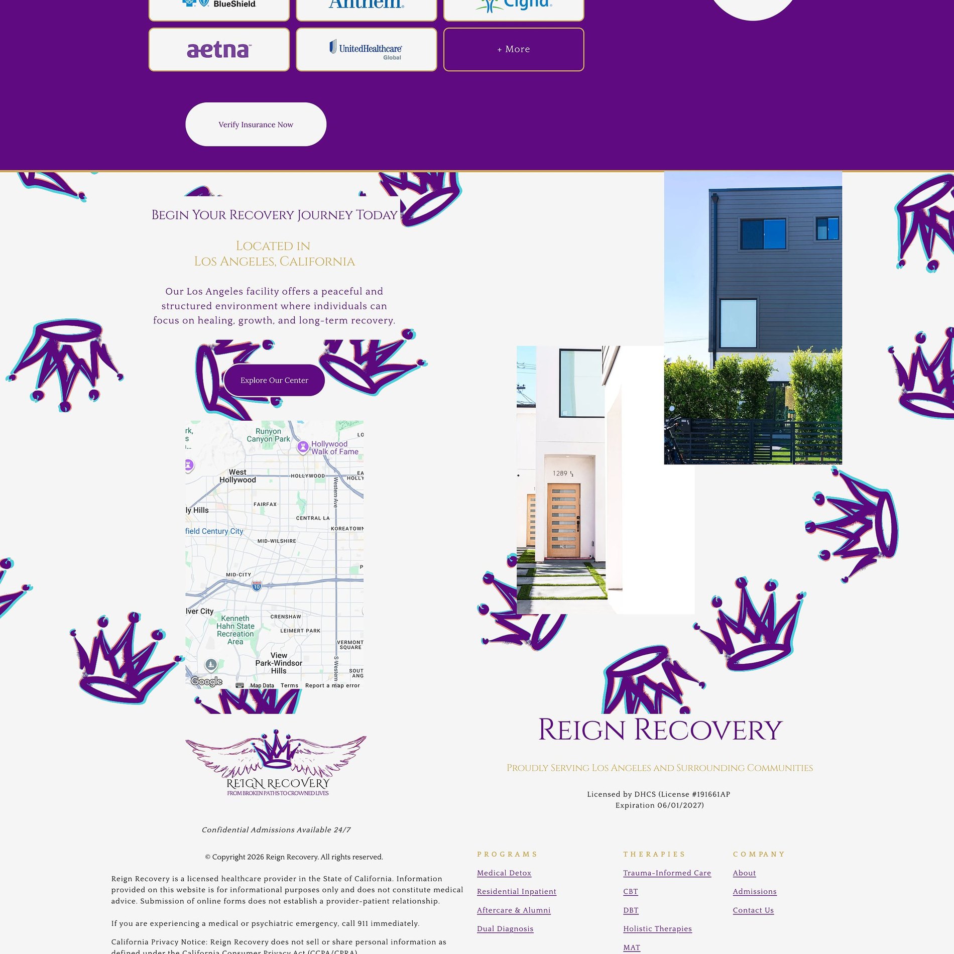

↓ Scroll inside the frame to explore · switch pages above
The Vision
What the brand needed to become.
Reign Recovery is a premier drug & alcohol rehabilitation center in Los Angeles, offering medically supervised detox, residential care, and long-term recovery. The category is crowded with clinical, fear-based, or generic branding — and the people it serves arrive at their most vulnerable. The brand had to do the opposite: restore dignity from the first glance.
The whole identity is built on a single idea in the name — reign. Recovery reframed not as a low point to survive, but as a return to worth: 'from broken paths to crowned lives.' Regal, hopeful, and warm, while still signalling the clinical credibility and insurance trust that families need to make the call.
From broken paths to crowned lives — a brand that treats every person as royalty worth reclaiming.
The Work
What we made.
A complete visual identity and a nine-page website built to inform anxious families, establish clinical trust, and make the hardest phone call a little easier to make — all while carrying a hopeful, regal tone edge to edge.
Visual Identity
The Reign crown-and-wings mark and a royal purple-and-gold system that reframes recovery as dignity and worth.
Nine-Page Website
Home, About, Programs, Admissions, Contact, and a full Therapies suite — fully responsive and trust-forward.
Programs & Therapies
Clear pathways through detox, residential, and dual diagnosis, plus dedicated pages for CBT, DBT, MAT, trauma-informed, and holistic care.
Trust & Admissions
Insurance-verification prompts, accepted-provider logos, and a low-friction admissions flow that reassures at the moment of decision.
The Palette
Color, with a reason.
Recovery branding usually reaches for sterile blues or sombre neutrals. Reign claims colour with intent. A deep royal purple anchors the whole idea — dignity, transformation, worth — lifted by a warm gold that turns 'crowned lives' from a tagline into a feeling. A trusted royal blue and soft lilac keep it credible and calm, on a light base that lets families breathe.
Royal Purple
#600C82
The anchor — dignity, transformation, and the 'reign' itself.
Crown Gold
#CEA756
Hope and worth — the gold that makes 'crowned lives' land.
Royal Blue
#0F1D88
Clinical trust and stability — the credibility families look for.
Lilac
#B79BC4
A softer purple — warmth and calm across supporting sections.
Deep Plum
#22072B
Grounding for dark sections — depth without ever feeling cold.
Soft Light
#F2F1F4
The breathing room — light, clean, and reassuring.
Type
The voice, set in metal.
Drug & Alcohol Rehab · Los Angeles
Broken paths, crowned lives.
- A stately, high-contrast serif — dignity first.
- Gold italics lift the hopeful phrases.
- Clean supporting type keeps clinical detail and insurance info easy to read under stress.
Selected Screens
A few pages.
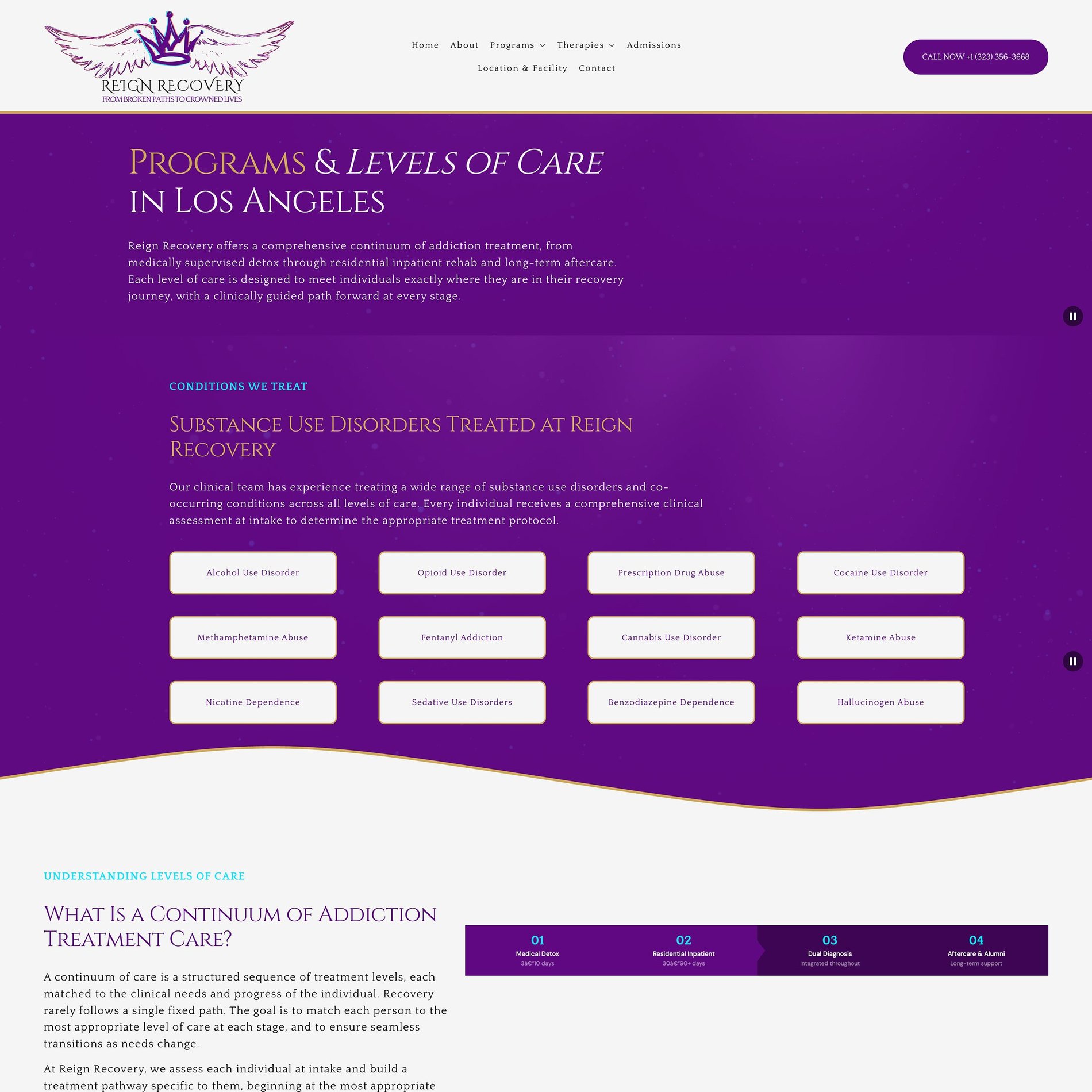
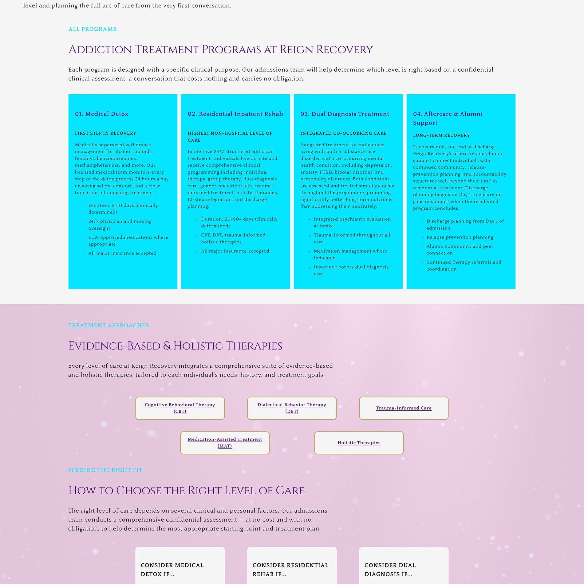
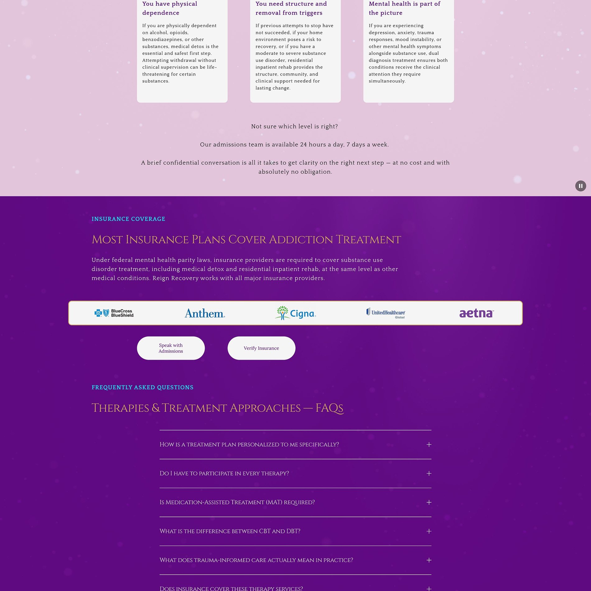
A clear path through care
'A continuum built for recovery' — detox, residential, and aftercare laid out as clear, unintimidating steps for families to follow.
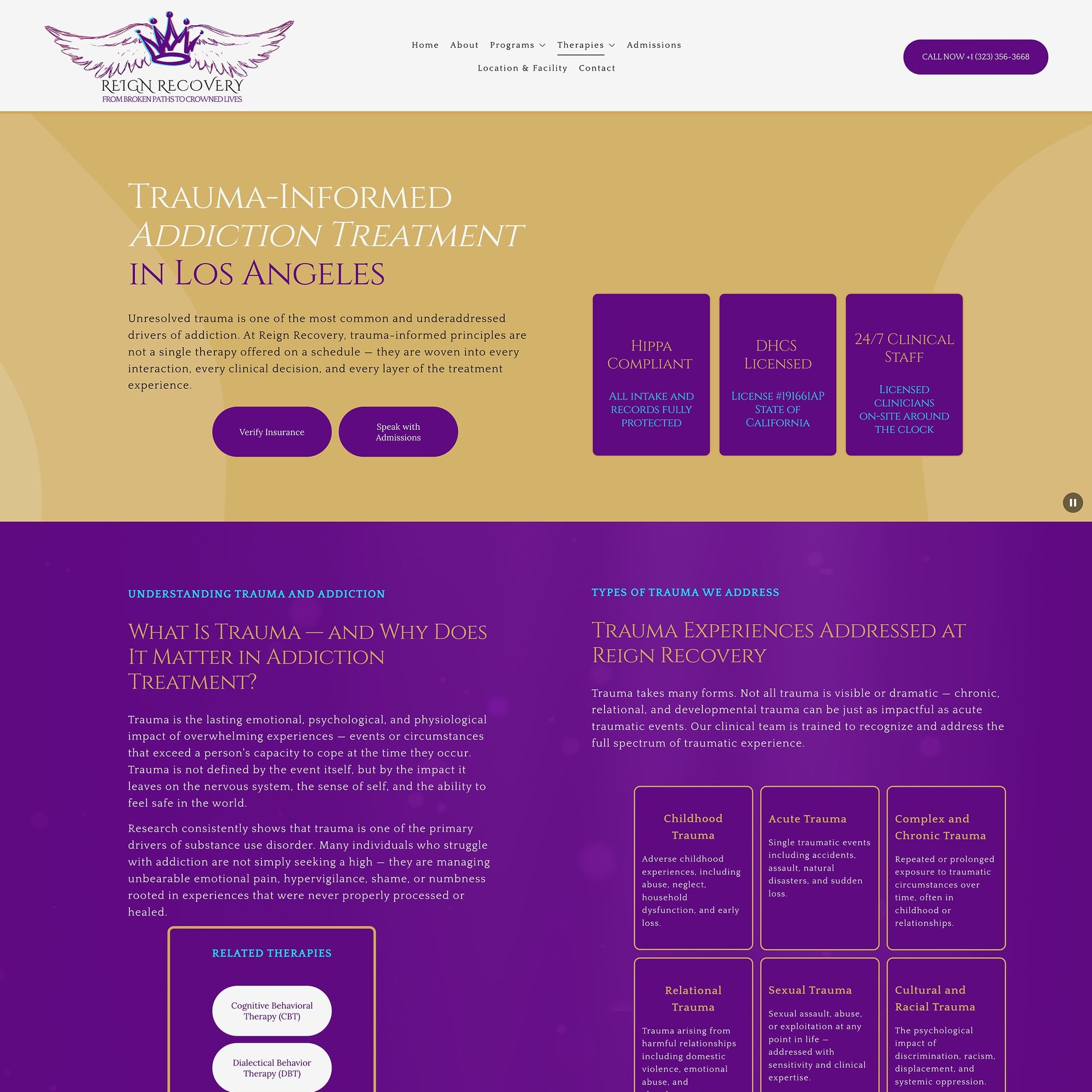
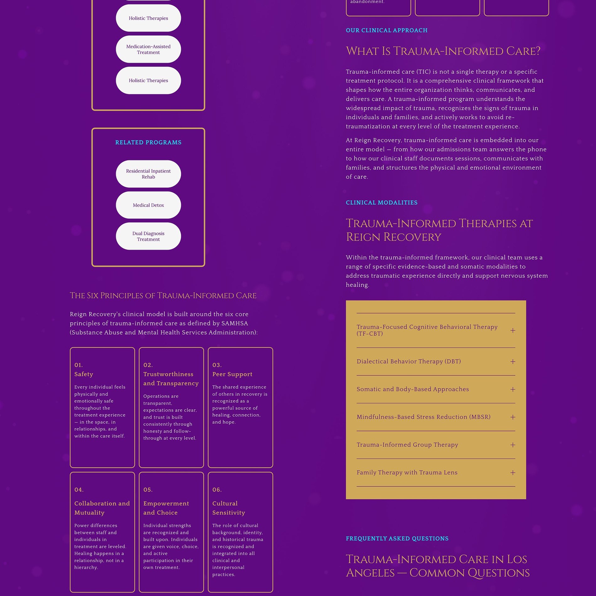
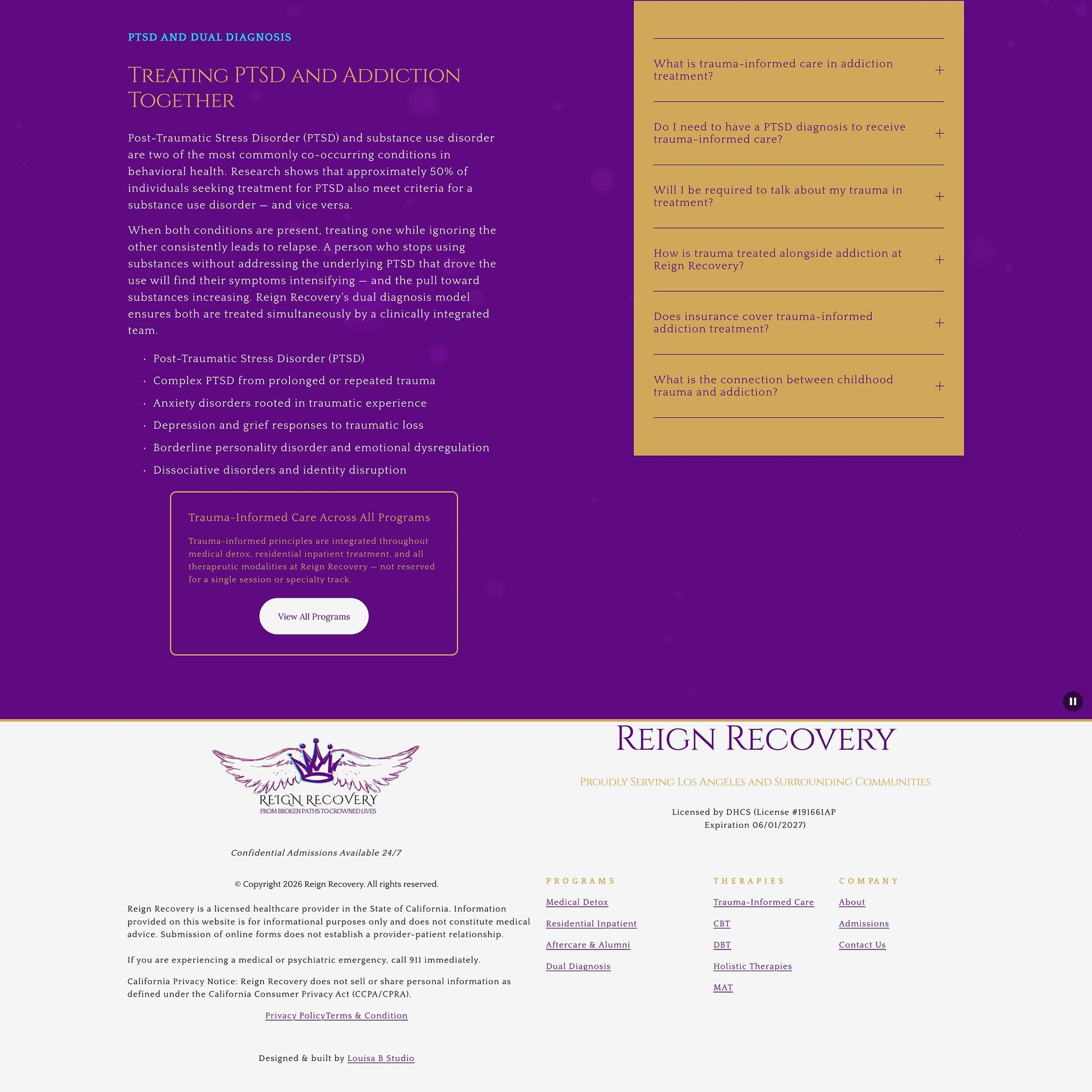

Care that meets people gently
The trauma-informed page leads with compassion — treatment that understands the whole person, not just the diagnosis.
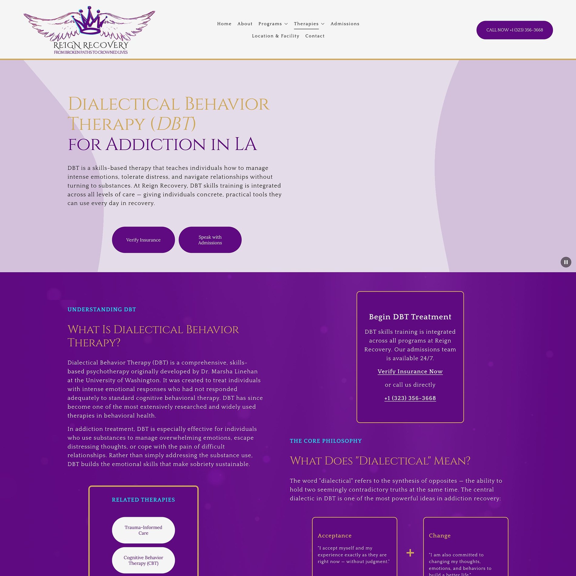
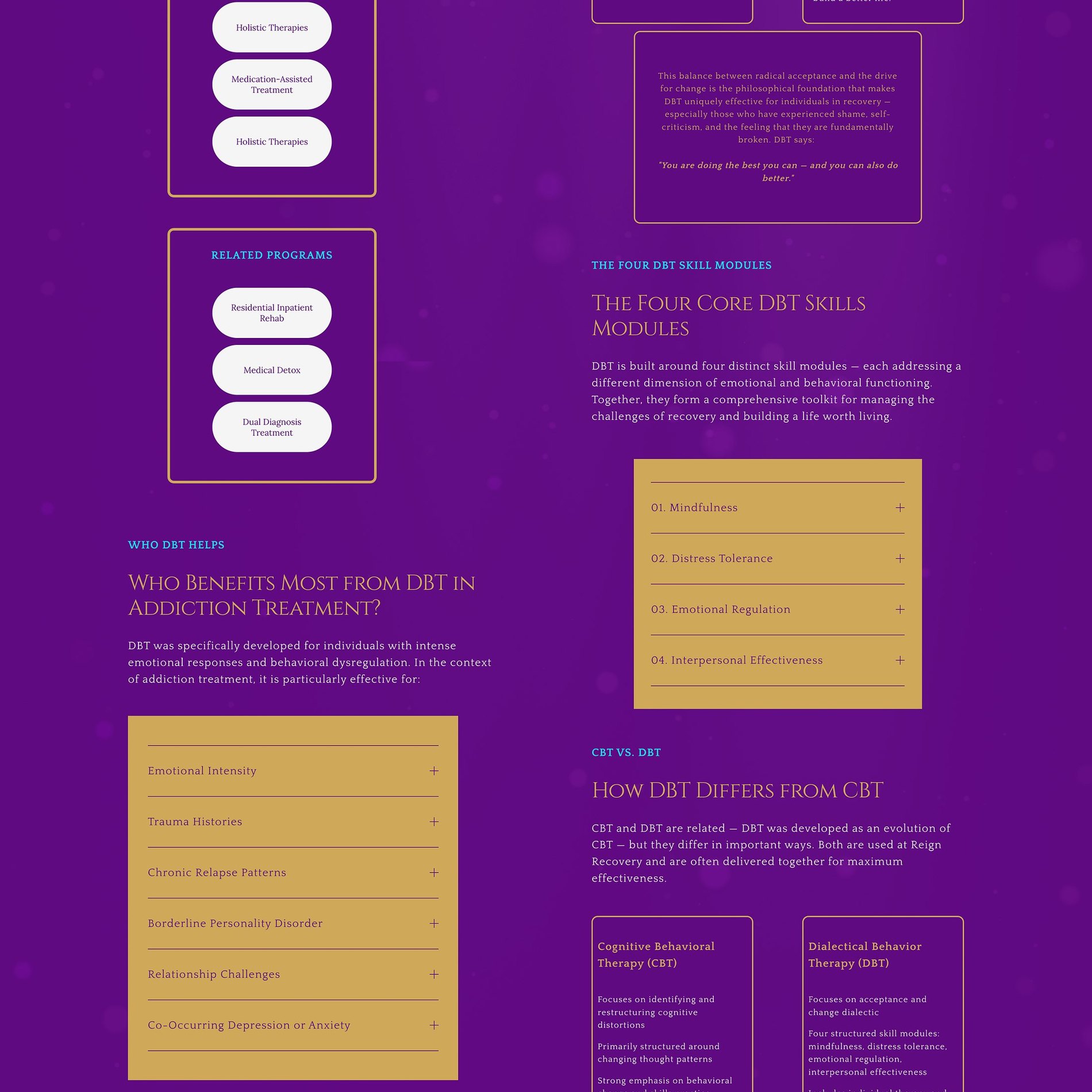
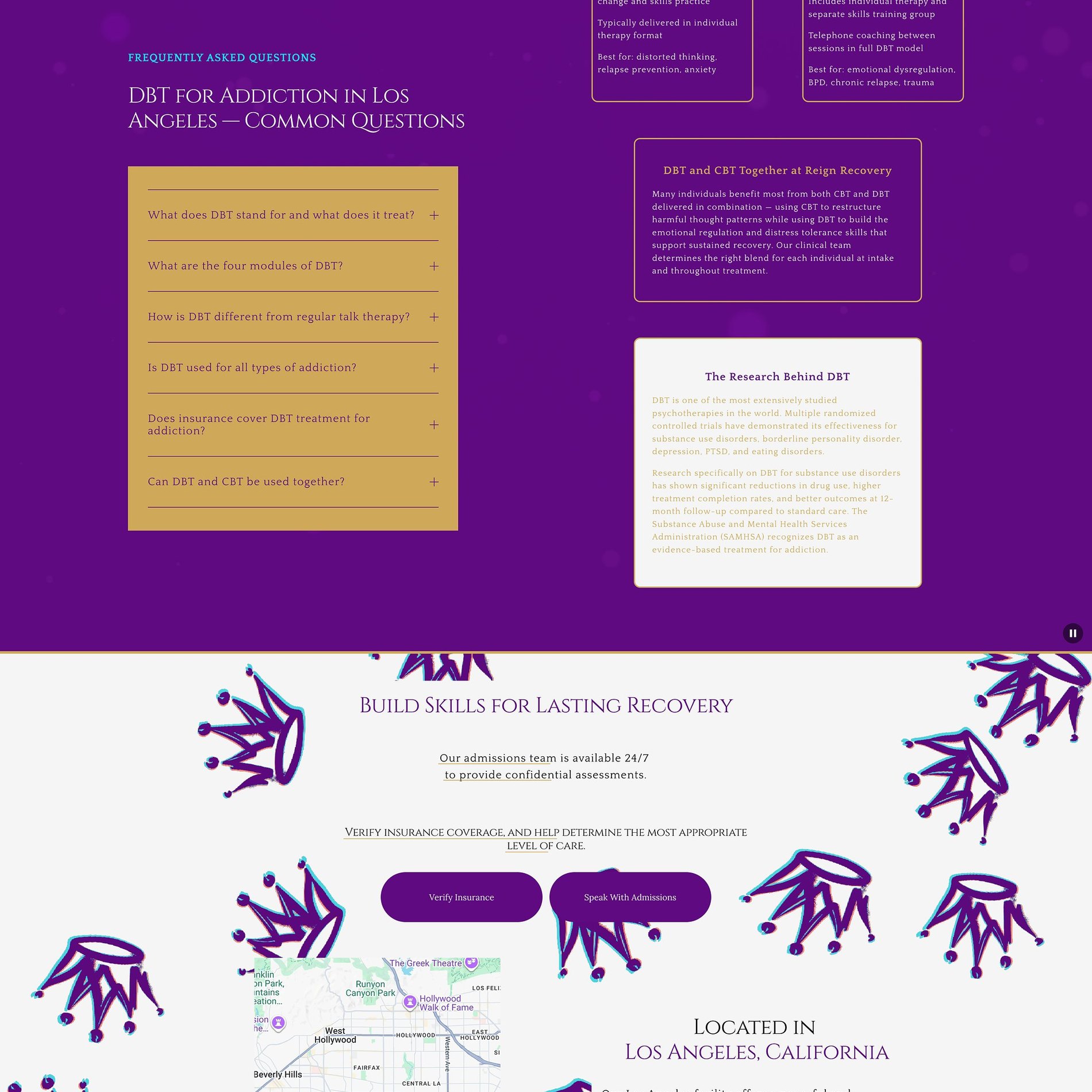
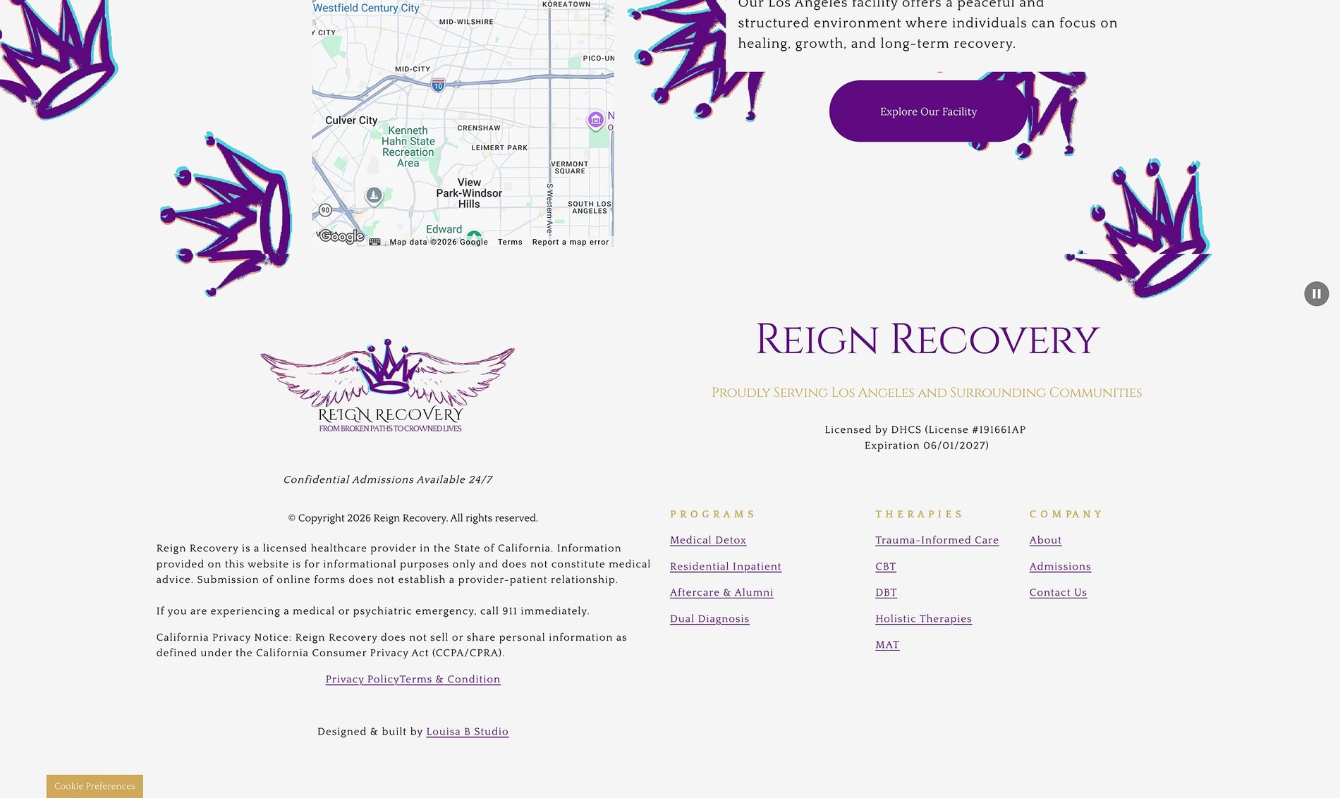
Evidence-based, clearly explained
Dedicated therapy pages — DBT, CBT, MAT — give each modality real depth, building clinical credibility without clinical coldness.
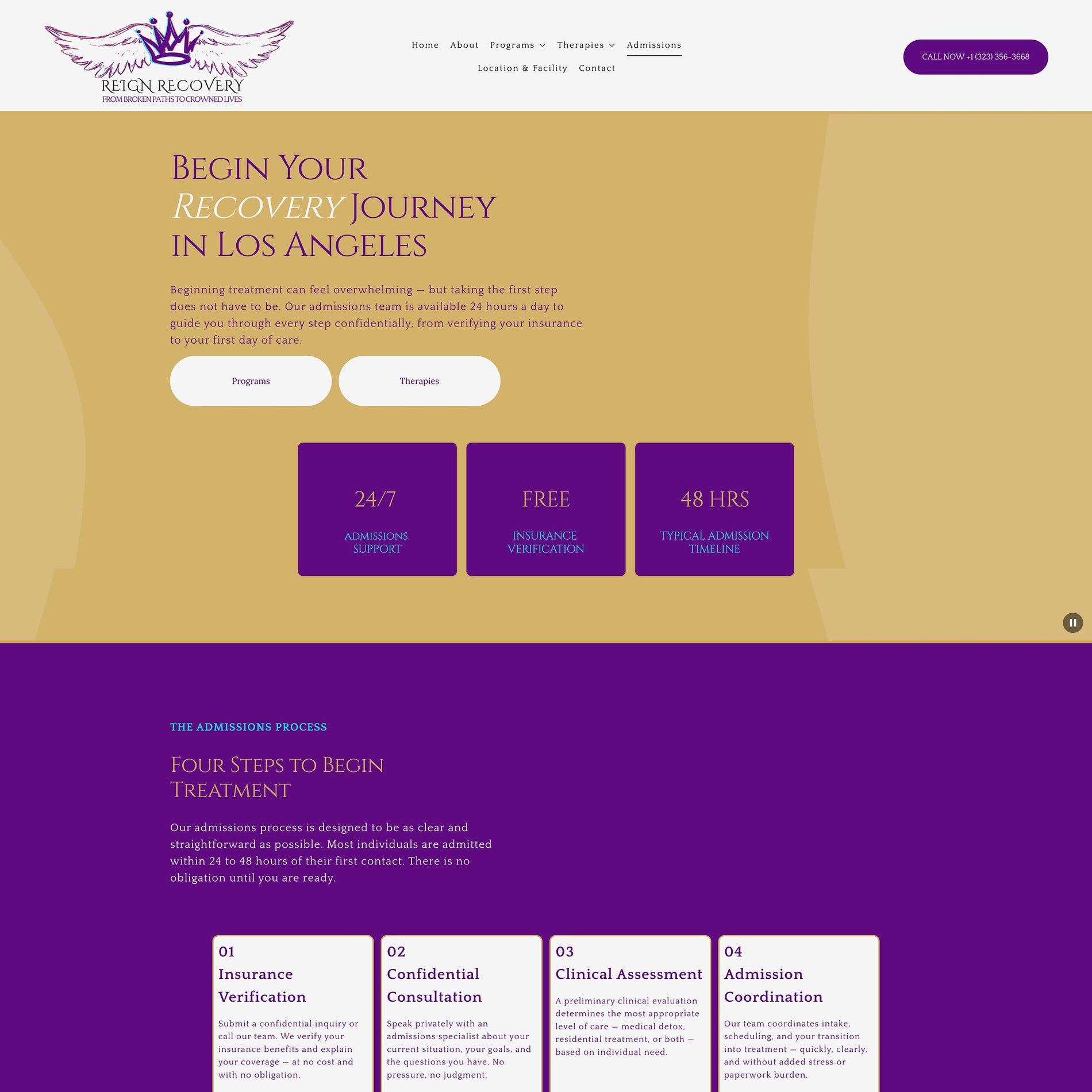
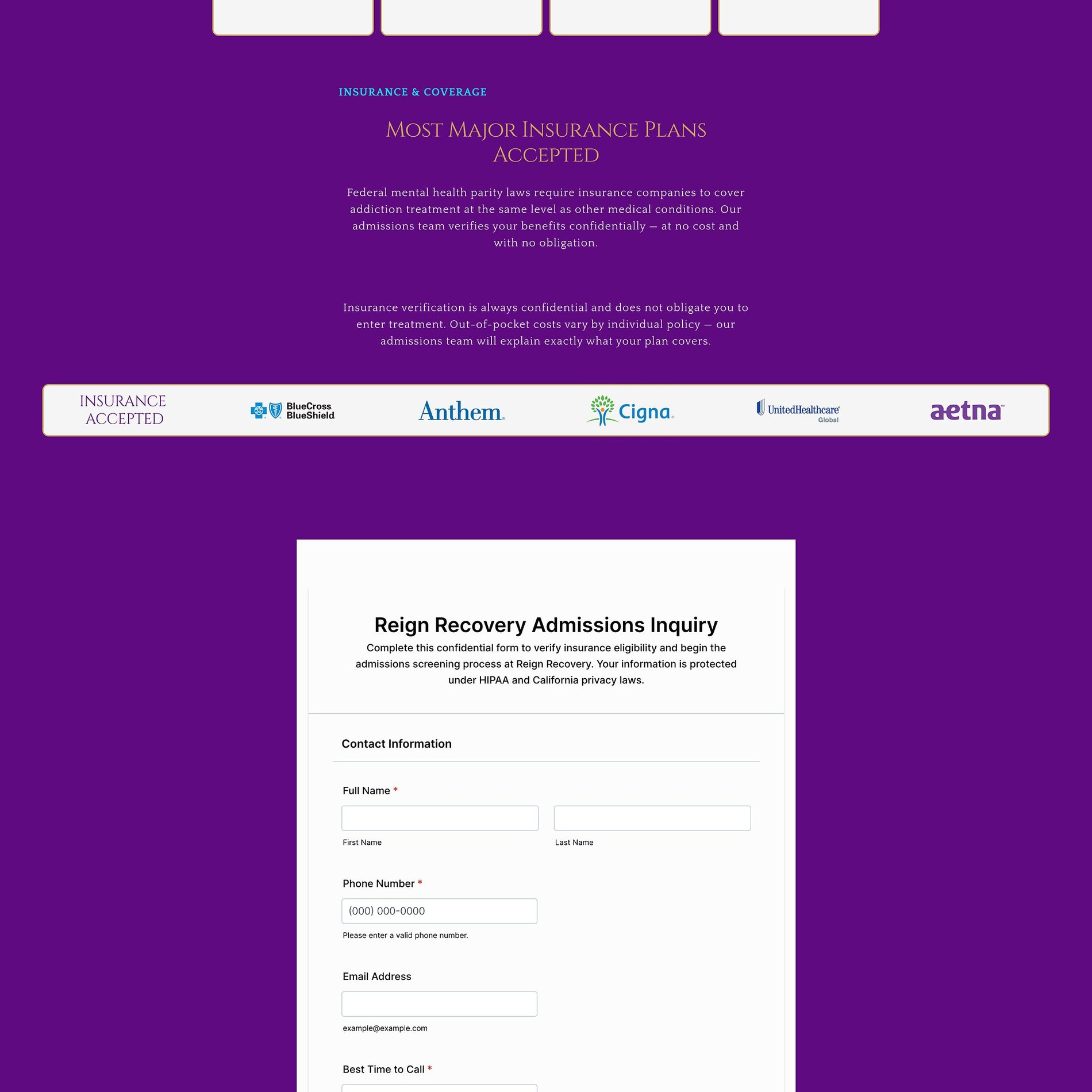
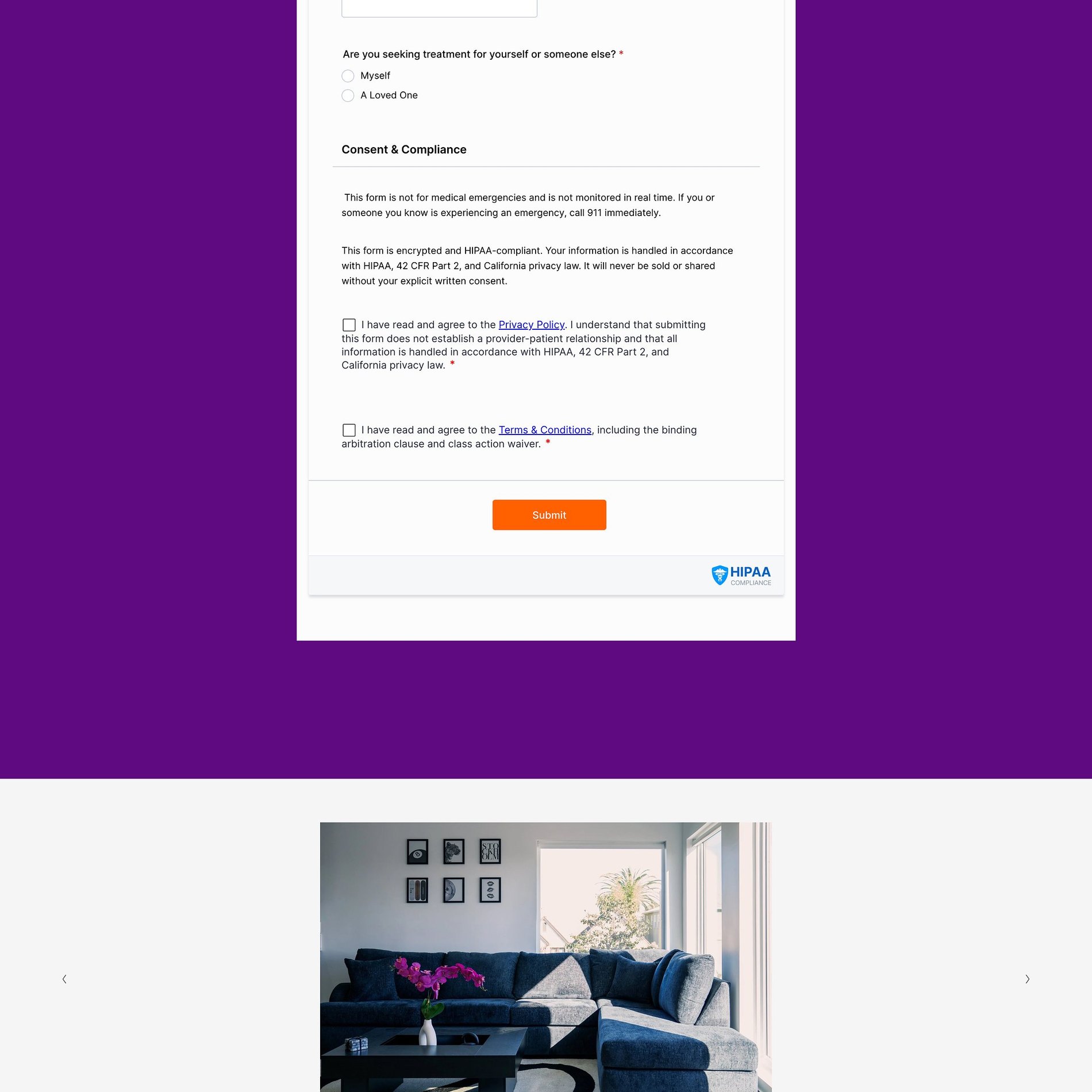
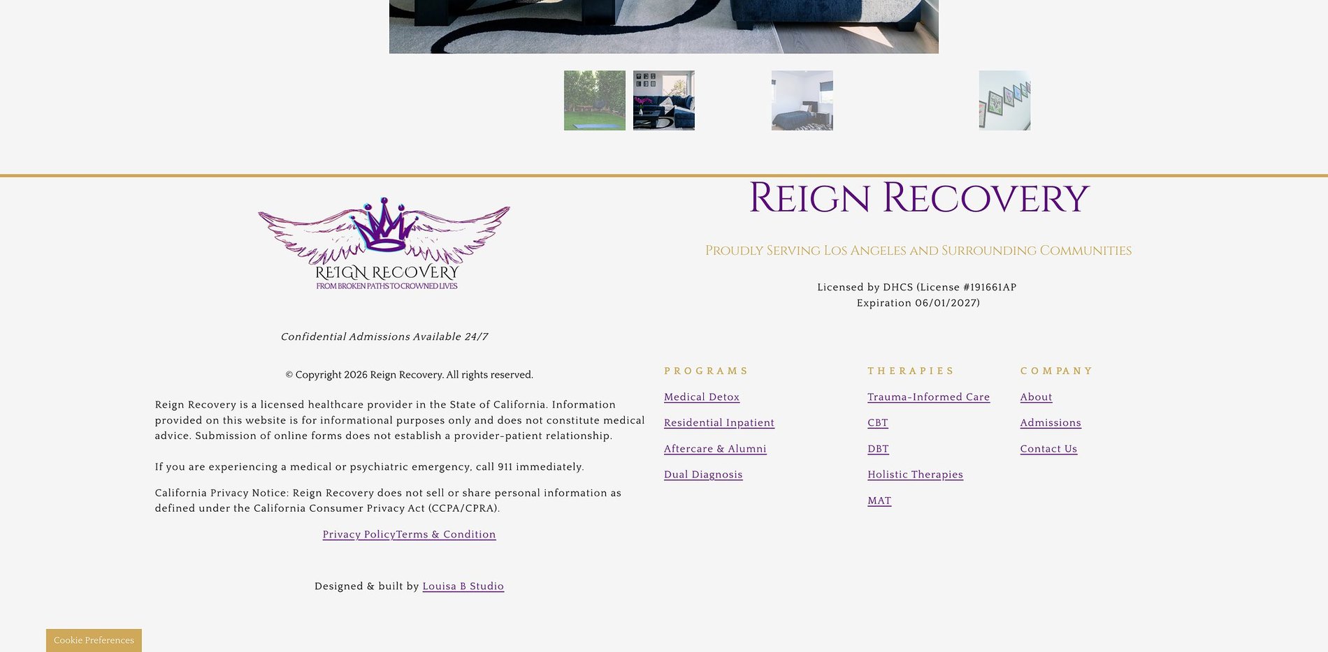
The hardest call, made easier
Admissions removes friction at the decision point — insurance verification, what to expect, and a warm way to reach out.
Before & After
What changed.
Before
- — Category norms of sterile blue-and-grey clinical design
- — No visual distinction from dozens of nearby LA facilities
- — Programs and therapies buried, hard for families to compare
- — No clear insurance or admissions reassurance before the call
After
- — A royal purple and gold identity built on the idea of dignity
- — Nine responsive pages with a defined role for each
- — Dedicated Programs and Therapies pathways, plainly explained
- — Insurance verification and admissions prompts at every decision point
The Process
How this site was made.
Strategy & positioning
We start with the audience a recovery center is actually trying to reach — what they're afraid of, what they're comparing, and what would make them book.
Identity direction
Colour, type, and tone are chosen against the category, not from a moodboard. Every decision has a reason you can repeat out loud.
Page-by-page design
Each page is designed for one job — reassure, explain, or convert — then built responsive from the smallest screen up.
Build, launch & handover
Copy, imagery, and SEO basics ship together, with a walkthrough so the team can keep the site current after launch.
Project Outcomes
What was delivered.
9
Pages designed & built
5
Therapy pages
Identity + Website
Scope
Live
Status
Services
Signature Website
Multi-page sites for treatment centers and clinics that need trust built into every screen.
View services & pricing →Start a project
Want something like this for your recovery center brand?
Tell me where the brand is now and what it needs to become. I reply to every inquiry personally.
Start an inquiry →