Case Study — Salt & Suture
Website Design for Med Spa & Aesthetic Medicine Brands
Precision, made warm.
Aesthetic medicine sits between a clinic and a luxury boutique, and the website has to hold both. This case study shows how treatment pages, credentials, and consult prompts can carry medical credibility without losing the calm the category is sold on.
Client
Dr. Ines Vega, MD, Studio City, LA
Deliverables
Visual Identity, Website
Industry
Aesthetic Medicine
Year
2026
Concept mockup — a design study, not a live website.
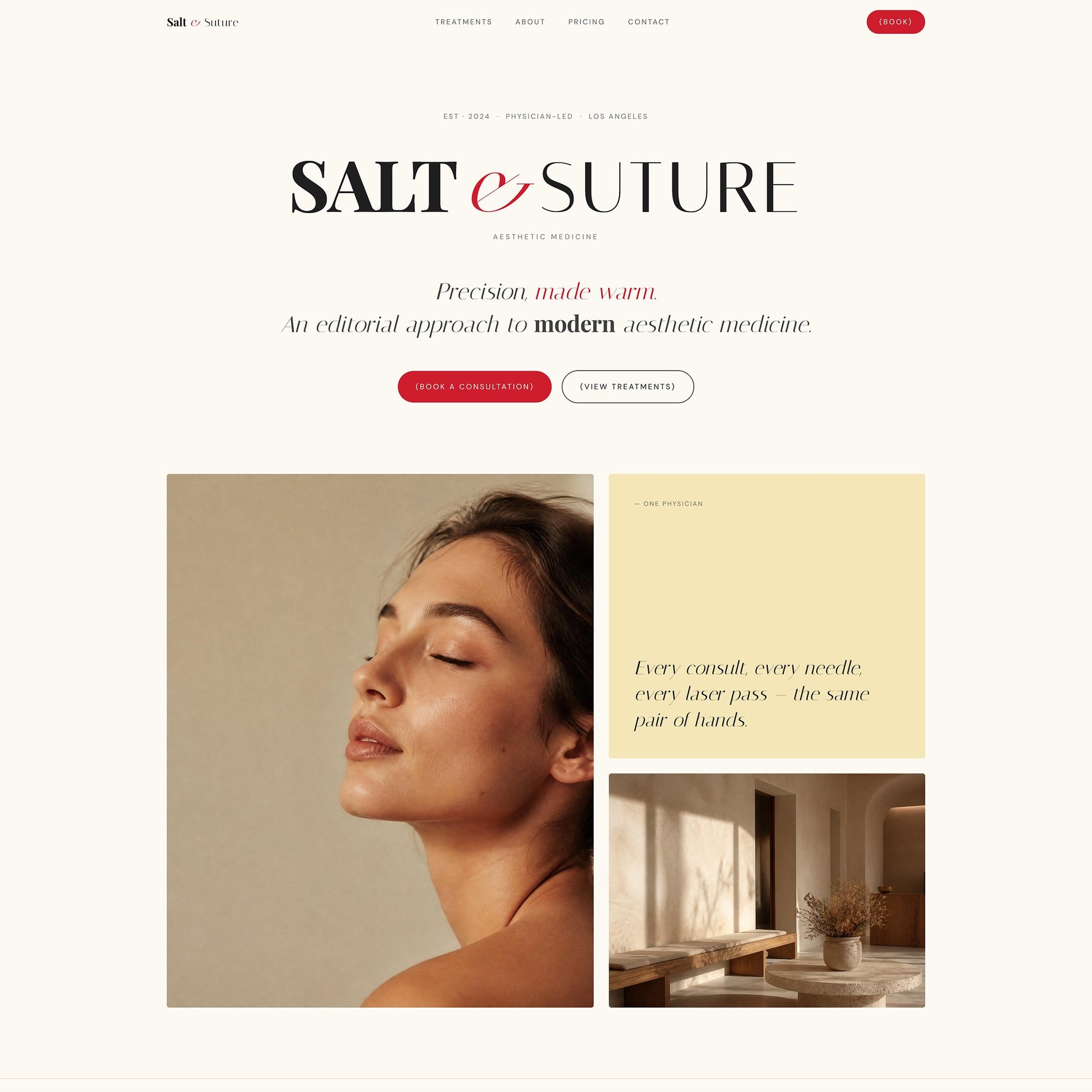
↓ Scroll inside the frame to explore · switch pages above
The Vision
What the brand needed to become.
Dr. Ines Vega built Salt & Suture out of one frustration: med-spas that felt like waiting rooms and salons that felt like showrooms. Hers is physician-led — one room, one appointment at a time, nothing double-booked. The brand had to carry that restraint before a single treatment was named.
Aesthetic medicine usually markets two ways: clinical and sterile, or glossy and loud. Salt & Suture is quieter than both — editorial, warm, and confident enough to whisper. The whole identity is built on a belief the practice lives by: the best work looks like nothing at all.
The first place on the westside that felt like a room, and not a chart.
The Work
What we made.
A restrained, editorial identity and a full website that makes a medical practice feel like a considered magazine — warm and human, without ever losing clinical credibility.
Visual Identity
The SALT & SUTURE wordmark and swash ampersand, an editorial type system, and a colour-coded language for the whole practice.
Five-Page Website
Home, Treatments, Pricing, About, and Book — fully responsive, paced with the calm the brand is built on.
Treatment Menu System
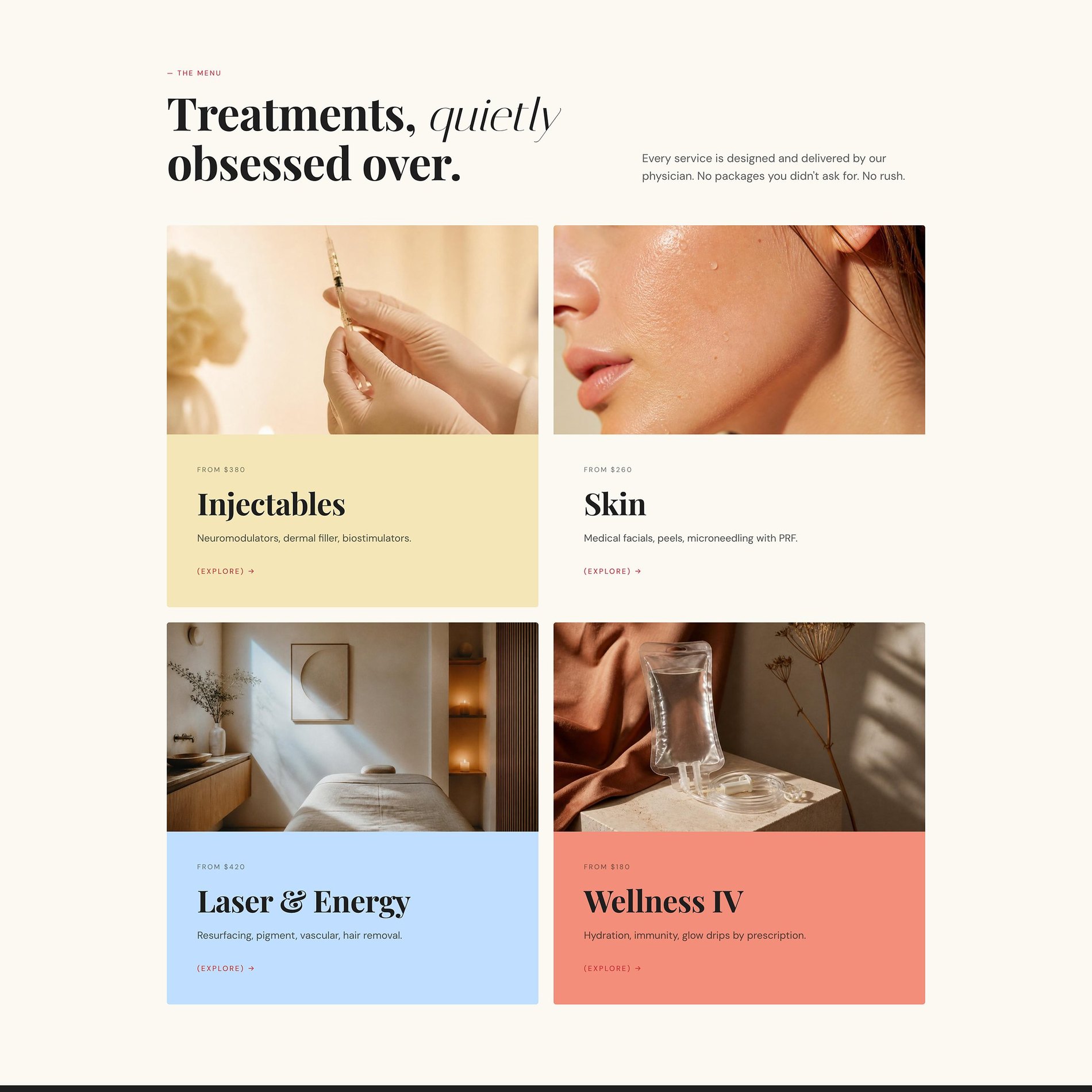
Four categories, each given its own editorial colour — so a medical menu reads like a lookbook, not a clipboard.
Transparent Pricing
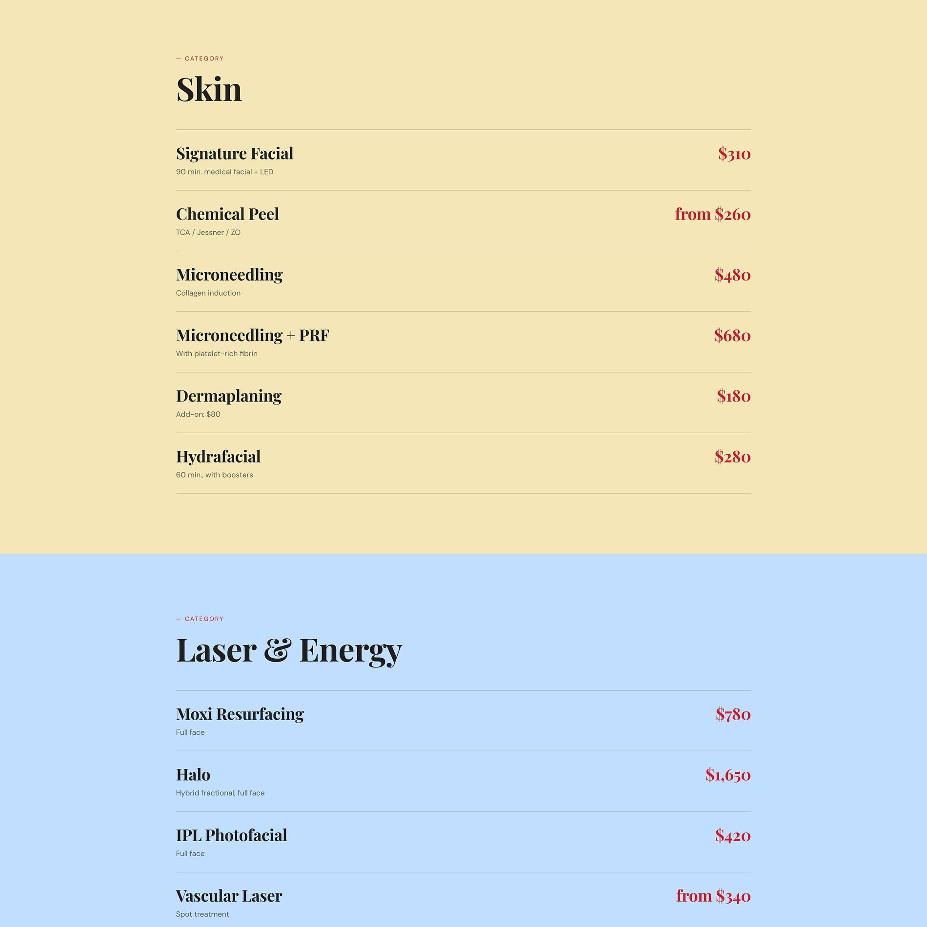
'Plainly said' — honest, per-unit pricing laid out with the same restraint, building trust before the first consult.
The Palette
Color, with a reason.
A physician's menu could so easily read like a clinical chart. Instead, each treatment category is given its own soft, editorial colour — butter, powder blue, coral — turning the menu into a calm colour story. A single sharp crimson is reserved for booking, while cream and ink hold everything in quiet, luxurious restraint.
Cream
#F7F5F0
The editorial base — warm paper, never clinical white.
Ink
#1F1F1E
Grounding for the serif headlines and the quiet, moody sections.
Crimson
#CB1122
The one sharp note — reserved almost entirely for 'book.'
Butter
#F2E2B5
Injectables — the warmest, most approachable category.
Powder Blue
#BEE1FF
Laser & Energy — cool, clinical calm, colour-coded for the menu.
Coral
#E49273
Wellness IV — a warm, restorative close to the colour story.
Type
The voice, set in metal.
Physician-Led · Studio City
Precision, made warm.
- High-contrast serif — editorial and calm.
- The swash italic — warmth in the details.
- Mono — clinical, precise category tags.
Selected Screens
A few pages.
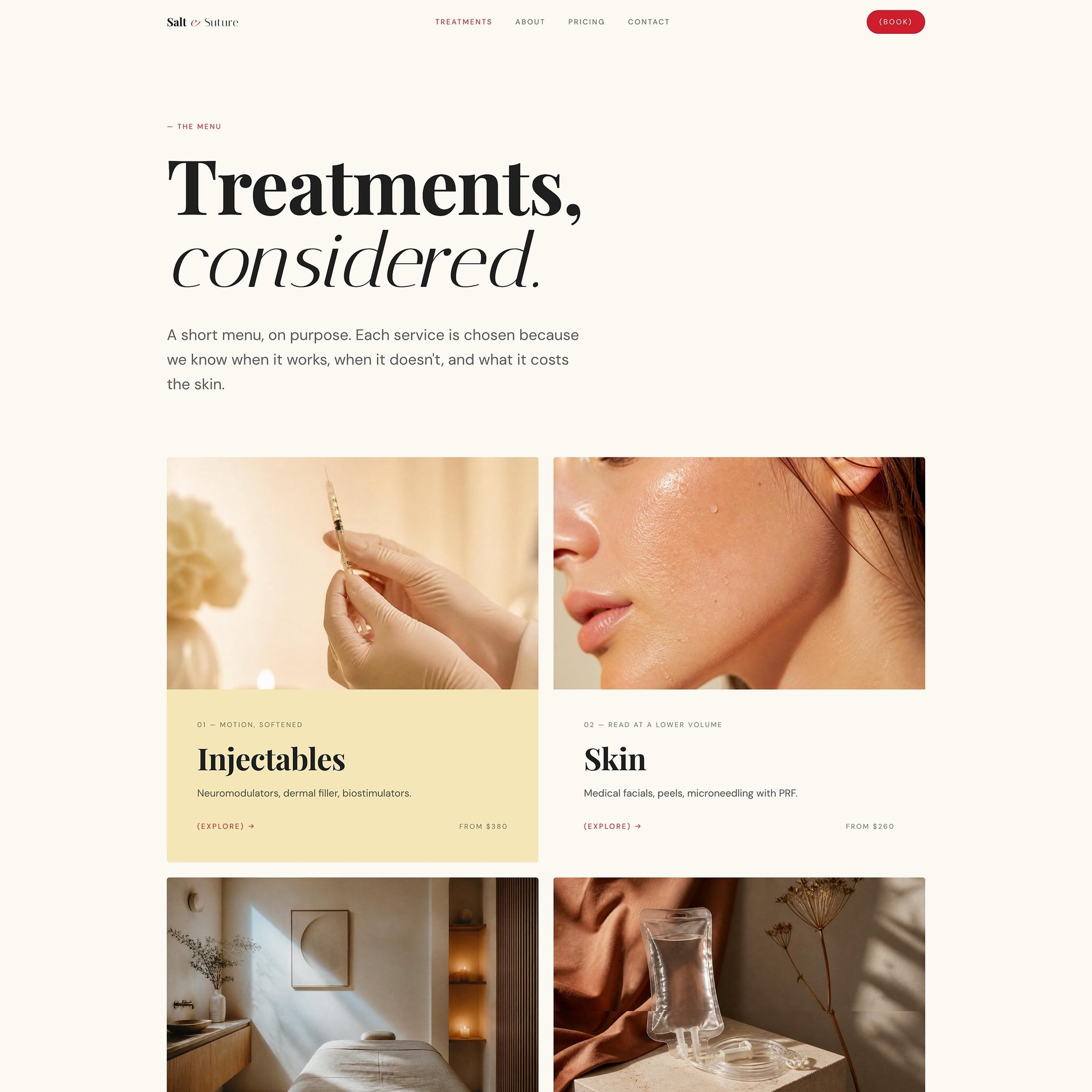
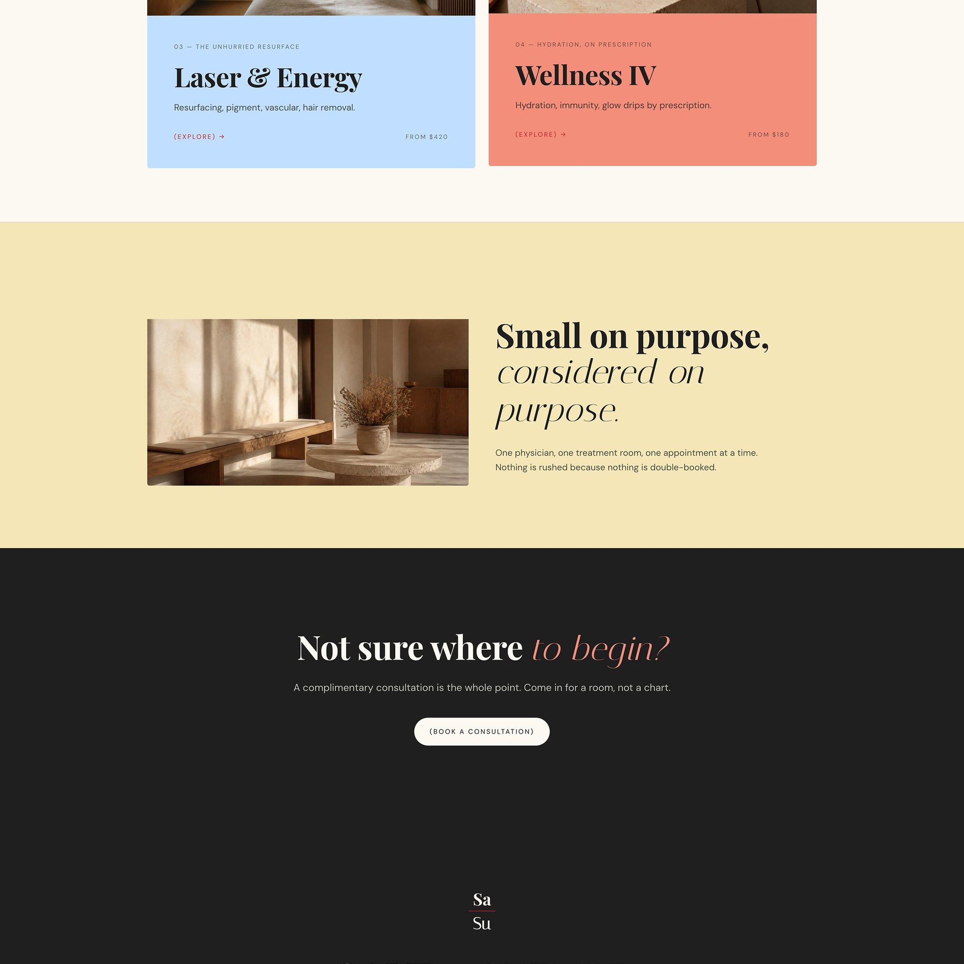
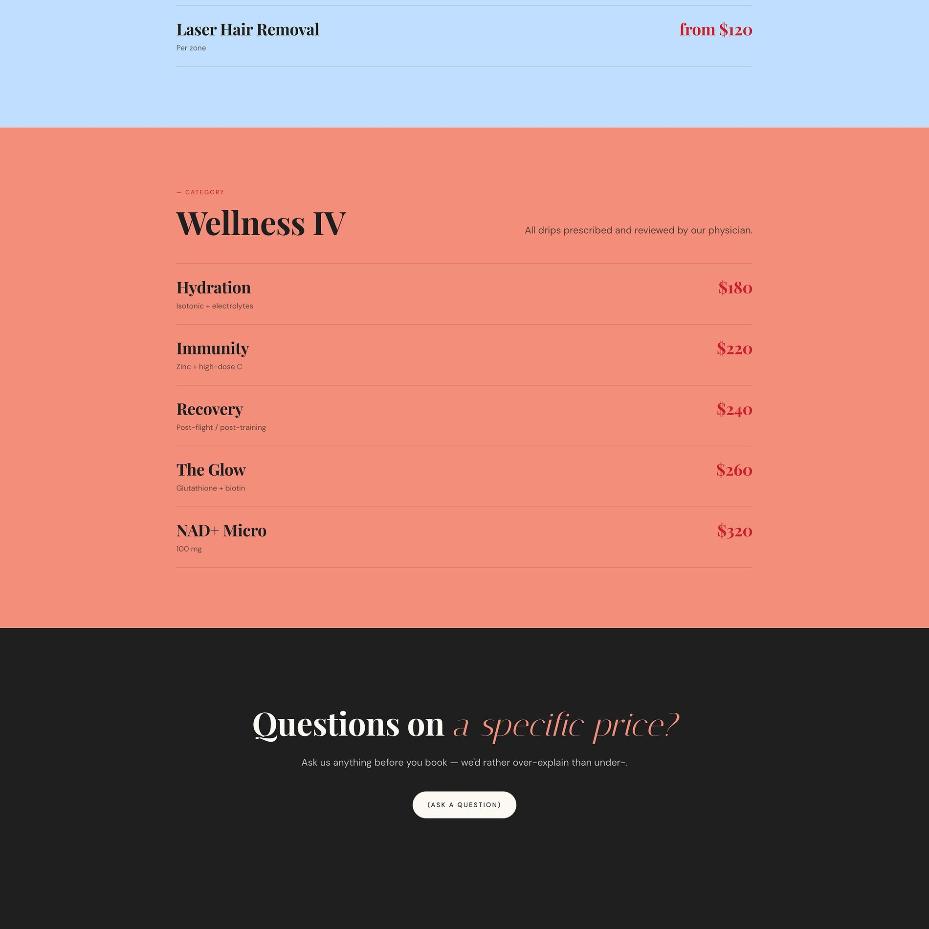
A menu like a lookbook
'Treatments, considered' — four categories, each its own editorial colour.
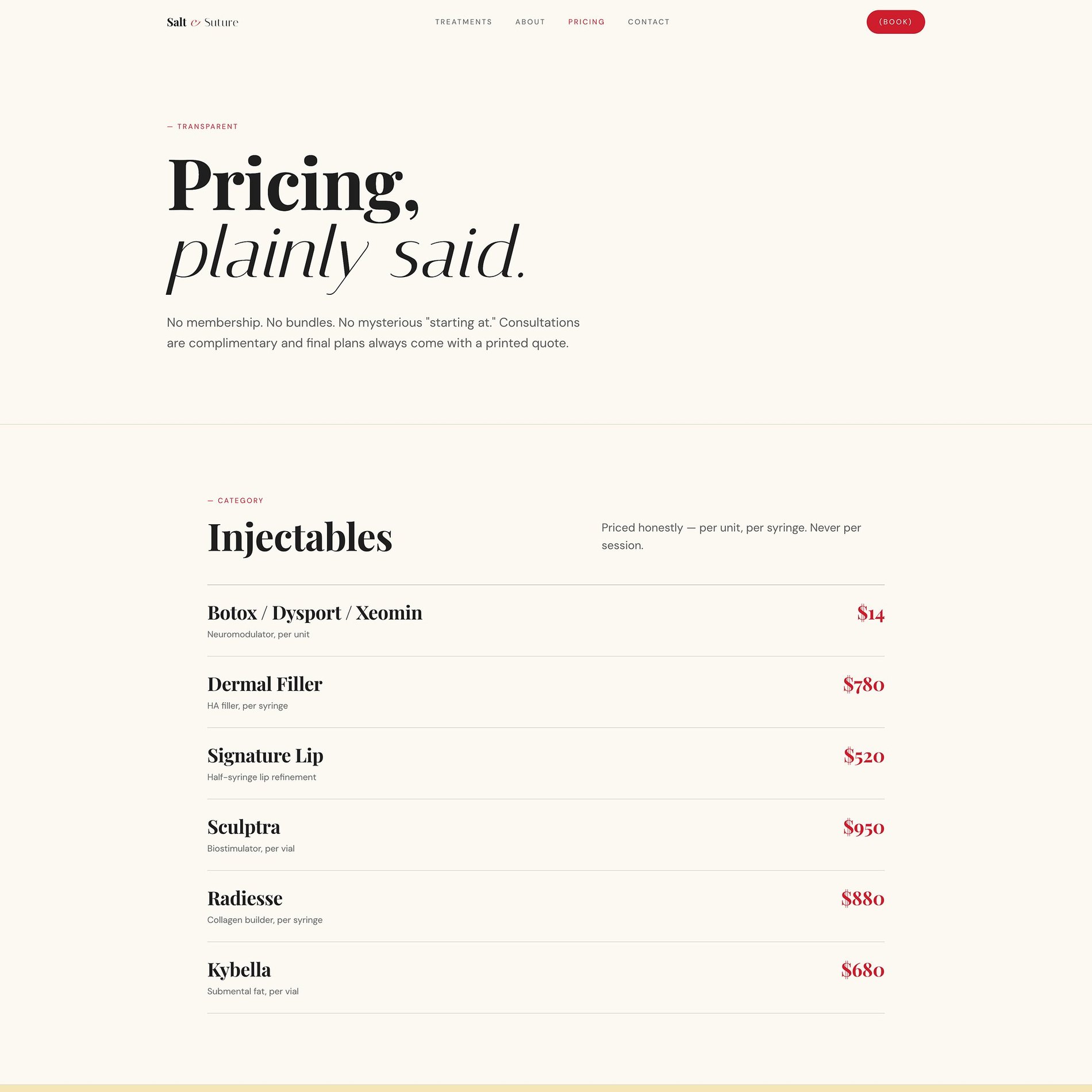
Pricing without the mystery
'Plainly said' — honest, per-unit pricing in the same colour-coded system.
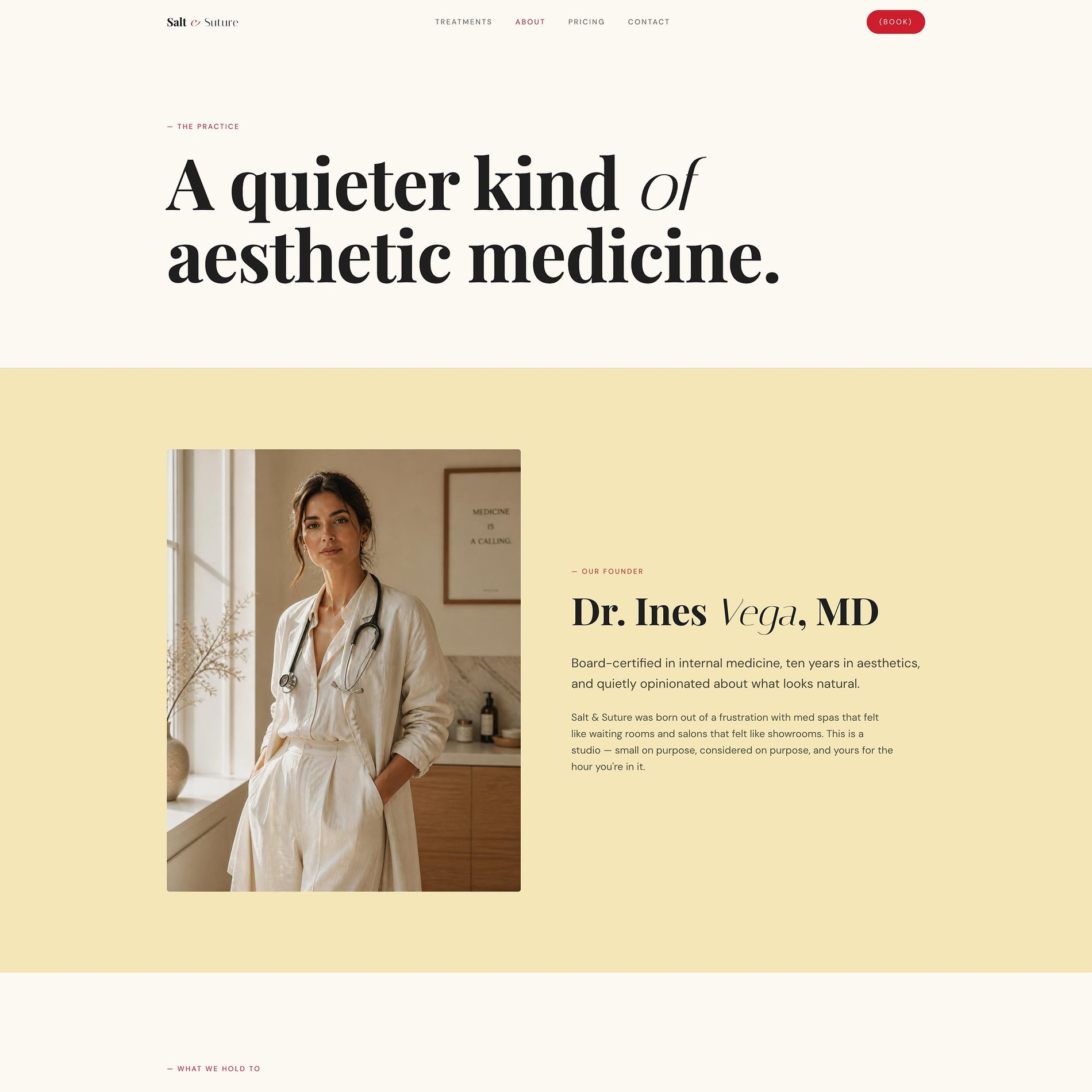
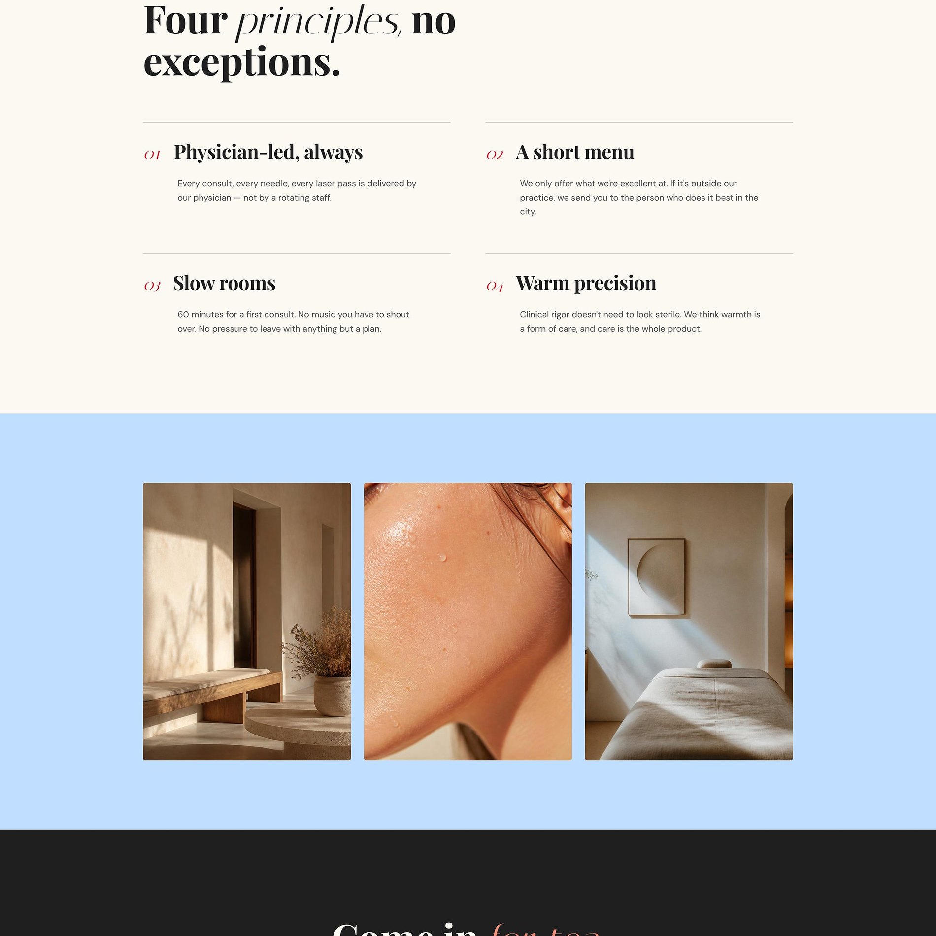
The physician & the philosophy
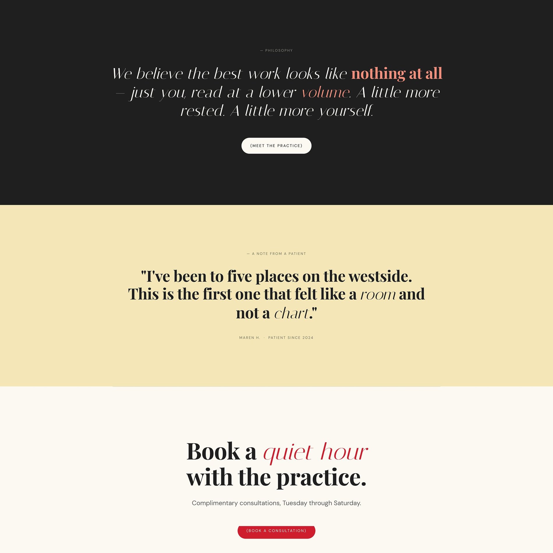
Dr. Ines Vega, four principles, no exceptions — the credibility and the restraint.
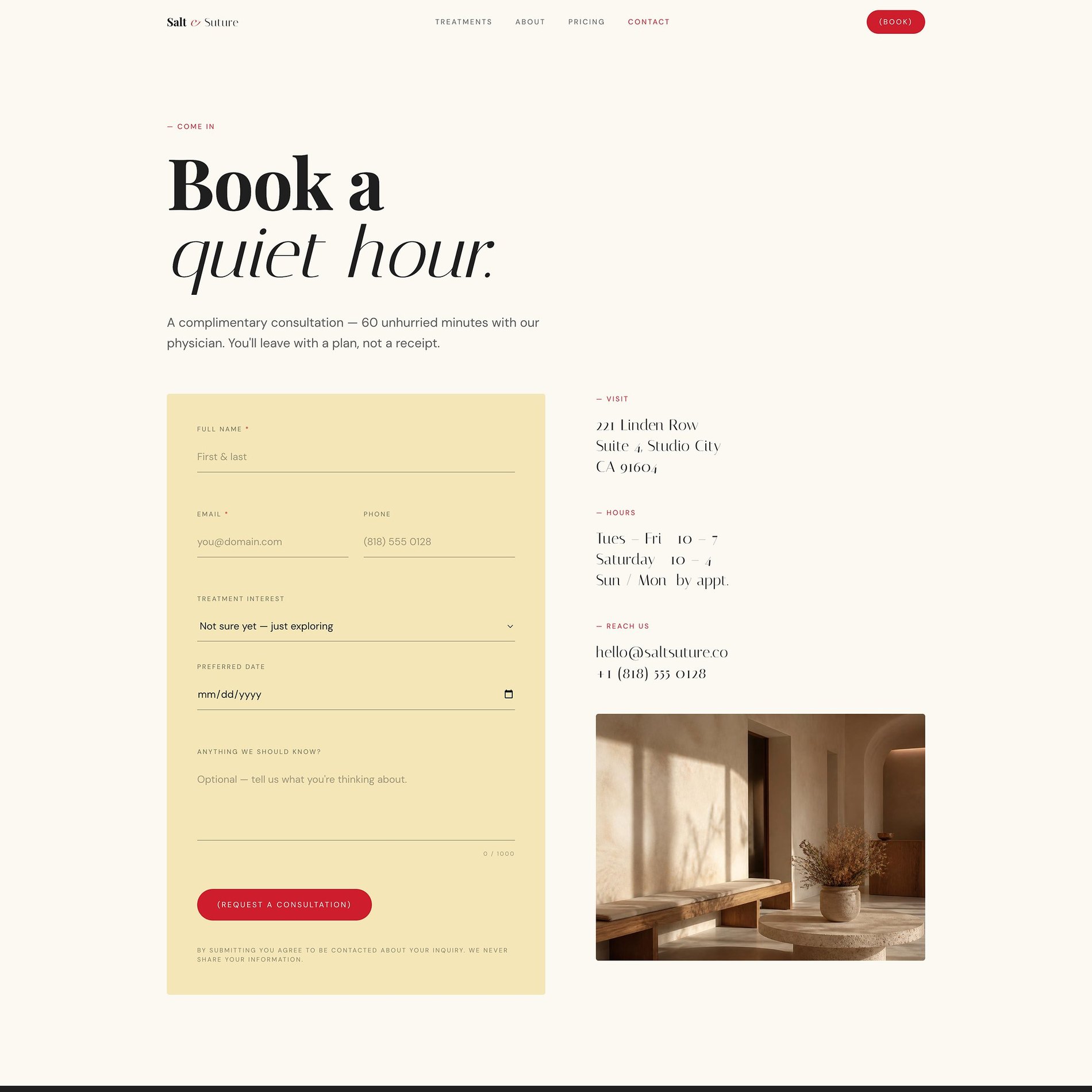
One unhurried next step
'Book a quiet hour' — a complimentary consult framed as a conversation, not a sales call.
Before & After
What changed.
Before
- — Either over-clinical or over-glossy — never both right
- — Treatments listed without explanation or expectation-setting
- — Credentials and safety information hard to find
- — Consultation booking treated as an afterthought
After
- — A restrained, precise identity that reads clinical and luxurious
- — Treatment pages that explain process, feel, and aftercare
- — Practitioner credentials surfaced where hesitation happens
- — Consult prompts placed at each decision point
The Process
How this site was made.
Strategy & positioning
We start with the audience an aesthetic medicine practice is actually trying to reach — what they're afraid of, what they're comparing, and what would make them book.
Identity direction
Colour, type, and tone are chosen against the category, not from a moodboard. Every decision has a reason you can repeat out loud.
Page-by-page design
Each page is designed for one job — reassure, explain, or convert — then built responsive from the smallest screen up.
Build, launch & handover
Copy, imagery, and SEO basics ship together, with a walkthrough so the team can keep the site current after launch.
Project Outcomes
What was delivered.
Identity + Website
Scope
Treatments & consults
Focus
Clinical + luxury
Tone
Mobile-first
Responsive
Services
Signature Website
Treatment-led sites for med spas and aesthetic practices.
View services & pricing →Start a project
Want something like this for your med spa & aesthetic medicine brand?
Tell me where the brand is now and what it needs to become. I reply to every inquiry personally.
Start an inquiry →